It’s an urban myth that the modern attention span has shortened to less than that of a goldfish – let’s clear that up first*.
However, the fact that we’re living in a world of content, content, content coming at us from all angles is certainly not fake news. When there’s so much easy distraction out there, how do you hold someone’s attention?
This becomes an even greater challenge when that message is a bit complex, dense or tricky to understand. Here’s where traditional communication methods can fall short.
It’s time to deploy some interactivity ⚡️
Why, though? Well first up, here are some statistics to mull over…
☑️ Only 10% of people remember what they hear
☑️ This increases to 20% of people who remember what they read
☑️ But a whopping 80% of people remember what they see and do.**
That makes a pretty great case for communicators to give people something to both look at and take part in at the same time. The people we’re trying to reach are no longer passive onlookers. Instead, they become active participants, influencing and being influenced by the content they’re engaging with.
Let’s explore the awesome potential interactivity holds in fostering meaningful understanding…
Capturing attention & boosting comprehension
Humans are nosey creatures and we’re naturally drawn to interactive experiences. Engaging our natural curiosity and prompting us to explore and participate means that complex topics become instantly more approachable, relatable and enjoyable.
The Luna 9 studio often employs this what’s-coming-next, storytelling style technique for creating explainers. It’s often attached to a topic that’s either very detailed and tricky to grasp, or – let’s face it – kind of dry.
To combat this we have to put the power in the user’s hands and make them want to learn, instead of just hoping that they pick it up. Scrolling explainer pages are a light version of interactivity that enables hands-on exploration. You’re encouraged to keep going (and learning) to uncover the next cool thing – while still giving you the power to explore at your own pace.
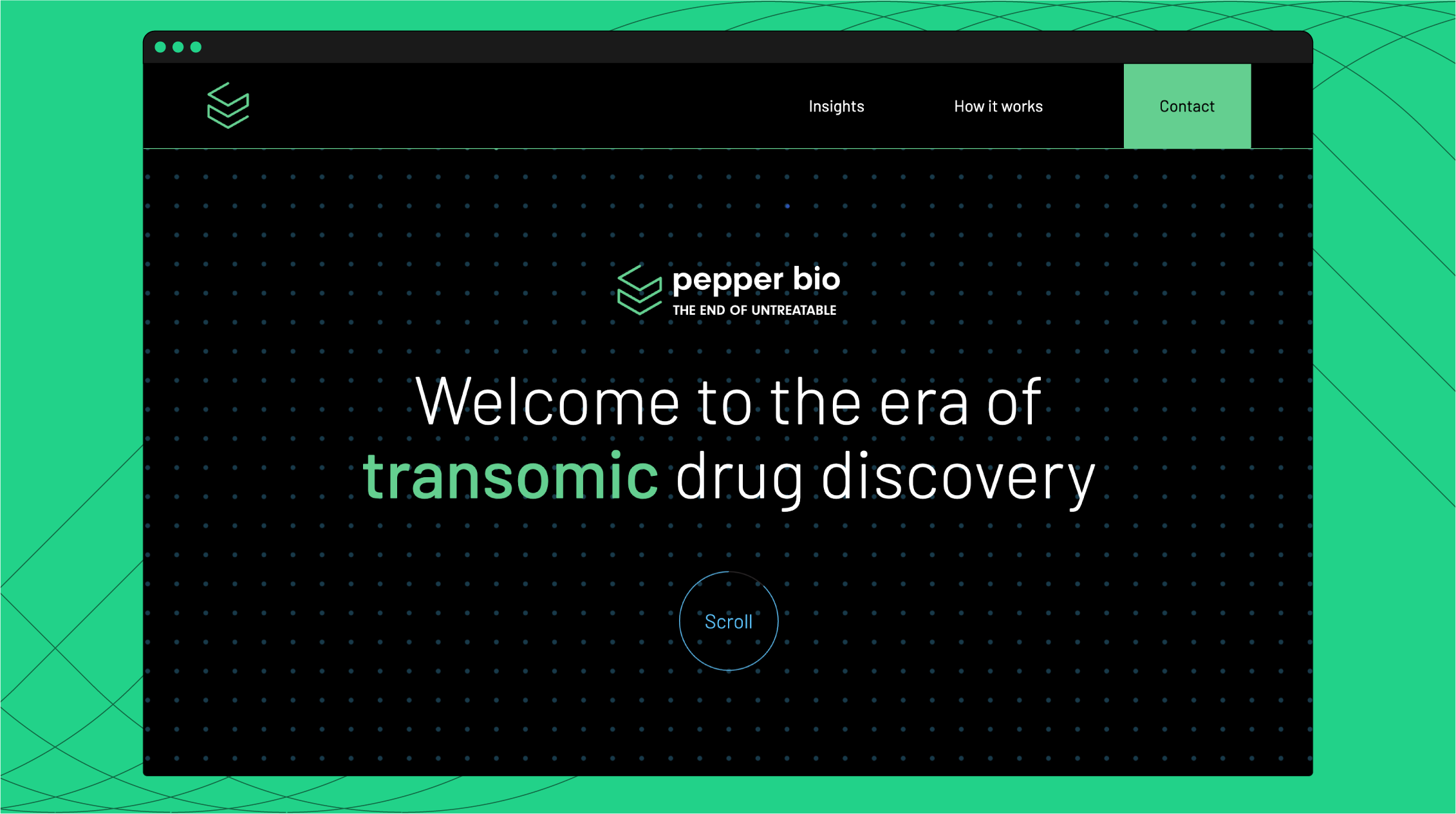
Check this out in action for the explainer page we created for Pepper Bio…

Personalised learning
True, it’s not school and there’s no exam (promise!), but everyone learns at their own pace and has different preferences when it comes to uncovering and digesting information.
Leaning into this fact with interactivity lets your audience embrace this individual nature and delivers your message with more accuracy.
It’s refreshing to be able decide what’s most relevant to you and choose what you read, click or watch – which enhances the retention of what you’re reading as it’s putting your needs front and centre. Everyone loves that!
We’ve used this tactic in interactive infographics and games for projects that have a vast amount of information to communicate, and the audience spans across lots of sectors and disciplines. Instead of shovelling absolutely all the info onto people, which is guaranteed to cause overwhelm, we structured the interactive journeys so that users can quickly recognise themselves in the opening screens.
From here they’re able to select their own paths, variables and options as they move through the graphics, so that they’re always in control. Fun!
This means they can track down tailored content that’s useful and most importantly – valuable – to them. Message delivered.
We employed this approach in creating the SME Net Zero challenge for BSI – check it out here.
Focusing all-important context
To avoid hitting snoozeville early, hard-to-understand topics are always going to need a little bit of context to convince your audience to stop and take note.
If you can’t relate stuff to real-world scenarios, then it’s usually asking too much of your audience to think in the abstract… Which means they’re unlikely to keep caring about your message. Bummer.
Interactivity can bridge this gap though, by providing examples and simulations that can really helps the people you’re trying to reach to join those dots between theory and practice.
We explored this element of interactivity with our Energy Landscape Map. We began with with a simple, visual grounding of the content, drawn as an easy-to-understand map for how everything works together as a network.
From here, the information is then layered on top, letting you whizz around at your leisure and uncover different levels of detail depending on what interests you, but all the while grounded with the knowledge of how it all interlinks back on the map.

Check our our interactive Energy Landscape Map here…
So – what’s the all-round benefit of interactivity?
Simple! It boils down to the seeing and the doing. Combining the two with an element of storytelling can make even the most complex of subjects easier and enjoyable to explore.
Get in touch at [email protected] or sign up to our newsletter for news, updates and morsels of inspiration from the Luna 9 studio.
We accelerate commercial traction for innovative organisations by creatively explaining what they do and why it matters.
You need to load content from reCAPTCHA to submit the form. Please note that doing so will share data with third-party providers.
More Information