At Episode Two, we’re nuts about great packaging design and the solid consumer engagement it can bring. So, when Koko, a leading dairy-alternative brand, asked us to help reinvent the on-shelf presence for their coconut-based milk, we couldn’t wait to get cracking.
After wrapping our heads around the nutty fact that coconuts are in fact a fruit, we wanted to understand a bit more about the brand story. And we love what they’re all about.
Launched in 2010, Koko was the first UK company to make a coconut-based alternative to dairy milk. Their plantations are grown with love and care and rooted in strong ethics. Their plantations have shorter, hybrid trees so they can be harvested by people on the ground using hand tools and knives. What’s more, the same people pack the coconuts within hours of picking, to guarantee freshness, ripeness and quality.
Koko’s heritage, commitment and passion has led to its success with consumers today, but thirteen years is a long time in the world of FMCG and, with a new milk alternative hitting the shelves almost daily, it’s easy for consumers to feel a little drowned with choice.
So, Koko knew they needed a packaging refresh to really shake things up, without completely losing the look of their already established brand. Koko have a loyal customer base, affectionately known as the ‘Koko Nuts’, so whilst there was an appetite for newness, regular buyers still needed to recognise the product on shelf.
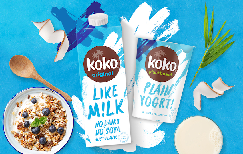
First off, we looked to tone back the tropical feel so that we could remove confusion amongst new consumers – these are not coconut flavoured milks, they just harness all the goodness of the coconut as an ingredient. The packaging needed to present the product as a delicious dairy alternative; not a tropical milk, not a cooking product.
The colours and graphic elements we chose deliberately reflect the product usage. The new pack looks like a fresh milk carton and the bold design change has a younger, modern feel to better align with the needs of Koko’s core consumer base.
New naming of M!lk and Yogrt! takes on a playful and cheeky tone to reflect the friendly and fun brand personality. With the full range of products being relaunched, the new packaging also ensures clear brand consistency across the ranges – creating a much stronger, recognisable brand presence on shelf.
” With an ambitious brief, that needed to be turned around within a tight timeframe, we knew we needed a creative agency who could dive straight in – and that’s exactly what Episode Two did. They immediately understood what we were trying to do and have really captured the essence of what we want Koko to be. We absolutely love the new look and know our Koko Nuts will too!”
Victoria Eadon, Marketing Manager

Championing the power of packaging design to elevate your brand and build stronger connections with consumers. Our approach to brand identity and packaging design makes consumers say ‘WOW’ when they see your brand on-pack, in-store and online.
You need to load content from reCAPTCHA to submit the form. Please note that doing so will share data with third-party providers.
More Information