

6 Quick website hacks to improve your website like a pro

You may have a website already, in which case, this article is for you, if you don’t have a website yet, kudos to you for doing some research ahead of time!
Sometimes decisions are solely based on budget alone and that’s okay, so sometimes, it’s great to be able to do things yourself before bringing in the professionals.
The website hacks we’re going to outline below won’t suddenly launch you to the very top of Google, nor suddenly land you thousands of sales. But they will contribute and will get you into the mindset of your audience.
So, get that coffee and let’s begin!
Think from your user’s perspective
This sounds like an obvious one but don’t scroll past this one, here us out. What are your users looking for when visiting your website? Is it your value? Your contact information? Your pricing?
When you get a phone call from a new prospect, what are they typically asking for? Can you find this information on your website?
You need to make sure that information is easy to find on your website and not hidden away – even if it’s content further down the page, you can still link them to it to speed their journey up.
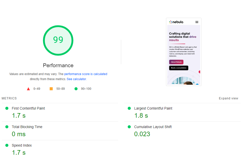
If you’re paying less than £5 a month or less than £60 per year for your website’s hosting – you need to invest more if you want results.
Now, we’re not talking bank breaking amounts here. A good website hosting provider is essentially your website’s foundations. It’s a pointless exercise to invest in improving your website’s user experience when it’s your hosting provider slowing you down.
If you check your current website over at https://pagespeed.web.dev/– what does it score?
If you’re scoring low, it may be that your current hosting provider has you on a shared platform. Whilst simple brochure sites aren’t necessarily demanding, you could be being hosted on an underperforming server to save cost.
Don’t slow your visitors down
To put things into perspective, we pay a little extra for our web server to bundle LiteSpeed Cache (amongst other improvements) – the result? Performance.

If you’re considering putting a pop up on your website, even if it’s just a one-off. I’d like you to visit this website first: https://how-i-experience-web-today.com/
Don’t be mad at me – that’s what your users have to face whilst they’re looking for someone to solve a problem. Stand out by NOT bombarding them with pop ups.

When users visit a website, they’re on a journey following you designed path. By introducing a pop up, you’re actually interupting them and distracting them.
It’s akin to whilst I’ve been writing this article, my phone has pinged several times – 4/5 of the notifications have been absolute nonsense. Go away! The same frustrations apply to your website.
There are so many free tools at your disposal, so before you get your wallet out from from within the sofa, consider some of these handy free tools:

Stop cluttering up your website and embrace whitespace. By reducing clutter and ensuring a good whitespace ratio, you maximise user focus. White space can also make your website feel ‘fresh’, modern and professional.
If you have a lot of content and not a lot of space, consider alternative solutions like accordions or modal pop ups (not to be confused by the earlier intrusive pop ups above).
If you utilise the above guidance of using white space, your calls to action are suddenly going to have a lot more attention on them. Don’t waste this undivided attention with a button that says “Click here”.
Instead, crack open the dictionary and throw down some terminology that’ll get the user clicking. Wording like “Get started now” or “Sign up for free”. Wording like this implies time-sensitivity and/or the value.

There you have it! Some quick website hacks to improve your website, you’re now a pro! Of course these are just 6 quick ‘hacks’, there’s plenty of other improvements that can often be easily applied but they usually depend on your audience and your website’s goal(s).
If you need a hand or would like anything clarified/expanded on, please do feel free to reach out. 

Crafting digital solutions that drive results
You need to load content from reCAPTCHA to submit the form. Please note that doing so will share data with third-party providers.
More InformationNotifications