
This article originally appeared in Brand Packaging
Remembering Margo Chase
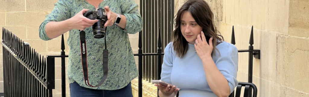
Margo Chase got her start creating iconic graphics for some of the world’s most celebrated musicians, including Bonnie Raitt, Madonna, Cher and Prince. Just like the legends she collaborated with, Chase mastered her craft, challenged convention and learned how to work with any client without sacrificing vision or quality. A year after her untimely death, those who knew her best reflect on Chase’s approach to creating one-of-a-kind designs that continues to inspire.
Master your craft
In 1991, Capitol Records approached Chase to design the album art for Bonnie Raitt’s classic record, “Luck of the Draw.” The songwriting legend spent years honing her distinctive guitar style. Like Raitt, Chase spent tireless hours mastering her craft. In the age of Adobe Illustrator, it is easy to overlook the intricacy involved in creating the handdrawn typography Chase made for “Luck of the Draw.”
She applied the same skills years later to ensure the women’s footwear brand Chinese Laundry stood out with consumers and at retail. Chase took a muralist approach, handcrafting a collage of intricate illustrations and typography that ultimately helped the brand achieve its goal.
Break the rules
In true Rock ‘n’ Roll fashion, Chase broke rules in design. In 1992, she was approached by Victory Records to design the album art for Ten Inch Men’s “Pretty Vultures.” Prior to digital photography, designs involving photography started with a series of Polaroids that were used to refine the art direction for the project. Once the composition was chosen, a pristine photograph was taken and the negatives would be scanned for the final printed piece. But for this project, Chase felt the lo-fi aesthetic of the Polaroid added an edge that a cleaner image simply could not create. She scanned it into Photoshop where it was symmetrically duplicated and colourised—creating the shadowy, distorted image we recognise today.
While working with Califia years later, Chase convinced the brand to step away from conventional cues in the non-dairy milk category to stand out at shelf. At the time, almost all brands used the same gable-top structure, the colour blue, splashing milk and scattered almonds. Similar to how the anarchy of punk rock shifted the culture away from mainstream rock aesthetics in the mid-70s, Chase’s persistent exploration of the unconventional paved new roads in design. Califia’s adoption of an iconic new structure and a design without traditional flavour visualisation marked a significant departure from convention and positioned the brand for success in a market of larger established brands.
Sing in harmony
The idiosyncratic tendencies of Prince, Madonna and Cher are, by now, legendary. Chase’s experience working around the nuanced and changing demands of her celebrity clients aptly prepared her to navigate the complexities of working with larger brands. Working on Gain detergent, Chase had to collaborate with an extensive P&G team, and her skill at keeping true to the brand’s vision and goals ultimately helped everyone sing in harmony.
There is no doubt that Chase’s beginnings in music informed her approach to later work in packaging. By mastering her craft, breaking the rules and learning to sing in harmony, Chase was able to create packaging that really rocked!
Clark Goolsby, Chief Creative Officer, Chase Design Group
A creative agency dedicated to innovative brand-building.
You need to load content from reCAPTCHA to submit the form. Please note that doing so will share data with third-party providers.
More Information