Bristol-based strategic design agency Rhombus have launched their refreshed brand to better align their visual language with their evolving purpose. Known for their work in crafting transformative brands, websites, and campaigns, the studio has repositioned itself to emphasise collaboration, creativity and strategic problem-solving.
For Rhombus, design is about finding the right balance between strategy and creativity to solve problems, inspire audiences, and drive meaningful change. As their work has grown, so has their purpose – partnering with progressive organisations and people who are on a mission to do things differently.
Despite the visual overhaul, Rhombus maintains its strategic approach to projects, which the studio describes as a balance between insight-driven strategy and creative execution. This involves viewing each project through a lens of problem-solving and potential, whether in the context of branding, web development, or campaign creation. From crafting distinctive visual identities to building engaging websites and powerful campaigns, their work is designed to spark change, grow audiences and connect brands with the people who matter most.
While the studio’s external identity has evolved, its core values and processes remain the same, providing clients with the same thoughtful, collaborative approach they have come to expect.
Each change is intended to communicate Rhombus’ values more effectively:
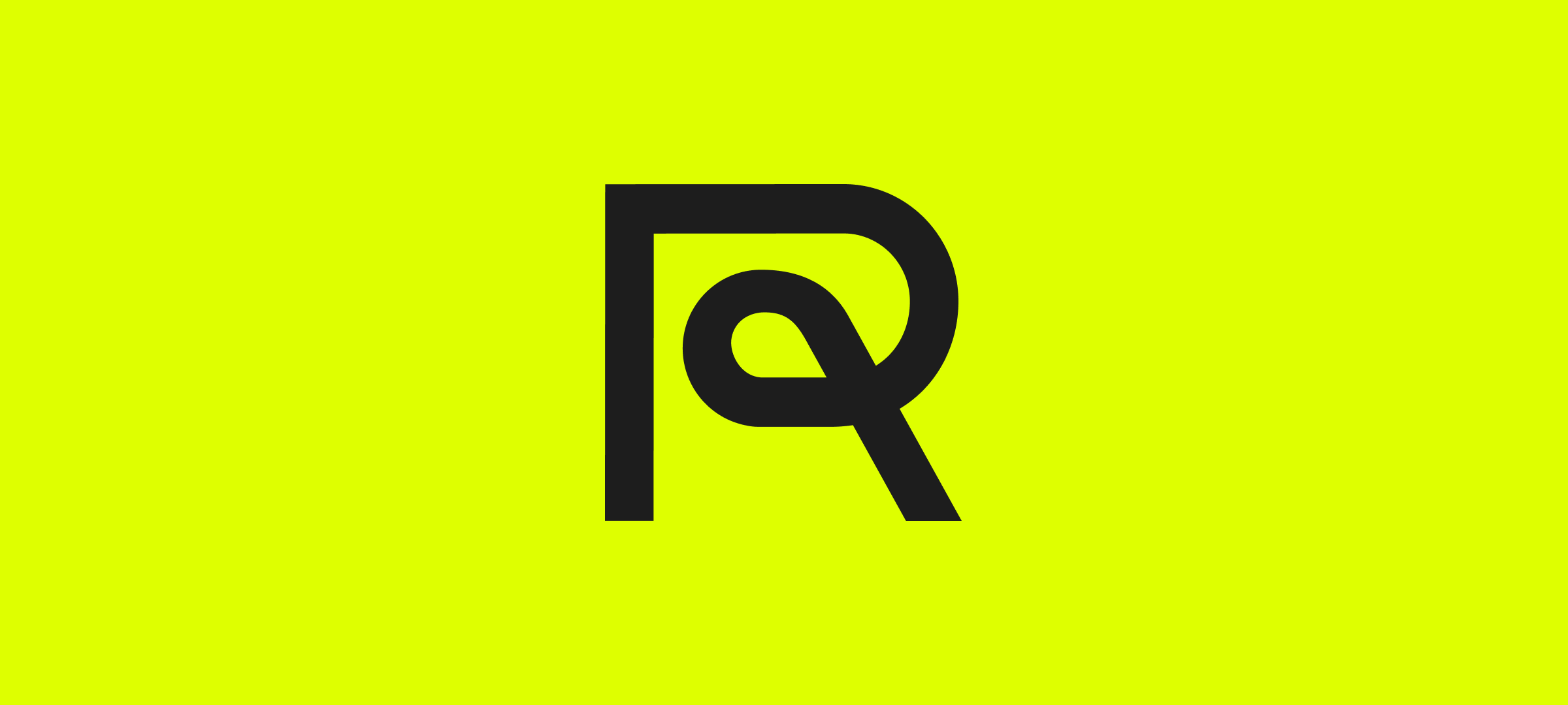
The Rampersand: The new logo integrates an ‘R’ with an ampersand, symbolising the studio’s focus on people and process. It’s about collaboration between their team and partners, and the transformation that creates for organisations and individuals alike.
Basel Grotesk: The introduction of Basel Grotesk as the primary typeface reflects a blend of modern aesthetics and historical design influences. Inspired by modernist typography, it is bold, flexible and designed to elevate the studio’s visual language.
A new colour palette: The updated palette features a range of colour, each with a specific purpose: Process, Optimism, Transformation, Play, and Rigour. This deliberate selection reflects both the diversity of Rhombus’ work and the intentionality they bring to every project.
From raves to rebrands, Rhombus’ journey to becoming an agency has been anything but traditional. It began in Bristol’s vibrant DIY music scene, where they learned to build brands through a hands-on approach. Designing rave posters provided their first design experience, with their signature brand colours paying homage to the day-glo stock they once plastered across the city.
This transformation is not about change for the sake of it, but a deliberate step forward to align who Rhombus is with what they stand for. Their work is about finding the perfect balance – creativity and process, imagination and rigour, people and purpose.
They remain the same studio, but with a renewed purpose to shape brands that don’t just look great but move all of us forward.
Explore Rhombus’ new site here
Shaping brands that move the world forward.
You need to load content from reCAPTCHA to submit the form. Please note that doing so will share data with third-party providers.
More InformationNotifications