Rave culture and a rebellious past – Rhombus Studio’s euphoric rebrand for Lakota
From dance floor to studio – the team behind Rhombus have a long history with the venue, from their first-ever club experience to running multiple high-profile events at Lakota in later years.
The rebrand took them on a dive into the club’s 90s golden era, combining their passion for music and design into a euphoric exploration of rave culture.
As a nod to Lakota’s immense heritage, part of the venue lives in the new identity, which draws inspiration from the club’s original logo, building architecture, and rebellious, 30-year history at the heart of Bristol’s underground scene.
Trip-hop & Massive Attack. Acid house & Carl Cox. Drum and bass & Goldie. There’s no doubt about it: Lakota is truly the beating heart of Bristol’s rich and longstanding music scene. Sitting proudly on Moon St. in the city’s historic St Paul’s area, the venue represents one of Bristol’s only black-owned venues.
Free-spirited and fiercely independent, Lakota has always promoted progressive programming and ethereal dance floor moments.
Now, after 30 years as the heart of the city’s underground music scene, Lakota needed a modern brand for their new chapter. One that acknowledged their past, set the tone for their future, and represented the increasingly diverse events they’re putting on: from club nights to live music, circus, drag, pop-up food and more across three spaces within the venue, the original Lakota club, Lakota Gardens and Coroners Court.
The Rhombus team are Bristol born and bred, and as regular ravers and promoters at Lakota since our younger years, the project took on a very personal approach. The deliverables were a brand identity and architecture, custom-built website, animation, brand launch and rollout, but getting there would start with hours and hours of research into the club’s history.
From poring over archive photography to studying old rave culture and multiple trips to the club exploring the architecture and original features, including the rough and ready floors and exposed walls, the team developed a modular brand system inspired by the venue’s heritage, ethos and vision. A language that could easily showcase a huge range of events, from underground club nights to immersive circus performances, and a brand that could flex into new ventures outside of the traditional club space.
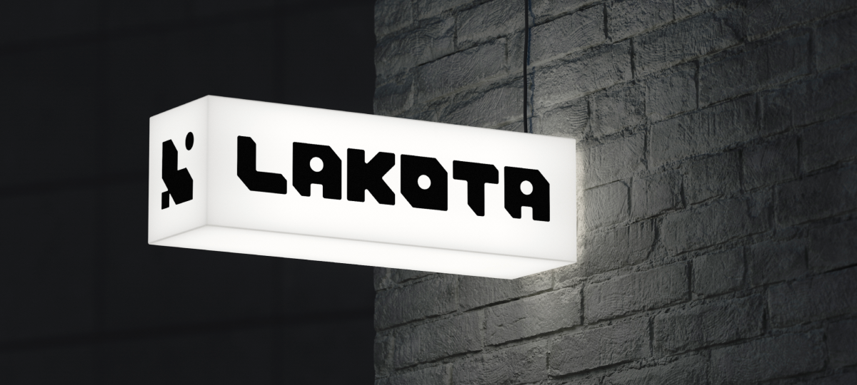
Part of the venue lives in the identity. The primary logo uses shapes from the iconic original logo, constructed alongside geometric forms from the venue’s floor plan, to represent a symbol of culture, a frame for established and emerging artists and a window into the space.
The elements of the venue, the iconic sticky floors, worn walls and stonework are the background for a lot of the textures used in the new brand, while the wordmark was custom built using the same angles and shapes found in the emblem – which work in unison, but are strong enough to work independently too.
Encapsulating the energy of the DJs, artists, performers and dancers that make the venue was crucial, so the primary pattern is built using the venue’s motif. The secondary patterns are constructed from the motif and the feather, giving the brand further flexibility and nodding to the heritage.
The palette combines technology with history, taking aspects from the club lighting whilst also looking back at film photography of the venue. The colour system helps give each space its independence. Lakota club utilises the primary palette, Coroners Court is confidently black and white to compliment the nature of the space and the Gardens uses more vibrant colour combinations to showcase the culture and performances.
The new language and tone of voice centres around the idea of rebels with a cause – a nod to the rebellious past but with a purposeful new attitude underpinned by the venue’s focus on community and heritage. When it came to the type system, the rebrand puts Formula by Pangram Pangram front and centre, flexing between Condensed (loud) and extended (energetic) for contrast, combined with Apercu in the body copy for clarity and accessibility.
“With the Lakota mark and visual identity established for nearly 30 years, changing it was no easy feat. However, Rhombus understood our heritage, history and future vision.
Their past experience running their own events was an added bonus and gave them insight into the sector and its challenges. We are thrilled with our new identity. The motif and wordmark have real versatility and reflect our values; we hope they will see us through the next 30 years.”
Cassara Jackson – Lakota
Check out the full case study here

Shaping brands that move the world forward.
You need to load content from reCAPTCHA to submit the form. Please note that doing so will share data with third-party providers.
More Information