
Hartwell Nutrition: Empowering and informing people on their menopause journey.
Agency
Awards
Branding
Corporate Social Responsibility
Creative
Design
Inclusion & Diversity
Until recently, the menopause was something that was not understood and not talked about in equal measure. But after several celebs spoke about their experiences, it became something of a hot topic, with many ‘experts’ appearing to offer help, like tips for a ‘menopause diet’.
We needed to cut through this noise when we created the Hartwell brand. This was different: its founder Natasha Hartwell was a nutritional therapist who based her work on science and evidence-based results, and made real-world, practical suggestions. This was a real expert who could actually help with the symptoms of menopause, and help people feel like themselves.
Hartwell’s approach was a fantastic differentiator and a great place to start, so we began the process of building the brand around this strong core idea.
As with any branding, whether we’re creating a brand or refreshing one, we need to understand what makes it unique, what makes it tick and what makes other people care.
We started a deep dive into Hartwell’s way of working, including how it does it, what it values and its ambitions. The answers to these big questions would help define the new brand’s values and personality, which would lead us towards how the brand should look and feel.
Hand in hand with that, we also carried out an audit of the busy world Hartwell would be entering, specifically focusing on the menopause diet market. What were existing competitors doing? And was any of it working? We discovered an ocean of word salad, bland imagery and ‘mumsiness’, with very few examples of brands who really knew how to communicate what they were doing.
We held a focus group for people going through menopause, to find out about their general experience and if they had tried menopause diets. It was clear that they felt unseen and unsupported, and were suffering emotionally as well as physically.
Our research showed us that to reach as many people as possible, Hartwell had to be very clear with its messaging, putting its unique science-based approach front and centre. But to connect emotionally, this clarity had to feel personal. As a result, we made the decision that the voice of Hartwell would be Natasha, so it would be all written in first person, and talking directly to the target audience – just as it would be in a one-to-one consultation.
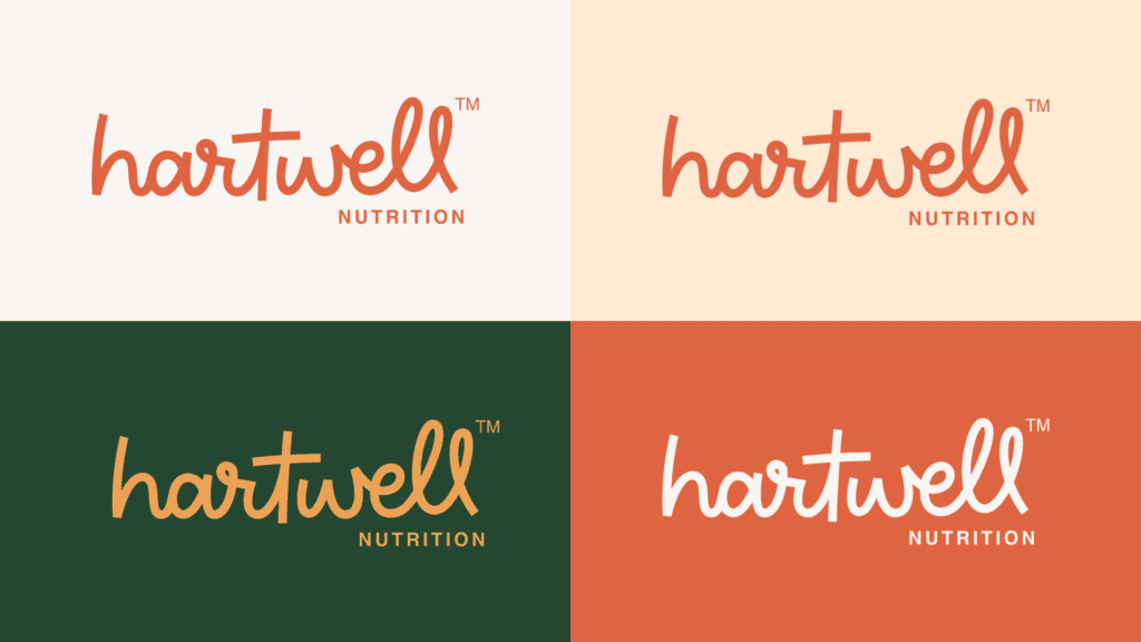
This connected perfectly with the decision to use Natasha’s surname as the name of the brand (her name, her voice) and also helped to complete the circle with the logo, which feels like a signature.
This hand-drawn logotype not only gives the brand a personal, human appeal, it also shows that Natasha is not afraid to sign her name to her work. The brand’s confident because its work is based on evidence – Natasha knows that she can genuinely help her clients.
We created a stacked version of the logo too, primarily to work with social media and smaller spaces, but also with one eye on the future, where ‘Eat well’, ‘Live well’ and other variations could be used.
The logo had been developed as part of a stylescape. These are visual explorations of a brand driven by a core thought, and include everything from brand palettes and imagery through to typefaces. They’re a great way to ensure everything is designed as a family, not in isolation, and to see the entire brand working together.
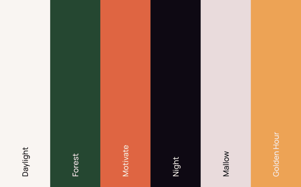
This particular stylescape was based on the idea of empowering clients, factual information, non-judgemental advice and friendly support. Those building blocks led us to a colour palette that was vibrant and earthy, warm and dignified. We purposefully kept away from a palette that was overtly feminine.
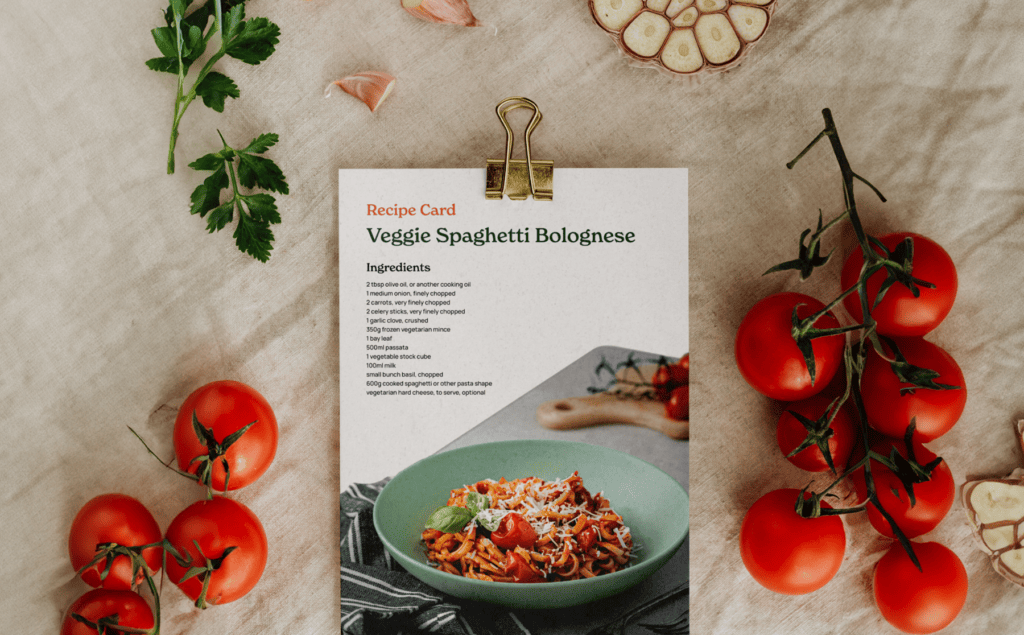
Brand imagery centred on collages which connected the way of life our audience wanted to get back to, with nature. The collage construction gave us the scope to tell infinite stories, while the connection to nature was a common theme throughout the work, coming both from Natasha’s understanding of nutrition, and people’s connection to cycles.
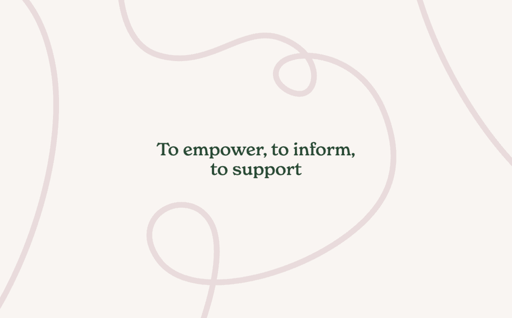
Finally, and developed from the hand-drawn logo, we introduced the squiggle. This graphical motif doesn’t have a defined form, and instead is unique each time it’s used, just like Hartwell’s clients and the advice Natasha gives them. The squiggle device can be used to frame text, create direction or simply bring some visual interest to a design, and helps to bring the whole visual identity together.
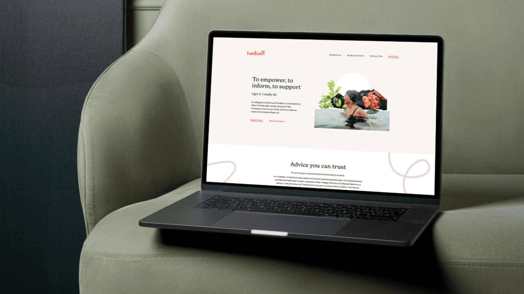
As part of the brand launch, we designed and wrote the Hartwell website. We initially mapped out a number of user journeys so we could design the perfect UX for the busy audience. Our goal was to show enough to prove Hartwell’s credentials, and then invite the audience to take the next step by getting in touch. Copy was therefore kept to a minimum, with the approach being to balance the warm, personal tone with the science that backed it up. This was helped by the brand fonts, the soft and warm New Spirit, paired with the strong and steady Elza Text.
The look of the site mirrored this balance, with a clean look punctuated with lifestyle/nature combination images that brought energy to every page. With minimal copy, the space in the design really helped to deliver a fresh experience, in contrast with nearly every one of Hartwell’s competitors.
The finished brand feels like a modern lifestyle/health brand (not a faddy menopause diet plan), which has the confidence to show what it can do, without having to tell its audience everything it can do.
Find out more about Hartwell Nutrition here
We’re an award-winning creative agency based in Bristol, UK. We partner with curious people to create and develop awesome brands.