Connecting with people – The Art of Visual Nudges
This article was written by Epoch’s Creative Director, Vix Hansard.
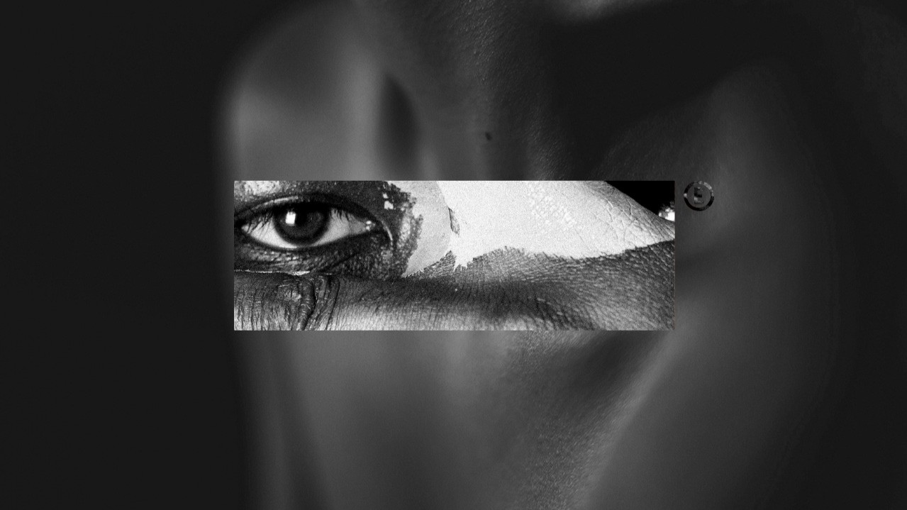
Every single day, the minute we step out of our house, we find ourselves swimming in a sea of visual cues. These cues can guide us, they can teach us, they can resonate with us or in some cases, they can shove us to the margins.
Take a hospital. You’re stressed, you’re scared, and the signs make no sense. Too small, poorly placed, or a muddle of colours. At best, it’s frustrating. At worst, it’s dangerous. Good design can soothe; bad design creates chaos.
Ever noticed raised metal bumps or concrete studs outside storefronts? They’re not decorative, they’re designed to stop homeless people from resting there. They are physical “no entry” sign for the most vulnerable. It’s hostile architecture and it’s basically telling us to f*@k off.
Visuals also reinforce bias. The press often show mugshots for black suspects and family photos for white ones. Before you even read the headline, the picture has framed your judgment. That’s not neutral design; it’s a loaded cue.
But visual design can also include, uplift, and connect.
In classrooms, images and symbols help diverse learners grasp complex ideas. In public transport hubs, clear, multilingual signs empower newcomers to navigate new cities with confidence and joy. A rainbow sticker on a café window is a clear invite to the LGBTQ+ community, saying ‘you’re welcome here’.
And long overdue, fashion is catching on. Inclusive mannequins are popping up in storefronts featuring prosthetic limbs, diverse skin tones, and more varied body shapes. Nike nailed it with their plus-size mannequins standing alongside their slender counterparts in their flagship London store. It’s not a gimmick. It’s visibility. It’s a ‘you matter too.’
Japan has a word for this kind of intentional, behaviour-shaping design:
Shikake (仕掛け), creativity that influences action and emotion without force. Like zigzagging pathways that naturally slow you down, or stairs that play music, SO MUCH more fun than the escalator. Playful, practical, effective.
In summary, we don’t just look at the world, we read it. Constantly. Every shape, symbol, colour, and structure around us is whispering (or shouting) something. The question is: What’s the message? Who gets to connect with it and who’s left out?
Design is power. It can open doors or build barriers. It can be a warm welcome or a cold shoulder. So, let’s design better stories and create visual cues that guide with clarity, include with heart, and resonate. Design speaks. Let’s make sure it says the right thing.
References:
Hostile Architecture by Ben Campkin and Ger Duijzings Designing Disorder: Experiments and Disruptions in the City by Pablo Sendra and Richard Sennett
Shikake: The Japanese Art of Shaping Behavior Through Design by Naohiro Matsumura EJI & Global Strategy Group (2021): Innocent Until Proven Guilty?
Signage and Wayfinding Design by Chris Calori & David Vanden-Eynden

We are Epoch. We are a global brand agency. We build brands that build bonds.
You need to load content from reCAPTCHA to submit the form. Please note that doing so will share data with third-party providers.
More Information