Leading Bristol web design and brand agency, Squarebird, have designed and built a new website for the biggest contractor in the South West, Lancer Scott, to elevate their digital presence and create a tool to better showcase and validate their people and projects.
After outgrowing their existing website, Lancer Scott came to Squarebird seeking a slick new look with a brave approach on both image and text. Lead generation was low on their priority list; instead, their new site was to be a validation tool to represent their people and projects – defining built environments all over the UK.
The finished website had to be clean, incorporate lots of white space, and have a text layout reminiscent of print. The aim was to validate their status and showcase their multidisciplinary offering.
Style tile designs were made, incorporating the initial copywriting concepts into broader visuals. Tone of voice work was also a key consideration for Lancer Scott, and Squarebird took the time to design a style that portrayed their bravery, vision, and ‘get-things-done’ approach. Once this all came together, Squarebird moved on to creating content throughout the site, refining Lancer Scott’s core message and speaking to their professional expertise.
“Our experience working with Squarebird on our new website was fantastic. The team seamlessly collaborated with Lancer Scott, actively listening to our ideas and flexibly incorporating them into the site’s design. They took the time to really understand the values and core of the business and worked with us to develop a tone of voice and website style that portrayed Lancer Scott accurately at a pivotal time for the company. The end result not only exceeded our expectations but also effectively showcases our company’s services, people and ethos. We would highly recommended Squarebird to any company looking to step up their digital offering.” – Nia Hughes, lancer Scott Marketing & Communications.
The final design represents the major contributions of Lancer Scott to the built environment of the South West. It incorporates full-scale photography, a bold use of text, and considered spacing. The structure facilitates inter-selling between their various services; boldly frames their case studies; and fully encompasses the firm’s achievements, CSR activity, and vision.
“As a business rooted in Bristol, there’s a special sense of pride and purpose that comes with collaborating with the city’s iconic industry leaders. Lancer Scott, a name synonymous in the area with pioneering large-scale developments, entrusted us with the challenge of translating their legacy into a vibrant digital presence through a brand-new website.
I’m immensely proud of the incredible collaborative effort between Squarebird and Lancer Scott, shaping this digital vision into a platform that showcases the essence of Lancer Scott’s impactful contributions to our beloved city of Bristol – and beyond.” – Nick Bird, Squarebird Managing Partner.
You can view the full case study here.
We’re excited to share that we will be supporting Caring in Bristol, as part of Studio Every‘s pledge of two weeks to two charities this year.
Caring in Bristol work in imaginative and creative ways with people experiencing or at risk of homelessness, with the public and community partners to bring about lasting change in Bristol and beyond.
We will be working with Caring in Bristol to explore ways that they can expand their corporate partnerships to create even more sustainable income for the future.
We look forward to contributing to the future strategy of this incredible charity, to help prevent homelessness.
The Southwest’s biggest Annual Open Exhibition returns for 170th year
The RWA (Royal West of England Academy) is delighted to announce the return of its renowned Annual Open Exhibition for the 170th year, running for an extended period, from 9 September 2023 to 14 January 2024.
This dynamic and varied exhibition features painting, drawing, printmaking, photography, sculpture, and mixed media submissions and is a showcase of some of the most exciting artists from across the country and beyond.
Amongst this year’s selection panel were invited artist Charmaine Watkins; President of the RWA Fiona Robinson; artist and Rabley Gallery director Meryl Ainslie, and Academicians Dallas Collins VPRWA, Lucy Austin RWA, Angel Lizon RWA and Karl Singporewala RWA. They assessed every artwork on its own merits, anonymously, before being able to bring down the 4000+ entries to just over 400. No mean task when the standard of work submitted was so high!
Alison Bevan, RWA Director, says: “This year above all others, we have been quite overwhelmed by the variety and standard of artworks submitted by every kind of artist, from long-established veterans to fresh new talent just finding its artistic voice. No matter what kind of art you enjoy, we can promise every visitor will find lots to love!”
The Annual Open reflects the RWA’s ongoing commitment to championing world-class art in the region and creating opportunities for new and emerging talent. It includes in excess of £10,000 in prize money, including the £5000 Academy Prize and a £4000 Other Art Prize.
All the original artwork on display is for sale not only in the galleries, but also online, with prices starting at less than you’d pay for a furniture-shop print. Buying art helps support both the artists and the RWA, which is a completely independent charity (1070163) delivering life-enhancing creative opportunities for young people and adults across Bristol.
Tickets to the Annual Open Exhibtion are £8.90 (concessions available), or for just £15 you can buy an RWA Art Pass, which allows unlimited access to all our ticketed exhibitions as many times as you like for a whole year. https://www.rwa.org.uk
We often get asked what is “managed web hosting”, and why should a client host their website with us. When we build a website we always ensure it is built to modern coding standards, the core code is quick and efficient and there is no bloat or unnecessary plugins or code blocks that the website doesn’t need.
To ensure clients websites are hosted in the right way we recommend clients use our managed web hosting service for a variety of reasons.
We say to clients let us worry about your website so you can focus on your business, with our years of experience we can take care of the technical jargon and leave clients to get on with generating business. One of our business aims is to form long term business relationships and we have succeeded on this year after year, many of our clients have been with us since we started back in 2008 and we continue to this day, we are trusted to host their important websites that generate leads, sales and interest day in day out, 24,7,365.
But I can get hosting for £4.99 a month!? Yes you can get your website hosted for less than an expensive coffee per month, but you will not have any support, you will not have any backups, no updates, basic security, the website will be shared with thousands of other customers and you won’t get our great customer service and all the extras that come with that.
If you would like to find out more about our managed web hosting service, our web design service or for anything else please do not hesitate to contact us.
Read the full article on our website https://www.eckhomedia.co.uk/what-is-managed-web-hosting/
On August 1st, Park Street based agency Dirty Design unveiled their rebrand. Timed to coincide with the 20th anniversary of the company’s founding by Charlotte Hockey-Berry in 2003, the new look is a huge development from the previous creampuff logo and signature Pantone 806 pink.
After a tumultuous few years which saw the unexpected loss of their founder, the Dirty Design team felt it was time to take stock and find a way to mark the progression of the company and acknowledge this new chapter, while still paying tribute to their roots.
The fresh identity expands on the existing colour palette with the addition of primary and secondary shades, which are paired with a bespoke font and set of unique and fun illustrations. The new Dirty Design logo is said to “reflect who we are as a company today; it’s personal, flexible and friendly”.
“After many years of putting our own visual identity on hold, we finally decided to practise what we preach and give ourselves a long overdue refresh. We pride ourselves on being a friendly and approachable agency, and our aim was to show that in our new look. It’s been great fun working on this with the other designers and collaborating with the whole team, to develop a style that suits who we are now and the company that Charlotte started 20 years ago.”
– Steve Harris, Head of Design
The rebrand marks an exciting time for the agency, who this year are expanding their work within the charity sector, including producing all design assets for this years YoungMinds #HelloYellow campaign, supporting national children’s charity Barnardo’s in design for various campaigns, and creating a fresh look and feel for the Motability Foundation’s direct mailer pack.
“I’m so proud of the whole team. Our new Dirty look is simply fabulous, and although light years away from the original it still portrays what we’re all about; a creative and fun bunch – and of course it’s still very pink! I’m so excited to see what the future holds and for us to continue to do what we do best, produce stunning designs and provide outstanding account management – to work with and support our incredible clients.”
– Lucia Boccacci, Managing Director
You can see the full rebrand in action at Dirty Design’s website; dirtydesign.co.uk. You can also watch their 2023 showreel below:
Since technology has changed the face of web design over the past ten years, conventional design elements are no longer relevant. The newest digital design trends for websites are what users expect to see when they visit a website since they want to see the newest features.
Since roughly 2010, smartphones have been the de facto mobile standard, with current estimates placing the ownership of smartphones at 86.11 percent of the global population. By 2023, smartphones will account for more than half of all web traffic worldwide. As a result, web design must be optimised for mobile use, which may be done by using one of the innumerable plugins available for WordPress and other content management systems (CMS). Website owners can also contact a reputed London design firm, which will integrate mobile optimisation as standard.
Web users don’t want to wait around to use slow platforms because they are used to quick digital offerings. A website or page should load in 3 seconds or fewer because, on average, users leave websites after 1-2 seconds. Website owners should perform a little “spring cleaning” each month to make sure everything is functioning properly. Once more, this is something that a reputable London digital design agency will handle.
Chatbots have been gaining traction over the last few years, and 2023 shows no signs of slowing them down. With machine learning (ML) and artificial intelligence (AI) becoming more intuitive, chatbots will become an industry expectation for dealing with personalised experiences and basic customer queries. You’ll find many chatbot plugins on web builders, but using one of these may make your website feel mundane. Therefore, you should have a team of experts from a London digital agency create a unique looking chatbot from scratch.
Although virtual reality (VR) is not a novel technological advancement, it has grown increasingly accessible and accepted by the general public, particularly in web design. You can take a virtual tour of a house before booking your stay if you’ve used Airbnb or another accommodation booking site in the past several years. This is one of the more straightforward VR website examples, but more use cases will start to appear in 2023.
Web users want to feel engaged when visiting websites in 2023, which is why there are more interactive elements than ever before. For example, if you use a simple cryptocurrency portfolio tracker, you’ll most likely find profit calculators, conversion tools, liquidity analytics and a host of other useful tools. As well as useful tools, you can explore elements of interactive marketing including contests, calculators, fun quizzes, and surveys. If you outsource your marketing, these are all elements a digital creative agency London can add to a website.
This article only scratches the surface when it comes to 2023 digital web design trends, but it’s safe to say that it’s all focused on improving user experiences and tailoring platforms around mobile usage. If website owners entrust an experienced digital agency London, all of these trending features will be integrated uniquely.
2023 has turned into another milestone year for ADLIB.
To recap:
In 2019 ADLIB became a certified B Corp, with a score of 82.3.
In 2020 ADLIB became 100% employee-owned.
In 2021 ADLIB launched the MotherBoard Movement.
In 2022 ADLIB broke all of its records.
In 2023 ADLIB recertified as a B Corp, with a score of 130.3, invested into HeyFlow and proudly refreshed our brand to reflect who we truly are today.
We’ve said for a long time that ADLIB is so much more than a recruitment agency.
ADLIB is a true talent partner, we go beyond candidate acquisition, we’ve created business solutions that tackle inclusivity, health, well-being and retention head-on.
We care authentically about the planet. We track and publicly report on our footprint, working with suppliers to support the regional business community.
All of which needed translating into our refreshed brand. From the look and feel, we opted for sustainable risograph techniques that reflect the business to perfection, whilst technically ensuring lean UX, negative space and page weights were priorities throughout our website build.
With our propositions growing at pace, geographical reach expanding into the US and influence happening at the government level, there has never been a better time to join ADLIB and make a difference.
Redeemer City to City is an international non-profit organisation with a heart for urban renewal – seeking to recruit, train and resource leaders to start new churches and strengthen existing ones.
Studio Floc were invited to create the identity and event collateral for Redeemer’s ‘Hub Weekend’; a high-profile fundraising weekend based in New York City.
Campaign idea
Taking place at the 1 Hotel Brooklyn Bridge, the driving idea behind the event’s campaign was one of connection, with delegates travelling from all over the world to join for the weekend. Studio Floc used the idea of connecting people and creating paths to new places as the core concept. This was rolled out across an extensive design suite of event collateral which was used in the lead up and throughout the weekend.
Never ending connection
At the heart of the event’s design concept was a vast illustration, created in-house to capture the breadth and vitality of life in New York City, the home of Redeemer City to City. Subtle details in the cityscape worked to honour other global partner cities. The mural, formed from continuous line drawings, was then, paired with type and colour, used both in sections and as a whole piece across the event assets.
Colour and typography
Supporting the illustration-heavy campaign was a subtle, yet extensive typographic system that was driven by the elegant serif, Chronicle Text (Hoefler & Co). Alongside the typography, a stripped back colour palette of navy and alabaster were used as the foundation for every design.
At the event
As part of the event, Studio Floc recreated the core illustration and hand drew a 17ft x 9ft mural in the atrium of the 1 Hotel Brooklyn Bridge, as a visual centrepiece to the event. Other designed collateral at the event included; table numbers, name cards, place cards, menus, bespoke fabric napkins, tote bags, information booklets and cards, signage, wayfinding, video creation and much more.
The Hub Weekend was a great success in raising money for the continuation of Redeemer’s work in cities worldwide. Studio Floc are already working on the event design for the next Hub Weekend in 2024 and look forward to further collaboration with Redeemer City to City in the future.
“Studio Floc are my go-to designers for event collateral. They are creative, sensitive, timely, very fun to work with, and brilliant at bringing my often-incomplete vision to a finished, effective, beautifully designed product. I’ve already recommended them to others and will continue to do so.”
Susan Thorson
Manager, Communications
Redeemer City to City
In a mere two years, I have held my own in an industry that I intermittently despise, all while nurturing my unwavering passion for design. Here are my insights on why these seemingly contradictory paths can converge harmoniously. This my addict’s story of the first two years in design and how I feel about the industry now I’ve seen it for what it really is, after only breaking into it at the age of 35.
Six years ago, I found myself hunched within the grimy confines of a crack house, waiting my turn to hack despair through a glass cylinder. The flickering lights of passing cars accentuated my swollen, bloated face. How did I end up there? And how did this utterly insane journey lead me to a life dedicated to design, devoid of addiction?

Fate, coupled with unwavering determination, slung me into an industry where previous creative encouragement was scarce. Neither school nor home fostered my fiercely creative spirit. Instead, it spilled chaotically throughout my youth, manifesting as mental indulgence and drunken scribbles on my bedroom walls. My life plummeted through multiple rock bottoms until I reached a precipice where I had to choose between death and taking control of my destiny. On the 27th of December, 2016, I made the decision to change my world.
The voyage ahead was wobbly as hell as I climbed aboard my makeshift raft of sobriety. My initial endeavours faltered, leaving me back on the same lonely island I had been stranded on for so many years. I had underestimated the enormity of the challenge I had undertaken. After another year of stumbling aimlessly, seeking solace in sporadic chugs of cocaine cider inertia, I reached my breaking point.
In a strangely desparate moment of internal creative intervention, I scraped together whatever funds I had and bought a cheap DSLR camera. Those funds should have been used for rent, but I am eternally grateful they weren’t. It was at this pivotal moment that my desolate landscape transformed from a blizzard into a serene lake. Darkness gave way to light, almost instantly, like a camera shutter on a blinding summer day. I had reached a point where I had nothing to lose (not that I had much before), and my mind, once clouded by substance abuse, became malleable and receptive to self-belief.
Lost and self-destructive, lacking paternal guidance and faith, I had frequently misused my rudder, burning it as firewood instead of allowing it to steer me towards my intended destination. But now, I had found my calling from within. Months passed, and my adoration for creative freedom blossomed. I taught myself Photoshop, which propelled me towards a design degree in Bristol, seemingly by chance, all while running across the Somerset levels with my camera in tow — it was a truly wonderful time in my existence.
Im going to be honest, my journey has been partially fuelled by spite towards the pretentiousness and banality that permeate marketing and advertising agencies and the art world as a whole — the very places that appear to be the epicentre of cool and the ultimate destination for most designers. Through my varied experiences — some positive, some mediocre, and some downright horrendous — I can confidently proclaim that these agencies are destined for obsolescence, and I am here for it.
To elaborate, these establishments squander valuable resources, fail to adapt to new leadership, undervalue their own talent, lack genuine connections, and suffocate creativity with excessive micro-management. Designers within such agencies often find themselves stagnating, rarely exploring new avenues of design thinking beyond the confines of their workplace. This stagnation is a massive problem, as designers and creatives become consumed by busyness and chaos and at the end of the long workday, they fling open the office doors with glee and proceed to the pub, where they aim to obliterate the last remaining brain cells of the day in a flurry of ice-cold frothy pints, and i don’t blame them. All of this is done in an attempt to ease the stress caused by the mind-numbing work they had to endure.
The real stinger though, all of these issues could have been avoided if the head honchos had taken the initiative to establish well-defined processes. With such processes in place, high-quality work could be delivered on time and with minimal stress whilst simultaneously reissuing creative licence back to these now fatigued artists and creators.
I don’t revel in the potential loss of jobs as these agencies and studios evaporate. Rather, I firmly believe that the truly exceptional individuals will always thrive, and it is in this context that agencies seem unsustainable. As we venture into a future that values quality over quantity, our focus shifts towards forging connections through the craftsmanship of dedicated designers operating on a smaller scale. Just look at Studio Sutherland, a two-person studio that recently picked up three pencils from D&AD. Whether you agree or not, such meaningless achievements do seem to indicate a shifting landscape.
Throughout my design journey, I have encountered disheartening aspects within the marketing and advertising industry. Despite their outward facade, the inner workings and top-tier decision-makers are plagued by constant changes of mind, shifting goalposts, and a seemingly odd pleasure derived from endless revisions. The attitude of “it’s your job, so do it” resonates deeply within these agencies and the corporations they serve, gradually eroding one’s passion for the very thing that brings liberation — an insidious paradox, a catch 1.618 if you will.
It’s quite remarkable how in some agencies, it feels like you have numerous bosses all chiming in with solutions to design problems. However, while it’s true that there can be multiple creative routes to solving these issues, the process of reaching the desired outcome should be clear and defined, rather than a barrage of “insights” coming over your shoulder from anyone and everyone in the office. I’m not suggesting that good ideas only come from creatives; quite the contrary, I believe that everyone on the planet is inherently creative and has unique ways of solving problems. However, once a clear direction has emerged, it should be you, as the creative professional, who guides the process, rather than the very people who hired you to be creative. This approach is undermining and counterintuitive, yet it seems to be prevalent in most agencies I’ve worked for. It’s no wonder then that the irony lies in the fact that while graphic communication on the surface may appear polished, the complete lack thereof behind the scenes leaves the final projects hanging at 75% of their true potential. This is a disheartening reality, not only for us designers but, more importantly, for the clients we serve.
There also exists a frustrating hypocrisy within agencies that proclaim their commitment to equality and fostering positive change while subtly exuding an invisible mist of pressure to work late and produce. As someone who has grafted on construction sites and endured some frankly awful office jobs, the enchantment of design remains ever-present in my mind. I still perceive myself as a tradesman, alongside many of my peers, constructing bold and captivating designs that provide joy while prioritising functionality and effective communication.
In my design journey, I have experienced some lovely moments within advertising agencies. However, as time went on, the glossy veneer began to fade, revealing a different reality that led me to choose a different path. While I cherish the connections I have forged and the talented individuals I have worked alongside, it all ultimately circles back to the same underlying issue — the pervasive air of arrogance and the relentless pressure to proclaim one’s greatness, which ironically undermines the very essence of creativity.
The enchantment of marketing agencies and design studios, with their reputation for being at the forefront of trends and innovation, is marred by a sense of exclusivity and cliquishness. This prevailing attitude breeds an atmosphere of self-congratulation, where being “cool” takes precedence over the authentic pursuit of creativity and genuine connection.
In reality, the pull of working on FMCG campaigns or catering to worldwide brands loses its lustre. The intrinsic appeal that initially captivated me and many others gives way to a sense of disillusionment. The truth is that the coolness factor is a façade, obscuring the reality of the creative process and the individuals who steer the ship.
I have come to the realisation that true creativity thrives beyond the boundaries of what is considered “cool” or popular. It resides in the realm of authenticity, originality, and the courage to challenge the status quo. As I part ways with the confines of marketing agencies and their superficial sheen, I embrace a different approach — one that is rooted in genuine connection, meaningful impact, and the pursuit of artistic integrity.
In this new chapter of my journey, I am guided by the knowledge that the path to true fulfilment in design lies not in the corridors of hip Bristol marketing agencies. Instead, it rests in forging genuine connections, embracing humility, and being true to oneself. So, while marketing agencies and their cool cliques continue to boast their self-proclaimed importance, I find solace in seeking a different kind of cool — the coolness that stems from genuine passion, creative freedom, and the courage to follow my own path.
Furthermore, within many agencies, a lot of individuals either forget their origins or emerge directly from the sheltered cocoon of university, where inflated self-importance festers. The primary beneficiaries of this delusion are the business-minded individuals at the top. Stripped of the embellishments, they are simply men and women driven by self-interest, despite their attempts to convince us all otherwise.
To make it clear — I bear no grudges or neither have any ill will toward this reality. In fact, I strive to secure a prosperous livelihood, for myself and for my loved ones. However, the fundamental distinction lies in the fact that my success will come at my own expense, not at the cost of others.
Design should embody a spirit of genuine collaboration, fostering an environment where creativity flourishes, ideas are nurtured, and true innovation takes root. The future of design lies in the hands of those who value craftsmanship, meaningful connections, and the pursuit of excellence over profit.
As I reflect upon my transformative journey from addiction to design, I am fuelled by an unwavering determination to forge my own way, unburdened by the constraints of pretentious marketing agencies and the fading relevance of traditional advertising. The industry is shifting, embracing a future where personal connections, authentic relationships, and the pursuit of artistic integrity take precedence over corporate agendas.
I am but a humble tradesman, armed with the tools of creativity and driven by the desire to build a world where design transcends the superficial and leaves a lasting impact. So, let the factories churn out their cookie-cutter campaigns, for I am resolved in my quest of craftsmanship, pure expression, and the freedom to shape a design landscape that resonates with the very core of my being.
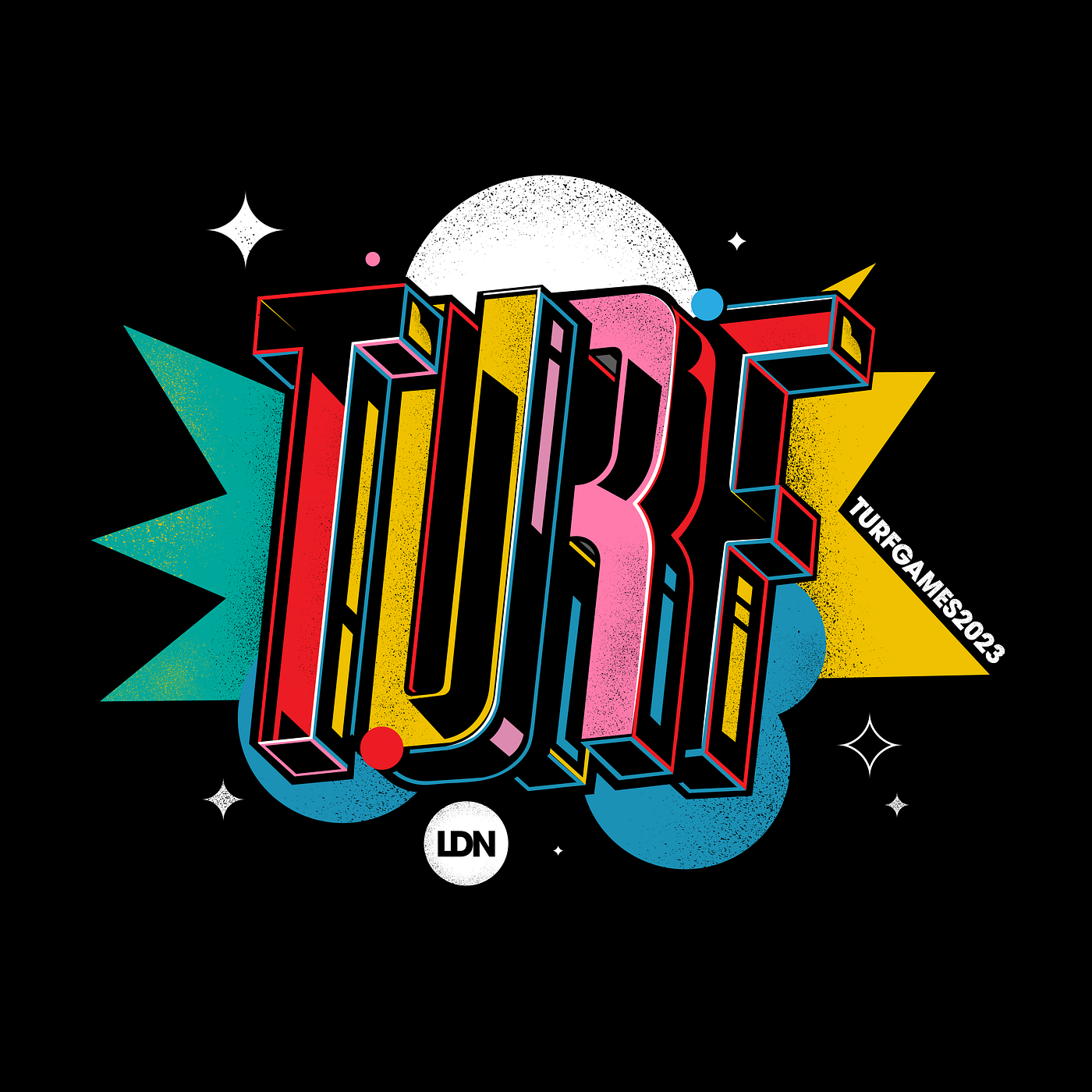 My work for Turf Games 2023 — Things happen when you keep turning up for yourself.
Unfold are a design and development agency based in the heart of Bristol. We work with the founders, marketing or technical leads of SMEs, startups and innovative corporates to help them increase revenue and profitability or save them time (or ideally both!).
Over the past five years Unfold has seen a lot of change. We’ve grown as a team, embraced new challenges and opportunities, and welcomed many new clients along the way.
We felt it was time to take a moment to properly reflect on our journey and how we’ve evolved as a business; to understand who we are, why we love doing what we do and how we make a difference to our clients’ businesses.
Today, we are thrilled to share our newly revamped website with you, showcasing our full range of services, the impact we create for our clients, and ultimately the Unfold way of doing.
Unfold started five years ago with the objective of building beautiful, user-centred websites and web apps, which provide exceptional experiences for end-customers and fantastic results for businesses. This mission remains at the heart of what we do, but has evolved significantly as we’ve expanded our expertise, knowledge, team and client base.
As a result our service offering has grown to encompass five key areas:
Our method for analysing and refining concepts, using the latest insights and trends, will show you where the big opportunities lie, reduce risk and produce real results.
Together we define, develop and deliver different design solutions by putting the customers’ needs at the centre of your website.
Our expert team of engineers are experts in dealing with complex requirements and creating intelligent, flexible solutions to match.
We’re serious about growing your business by providing the CRO tools you need to engage and convert higher-quality leads.
We don’t shy away from taking over existing projects and fixing difficult bugs, in fact it has become a core speciality of our team.
Day to day that means we work with the founders, marketing or technical leads of SMEs, startups and innovative corporates to help them increase revenue and profitability or save them time (or ideally both!).
At Unfold we take a user-centred approach to our clients’ work. Meaning that we seek to put the end-customer at the heart of everything we do, from design, right through to development. This approach enables us to produce outstanding and technically complex websites and platforms that have a real impact for customers.
We push boundaries and challenge thinking to transform our clients’ vision into reality. We’re focused on building close, transparent partnerships that drive innovation and achieve shared goals.
We’d love to hear what you think of the new site! Please feel free to get in touch and share your thoughts with us.
Do you have a project in mind or would you like some expert advice? Perhaps you know a friend or colleague that might benefit from working with us? If so get in touch and see how we can help you achieve your goals.
We’re also in the process of expanding our team. If you’re interested in working with us we’d love to hear from you!
And finally, stay updated on the latest news events and valuable resources from our team by following us on LinkedIn and Instagram.
You need to load content from reCAPTCHA to submit the form. Please note that doing so will share data with third-party providers.
More Information