Following a competitive pitch, SIM7 has been selected by the British Council as a key agency on its framework to supply services over the coming years.
SIM7 will work in partnership with the British Council’s international marketing teams, creating strategic messaging, copywriting and content to drive the organisation’s global initiatives.
This work will involve developing digital and OOH campaigns, creating assets across all channels, and supporting the British Council’s extensive international outreach.
SIM7 will join a handful of leading UK agencies selected to support the British Council’s strategic goals.
About the British Council
The British Council is the United Kingdom’s international organisation for cultural relations and educational opportunities. Operating in over 100 countries worldwide, the British Council builds connections, understanding, and trust between people in the UK and other countries through arts and culture, education, and the English language, reaching millions of people annually.
Says SIM7’s Simeon de la Torre, “As an agency with extensive international experience, this is a perfect partnership for us. We’re excited about working on some of the most significant cultural and educational initiatives globally, and empowering the British Council by delivering the effective messaging that we’re known for.
“Our capabilities closely align with the British Council’s mission to promote and uphold the English language worldwide. Our expertise will enhance the British Council’s efforts to make English accessible to learners across diverse cultures and backgrounds. Through innovative campaign strategies and engaging content, we’ll support the British Council’s role as a global leader in English language teaching and assessment.
“We’re looking forward to connecting with the international communities that the British Council fosters and supports.”
“The British Council is one of the best names in the industry for cultural exchange and educational opportunity, and the SIM7 team are all keen to help them deliver their mission of building connections between the UK and the rest of the world.”
SIM7 is an award-winning creative agency that uses language to empower design. We drive growth by creating brands, campaigns and strategy – for marketing teams around the world. Our experience in international education extends to universities, leadership organisations, business schools and more. For more information, contact Simeon de la Torre [email protected]
This article has previously appeared on the ADLIB Blog.
In this Women In Design feature, we caught up with Vee Rogacheva, Head of Product Design at Go.Compare which is part of Future Plc.
Vee emphasizes the importance of empathy, accessibility, and diversity in her work. She also highlights the unique contributions women bring to design, the need for mentorship, and the importance of owning your career to unlock opportunities for growth and success.
Could you please introduce yourself as well as your background?
Hi, I’m Vee Rogacheva, and I’m the Head of Product Design at Go.Compare which is part of Future Plc. I lead a team focused on building experiences that help millions of people across the UK save money.
Go.Compare is a regulated business and the design team is responsible for helping users achieve their financial goals. Our solutions are informed by deep understanding of users, grounded in research, and from the synergy between cross-functional teams and experts.
Before joining Go.Compare, I worked in the Education Technology sector, where I gained valuable insights into creating impactful experiences for users from different parts of the world. Prior to that, I was a user-centered design consultant, working with clients such as The Samaritans, Drinkaware, and Guide Dogs. These experiences helped me develop a deep appreciation for designing with empathy and purpose, focusing on accessibility and the diverse needs of different user groups.
At Go.Compare, I’m passionate about creating solutions that have a real impact on people’s lives, while nurturing a team culture that values creativity, inclusivity, and continuous learning.
In your opinion, what unique perspectives or contributions do you think women bring to the design industry?
As women we often have to challenge stereotypes and bring diversity into design thinking itself. By being in leadership positions, we can also influence the way products are shaped—ensuring that design is not just for a single type of user, but for a wide array of individuals with different backgrounds, needs, and expectations. This results in products that resonate more deeply with a broader audience, fostering inclusivity.
Women are also in a unique position as they, willingly or not, serve as role models for other women in any industry and design is no different. That means that female designers are often expected to not only perform at the highest level but also represent and pave the way for others. This dual role can bring added pressure and can be very tiring, no wonder so many women quit.
I’m passionate about unlocking opportunities in design for other women, which is why I got involved in co-organizing Ladies that UX Bristol, a community that supports women and under-represented genders on their design journey. We get together once a month and it’s a great opportunity to network and learn.
In an attempt to capture some of the Wisdom you’ve gained as a woman in the design sector so far, what is the 1 thing that you’d like to pass on to your peers as well as the future generation of talent within your sector?
I can’t emphasise enough the importance of owning your career. It’s crucial to proactively seek out opportunities for growth. A great example of is the story of my team member, Monica. She previously worked in another team here at Future and reached out to me, expressing her interest in design and her desire to transition from marketing to a UX role. Her initiative not only showcased her passion but also opened the door for her to explore new possibilities in her career. She has been a great addition to the team, bringing in all those skills she already had and quickly gaining new ones as she is now taking on bigger and bigger projects.
If anyone reading this is thinking about reaching out, I can’t promise you a job but I’ll always find time for people looking to break into design or wanting to become better designers. It’s essential to reach out, seek advice, and gather insights from those who can help you navigate your journey. Connecting with peers and mentors helps build your confidence and unlocks valuable opportunities to craft a fulfilling career in design.
If you’re inspired by the stories and wisdom shared in our ‘Women In Design’ series and would like to contribute your own experiences, we’d love to hear from you. Creatives at all levels, please email us and your story could be the next we feature.
Gold: Best Expression of a Brand on Social Media Channels
Bronze: Best Use of Copy Style or Tone of Voice
The Transform Awards celebrate excellence in brand strategy and execution across Europe. saintnicks’ work with Ascot Racecourse brought to life the brand’s creative platform, Elegance at Play – combining social-first storytelling, a distinct tone of voice, and thumb-stopping, jaw-dropping content that captured the attention of both loyal racegoers and new audiences alike.
Speaking on the win, Fraser Bradshaw, CEO at saintnicks, said:
“We set out to create a truly ownable brand voice and world-class social content that matched Ascot’s stature as an iconic British institution. To see that work recognised is a brilliant moment for the team and a testament to the power of brave, collaborative thinking.”
If you’re after a creative brand agency that will go the extra mile for your brand, drop saintnicks a line. You can find out more about their brand, campaigns, content and digital expertise here, or reach out to their Client Services Director, Francois d’Espagnac.
This article has previously appeared on the ADLIB Blog.
We caught up with Samantha Merrett, Senior Accessibility Specialist at the Ministry of Justice (MoJ).
She shares her journey into accessibility, the role inclusion plays in her work, and how small design changes can make a big impact. Samantha also offers practical advice for designers looking to create more accessible experiences and highlights key resources to stay ahead in inclusive design.
The purpose of the series ‘Design For All’ is to demonstrate the importance of inclusivity in design and share knowledge on how to create more inclusive and accessible design experiences.
Hi there, my name is Samantha Merrett, and I am a Senior Accessibility Specialist working at the Ministry of Justice (MoJ). I have been at the MoJ for nearly a year now and I have worked in the Civil Service for more than 8 years.
Before joining the team at the MoJ, I was Accessibility Lead at the Food Standards Agency and GOV.UK Managing Editor at the Ministry of Defence (MoD). Whilst working at the MoD, I managed a small team of editors editing and publishing content on GOV.UK. The introduction of the Public Sector Bodies Accessibility Regulations (PSBAR) in 2018 required us to upskill quickly to understand how to ensure our content was accessible.
However, there was one specific moment that made me realise that accessibility was the career for me! I spent time working on the Armed Forces Pension forms to try and make them more user-friendly and accessible. We ran focus groups with users to understand the problem areas and then worked to fix the issues. We then presented the improved forms back to the focus group and the attendees was so thankful that they could now independently claim for their pension.
It was that moment for me that made me realise how important accessibility is. I might have only helped one person in that room but that was enough for me! What we do matters and it can have a profound impact on the users that we serve.
For me accessibility and inclusion go hand in hand, if we make things more accessible, they should be more inclusive for all. In my current role, we encourage all colleagues to consider accessibility from the start, whether you work in design creating digital products or write emails and documents, accessibility should be front and centre.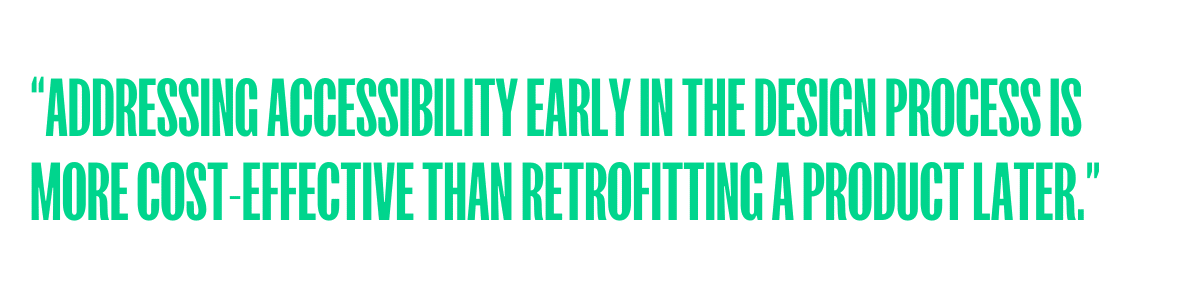
Adding accessibility in at the beginning makes it much easier to ensure the final product or design is accessible. Addressing accessibility early in the design process is more cost-effective than retrofitting a product later.
Designing for accessibility can lead to innovative solutions that benefit all users. For example, adding captions to videos benefits not only those with hearing impairments but also for users in noisy environments.
Fundamentally, accessible design can enhance usability for everyone not just those with disabilities. This promotes equal access and prevents exclusion.
Promoting inclusive design is a core aspect of my work. I strive to ensure that the information and tools I provide are accessible to everyone. This involves using clear and concise language, offering alternative text for images and ensuring all interactive elements are keyboard accessible. I also never stop learning; I continuously keep up to date with standards and best practices to provide the most relevant and effective support to my colleagues.
One of the main challenges I face is designing visually engaging content whilst making it accessible. I like to ensure that complex topics are explained in an understandable way. Infographics and visuals are often avoided when it comes to accessibility, but this overlooks the benefit they can provide for those who are visual learners or neurodivergent. If graphics are designed using the appropriate colour contrast, accessible font types and use clear and consistent layouts they should be accessible to users. Of course, to make the content accessible you must also provide an appropriate, equivalent text version of the content so users can read through the text if they prefer.
First, you need to understand your users. Take the time to learn about the different ways people with disabilities interact with digital products. This might include using screen readers, keyboard navigation or using voice commands. Talk to people with access needs about their experiences, specifically in the area that you are working in. It is important to truly understand your users and acknowledge that not everyone’s experience is the same. We are all individuals with our own needs and preferences, and we all deserve to have these needs considered.
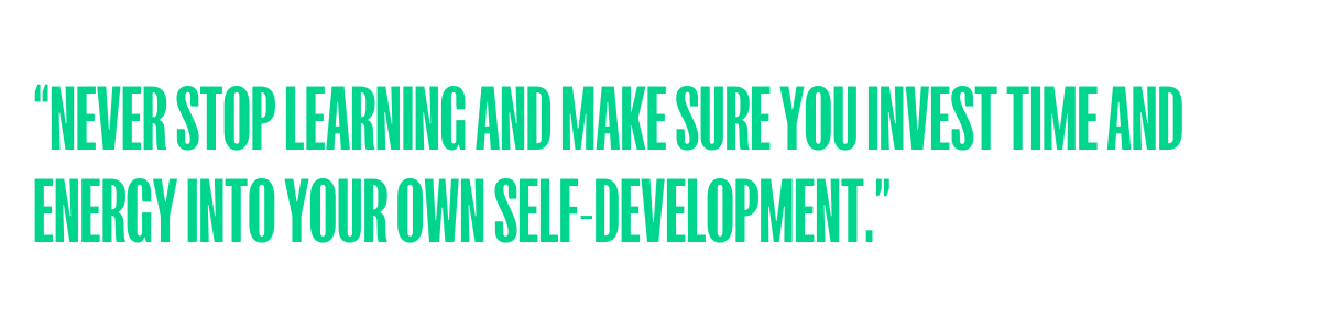 Never stop learning and make sure you invest time and energy into your own self-development. Continuous learning helps you to stay up to date with the latest news, technologies and best practices making them more effective in your role. Accessibility is an ever-evolving topic, and it can sometimes feel difficult to keep on top of all the latest trends. If you can prioritise your own development, you not only advance your career but also help to contribute to the overall success and adaptability of your team and organisation.
There are so many amazing resources that I could share but these are a couple that I refer to time and time again.
Accessible Design Resources
Following the insightful recommendations from our Design For All participants, we’ve curated an extensive collection of tools, guides, articles, books, blogs, and videos. This resource is specifically designed to support accessibility and inclusion specialists at every stage of their journey.
View Accessible Design Resources
JavaScript plays a key role in modern web development, powering interactive features like animated buttons, dynamic text, and responsive forms. With the rise of JavaScript libraries, building complex and engaging websites has become easier than ever. In fact, an estimated 99% of all websites now use JavaScript in some way. But here’s the problem: AI-powered search bots don’t always process JavaScript properly. This means if your website relies heavily on JavaScript to display key content, there’s a risk that AI crawlers won’t index it correctly. And if AI-powered search engines can’t read your content, it becomes much harder for users to find you in AI-generated search results.
This article has previously appeared on the ADLIB Blog.
I’m a brand identity designer and founder of Design Bench Studio, a creative practice based in South London. My background is in graphic design. I currently focus on working with local communities, tech-for-good entrepreneurs, and social change businesses.
We help clients define their voice and visual identity and work with the them at the very start of their ventures or business ideas. The “bench” in the studio name reflects the horizontal and open design approach, which has helped us build meaningful partnerships and create work that is purpose-first. Our studio values are designed to mirror the values of the people we work with.
Anyone working in design will have unique contributions to bring into our industry. It would be hard to define this according to gender alone without looking into cultural norms, access to education and resources. As in many industries where there is still a gender pay gap we will need to address a few issues before we can quantify fair contributions.

In terms of perspective, women will certainly have their lived experience lens to add to the industry, and this will be the same for people who identify as women and non-binary people. From my experience with working with all-women teams in design I have seen a more intentional focus on inclusivity and empathy across creative outputs as well as in the ways of working and workplace culture. I have felt more supported and influenced to grow mindfully in all-female teams.
It’s also worth asking—what unique perspectives do men bring? That’s not a question I hear answered a lot by men in design.
Start before you feel ready. Waiting for the “perfect” moment can hold you back, and the truth is, you’ll learn more by doing—even if it’s messy. Mistakes are inevitable, but they’re also where the best lessons happen. You’ll grow more from an imperfect starting point, as long as you adapt and learn along the way, correcting and owning your mistakes. A little embarrassment goes a long way.
The biggest challenge has been tackling my own self-doubt and limiting beliefs—questions like, “Do I deserve to be here?” or “Have I done enough to prove my worth?”. This is, in part, the female experience overall in the work environment, I feel.
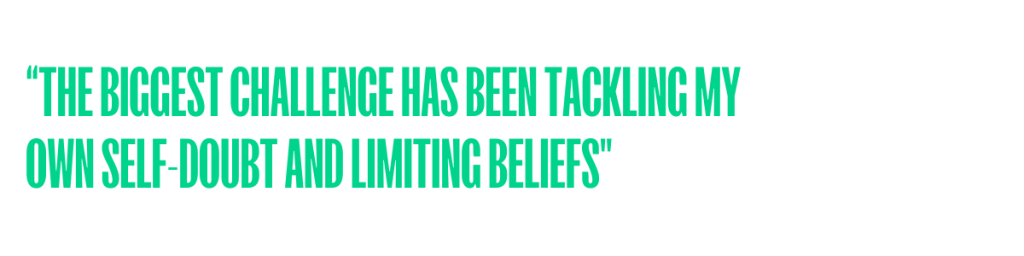
I have (somewhat) overcome this with support form a coach and by learning to ask for what I really want from a workplace. Building confidence is hard and I believe we all need some external help and support from mentors and peers to face those challenges.
Role models are hugely important – they show us what’s possible and that success can take many forms. Seeing women lead authentically in the creative industry has been so inspiring and was a big reason for starting the ffsc.club. The club is structured around soft networking events and story-sharing for women in the creative industries.
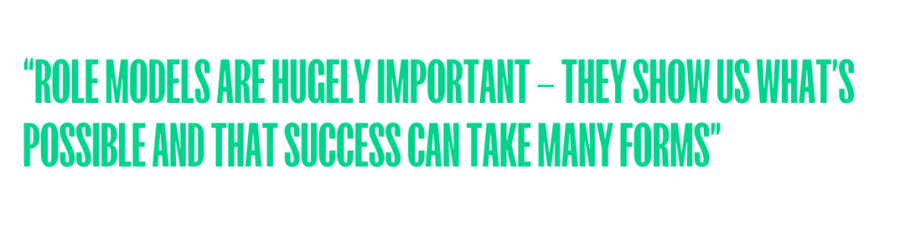
Role models can help us draw strength from their stories in order to carve out your own path.
Ana is the founder behind Female Founders Sharing Circle, an open-source directory and initiative designed for knowledge exchange between female founders in the creative industries and beyond.
Their next ‘soft networking’ event is scheduled for 20th of March in the CIC space at the Bussey Building, Peckham for a 7PM start.
Check out the event and community here.
If you’re inspired by the stories and wisdom shared in our ‘Women In Design’ series and would like to contribute your own experiences, we’d love to hear from you. Creatives at all levels, please email us and your story could be the next we feature.
The initiative combines a structured business accelerator with a unique creative placement scheme, providing practical tools and structured support to drive sustainable growth across the city’s thriving music scene.
The Two Step Programme addresses two significant challenges in the city’s creative sector. Currently, 60% of UK startups fold within their first five years (Forbes, 2024), while only 1 in 10 UK workers in the creative industry come from working-class backgrounds (The Guardian, 2024). By providing targeted resources for music businesses and opportunities for early-career creatives, the initiative seeks to help participants overcome these barriers, equipping them with the skills and connections needed for long-term success.
For Rhombus Studio, this project was more than just a branding opportunity, it was a chance to give back to the creative community that helped shape the studio’s journey. With the founders’ deep roots in Bristol’s music scene and a passion for supporting grassroots initiatives, the collaboration felt like a natural fit.
The studio aimed to create a visual identity that not only captured the essence of Noods Levels’ DIY spirit but also provided a professional, flexible design suited to the programme’s potential growth beyond the music sector.
The brief called for a bold, simple, and flexible brand that could resonate with both businesses and individuals. The design needed to reflect Two Step’s dual mission: supporting local businesses while fostering creativity among young talent.
Colour was key in shaping the visual identity, crafting a vibrant palette with limes and oranges to symbolise creativity and optimism for young creatives, while blue and purple represent collaboration and innovation for businesses. This energetic palette was paired with bold, chunky typography that delivers a clear, impactful message while maintaining a friendly tone.
At the heart of the visual identity is the ‘two-step’ frame, which became the focal point of the brand. It symbolises the programme’s twofold mission: supporting local music businesses while creating pathways for new creative voices from diverse backgrounds. The frame serves as a flexible design element, adaptable across various formats from digital assets to printed materials.
The final visual identity is bold, clean, and perfectly aligned with Two Step’s mission. It speaks to both businesses and creatives while leaving space for the programme to grow into new areas. Rhombus Studio is honoured to have played a role in an initiative that strengthens Bristol’s music community and creates meaningful opportunities for the next generation.
More info on Noods Levels site.
This article has previously appeared on the ADLIB Blog.
Here’s our conversation with Samantha Merrett, Senior Accessibility Specialist at the Ministry of Justice (MoJ).
She shares her journey into accessibility, the role inclusion plays in her work, and how small design changes can make a big impact. Samantha also offers practical advice for designers looking to create more accessible experiences and highlights key resources to stay ahead in inclusive design.
Hi there, my name is Samantha Merrett, and I am a Senior Accessibility Specialist working at the Ministry of Justice (MoJ). I have been at the MoJ for nearly a year now and I have worked in the Civil Service for more than 8 years.
Before joining the team at the MoJ, I was Accessibility Lead at the Food Standards Agency and GOV.UK Managing Editor at the Ministry of Defence (MoD). Whilst working at the MoD, I managed a small team of editors editing and publishing content on GOV.UK. The introduction of the Public Sector Bodies Accessibility Regulations (PSBAR) in 2018 required us to upskill quickly to understand how to ensure our content was accessible.
However, there was one specific moment that made me realise that accessibility was the career for me! I spent time working on the Armed Forces Pension forms to try and make them more user-friendly and accessible. We ran focus groups with users to understand the problem areas and then worked to fix the issues. We then presented the improved forms back to the focus group and the attendees was so thankful that they could now independently claim for their pension.
It was that moment for me that made me realise how important accessibility is. I might have only helped one person in that room but that was enough for me! What we do matters and it can have a profound impact on the users that we serve.
For me accessibility and inclusion go hand in hand, if we make things more accessible, they should be more inclusive for all. In my current role, we encourage all colleagues to consider accessibility from the start, whether you work in design creating digital products or write emails and documents, accessibility should be front and centre.
Adding accessibility in at the beginning makes it much easier to ensure the final product or design is accessible. Addressing accessibility early in the design process is more cost-effective than retrofitting a product later.
Designing for accessibility can lead to innovative solutions that benefit all users. For example, adding captions to videos benefits not only those with hearing impairments but also for users in noisy environments.
Fundamentally, accessible design can enhance usability for everyone not just those with disabilities. This promotes equal access and prevents exclusion.
Promoting inclusive design is a core aspect of my work. I strive to ensure that the information and tools I provide are accessible to everyone. This involves using clear and concise language, offering alternative text for images and ensuring all interactive elements are keyboard accessible. I also never stop learning; I continuously keep up to date with standards and best practices to provide the most relevant and effective support to my colleagues.
One of the main challenges I face is designing visually engaging content whilst making it accessible. I like to ensure that complex topics are explained in an understandable way. Infographics and visuals are often avoided when it comes to accessibility, but this overlooks the benefit they can provide for those who are visual learners or neurodivergent. If graphics are designed using the appropriate colour contrast, accessible font types and use clear and consistent layouts they should be accessible to users. Of course, to make the content accessible you must also provide an appropriate, equivalent text version of the content so users can read through the text if they prefer.
First, you need to understand your users. Take the time to learn about the different ways people with disabilities interact with digital products. This might include using screen readers, keyboard navigation or using voice commands. Talk to people with access needs about their experiences, specifically in the area that you are working in. It is important to truly understand your users and acknowledge that not everyone’s experience is the same. We are all individuals with our own needs and preferences, and we all deserve to have these needs considered.
Never stop learning and make sure you invest time and energy into your own self-development. Continuous learning helps you to stay up to date with the latest news, technologies and best practices making them more effective in your role. Accessibility is an ever-evolving topic, and it can sometimes feel difficult to keep on top of all the latest trends. If you can prioritise your own development, you not only advance your career but also help to contribute to the overall success and adaptability of your team and organisation.
There are so many amazing resources that I could share but these are a couple that I refer to time and time again.
Accessible Design Resources
Following the insightful recommendations from our Design For All participants, we’ve curated an extensive collection of tools, guides, articles, books, blogs, and videos. This resource is specifically designed to support accessibility and inclusion specialists at every stage of their journey.
View Accessible Design Resources
Proud to share the incredible work of our amazingly talented Graphics students (Level 3 & HND) from the Digital and Creative department at City of Bristol College 🎨✨
Working on a brief set by Halo Studio , they designed a limited-edition can for Batiste Dry Shampoo, inspired by 2025 design trends. The results? Absolutely stunning – showcasing creativity, technical skills, and future-ready design thinking. Well done to the creative team who supported this.🌻
hashtagCreativeEducation hashtagStudentDesign hashtagGraphicDesign hashtag2025Trends hashtagCityOfBristolCollege hashtagDigitalAndCreative hashtagDesignInnovation hashtagHALODesignAgency hashtagProudEducator hashtagFutureOfDesign
This article has previously appeared on the ADLIB Blog.
As part of the ‘Women in Design’ blog, we spoke with Kirsty Grafton, founder of Graft Creative.
Kirsty discusses balancing family life with running her own business, her passion for meaningful design, and the challenges she’s overcome as a female designer.
I’m Kirsty Grafton, I’ve been working for myself as Graft Creative for the last three years. Before working for myself, I worked at design agencies around Sheffield and Leeds for a decade, and also as an in-house designer for a university for a couple of years.
I initially wanted a career in design because it seemed like a perfect balance of creativity and logic. At school, my favourite subjects were always maths and art – it might seem like an unlikely combination, but I love how design uses creativity to solve problems and create clarity.
I’m a married mum of one, enjoying the challenge of balancing family life with running my business, as well as fitting in as much travel and socialising as possible!
Since going freelance a few years ago I have gradually specialised more and more in working for the charity sector. Typically, I work with medium-sized charities that have limited design capacity in-house. Particularly, I love working collaboratively on their campaign designs, brand development, and bringing to life often quite hefty documents like impact reports. I love working with organisations with heart, making positive change in the world.
I think every woman is a unique being and brings her own experience and knowledge to the table. Some of the most inspiring women I’ve worked with have the attitude of getting cracking with work, being proactive and always pushing things forward. I also really respect any person who is straight-talking but without an ounce of ego or bravado. Someone who can empathise with everyone’s perspective, acting as a true team player by giving everyone in the room a platform to speak.
Your style, preferences and opinions are as valid as anyone else’s. Just because your designs don’t fit into the ‘cool’ box, aren’t the latest ‘trend’, or look a certain way, doesn’t mean they should be discounted. It’s important to stay inspired by external influences, but also to be true to yourself. Keep pushing what you’re doing and trust your gut and opinions.
I found the transition to being a parent in the design industry a particular challenge. I really loved my previous agency role, particularly how sociable it was, but I just couldn’t see how the two worlds of parenting and agency life could comfortably co-exist.
Agency life often means being very responsive to clients’ needs, meaning that work can often land at the last minute, or jobs can take longer than planned. At the agency, my role was full-time – and I was concerned that if I returned part-time to the agency then I might miss out on the meatier projects because of being less responsive. I wanted to ensure I still got to work on creative, rewarding jobs, but respecting my boundaries and parenting balance.
Unfortunately, agencies were not designed to work alongside flexible working when I needed it, and I hope that this is now starting to change with the flexible working bill coming into place.
I would say to anyone in a similar position – remember that you don’t have to stick with the same setup forever. You can go back to work part-time, and then increase your days as your children grow or your situation develops. Don’t worry that your work-life decisions will define you forever. In reality, the period of having a young child or children is relatively short compared to your long working life.
However! Having said that… I think stepping out on my own was one of the best decisions I’ve ever made. I am naturally risk-averse so wouldn’t have made that step unless circumstances forced my hand, but I love the feeling of working with the clients I want to, planning my own time, and being in control of my own business and output.
I’m sure the quote ‘If you can’t see it, you can’t be it’ has been brought up in this series before?! I think having women at all levels in the design industry is important for the next generation of designers to feel it is the right industry for them and that they can make valuable and meaningful contributions.
It’s a shame that over my experience in the design industry, I’ve not worked directly with many women who’ve progressed past management to leadership positions.
Personally, I don’t envision management as being part of my future, but I still think I would have benefitted from being around more women at the entry-level of my career. Agencies would benefit from having more women steering the ship, signalling to young women who are just starting out in the design industry that they will be taken seriously and can aspire to the senior levels in the future.
Sign up to the Women in Design newsletter
If you’re inspired by the stories and wisdom shared in our ‘Women In Design’ series and would like to contribute your own experiences, we’d love to hear from you. Creatives at all levels, please email us and your story could be the next we feature.
You need to load content from reCAPTCHA to submit the form. Please note that doing so will share data with third-party providers.
More Information