Trends often get a bad wrap for being time-bound, fleeting designs with no substance and a short shelf-life. And while often true, it’s not always the case.
I’ve researched six growing trends in website design that are backed by strategy, science and best practices.
These trends will help you connect with your users, increase conversions and create a lasting, memorable impression that will have them coming back for more.
Whether you’re launching a brand new site or thinking about an overhaul of your current website situation, consider these six popular trends and cross-reference them with the needs of your users to see if your site can deliver them even more value.

Multilayered content is an ideal way to achieve a visually complex and interesting design while still achieving coveted minimalist, clean and simple style.
While conversion goals may differ from site to site, there are always a few common ones; to generate leads, sell products or capture data. And, in order for a website to achieve these goals, it needs to keep the user engaged and interested long enough for that to happen.
An easy way to engage a user is to add complexity and interest to the visual components of the design. By layering images, text and graphic elements, you’re not only creating an engaging page design, but you’re also able to showcase more content within a smaller space (like a phone screen, for example.)
Delights are a staple of good user experience (UX) and they come in two forms; Surface & Deep. In essence, a ‘delight’ is an element or interaction which adds to the overall experience of a website.
Surface Delights could include animations, movements, gestures, sounds or even snippets of micro-copy to inject personality, humour and interactivity into the user experience to make it more memorable.
While Deep Delight is holistic. It’s the overall experience of the site and is only achieved once all the users’ needs are met. Think about the feeling of flowing through a website, finding exactly what you’re looking for and then checking out with a few simple clicks — that’s Deep Delight.
We’re all now such experienced website users, that we expect such delights without even realising it. And so, as designers and website owners, we’ve reached a point where delights (both surface and deep) are now necessary to meet users’ needs and habits.
Perhaps it’s wrong to call this one a trend. As a core element of good user experience, delights really will become integral to all and all good website design, in 2022 and evermore.
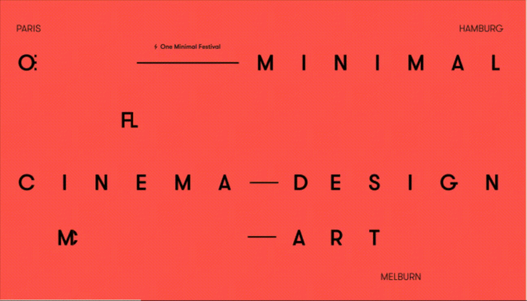
If your brand can handle it, then consider elevating your website design with bold, dominant typography.
Also known as brutalist typography, this statement trend can elevate a minimalist design to a feeling of prominence, strength and ruggedness. Coupled with a simple, but strong colour palette, bold typography can exude an urban-like, metropolitan or masculine vibe.
Users connect with visual design and are able to draw conclusions about a brand from how their website looks and feels (and ultimately, makes them feel). A trend or technique like this can be a great way for brands to assert confidence in their offering and connect with their users on an emotional level, without obnoxious copy or cringe-worthy brand statements.

Two years into the pandemic, life still feels uncertain and divisive. From fashion to interiors, wherever creativity is concerned, people are seeking comfortable and familiar experiences as an opportunity to escape the chaos. Website design that feels a little more analogue and more retro can feel comfortable, relatable and nostalgic — offering soft reminders of the good old days
A big trend for imagery and typography — designers are making their websites feel nostalgic and familiar with subtle elements like retro fonts, grainy or textural filters, soft lighting or imagery with a film aesthetic.
Be sure to approach this one with caution. There’s a fine line between the beauty of nostalgia and the dagginess of dated design.
For reasons similar to those used to unpack Trend №3 — websites with bold, contrasting colour palettes are in favour. When it comes to design, colour is arguably one of the most powerful elements used to create an emotional connection, so for brands and products with emotional baggage, this can be a great way to connect with your target customers.
Not for the faint-hearted, or faint-intended, this style typically packs neon colours, deep blacks, colourful gradients and grunge-acid shapes designed to connect with millennials and Gen Z users. A bold trend which certainly isn’t for everyone, consider whether strong contrasting colours is going to inspire or stress your users.
A design element as old as advertising itself, kinetic typography (or animated text) is now flaunted by some of the best websites across the globe. While this can be a relatively simple design inclusion, the impact kinetic typography has on the user experience is strong and long-lasting.
Historically relying on animations, graphics or video to tell brand stories, website designers can now use the power of animated text to engage users and convey meaningful messages in a variety of forms.
Not just an aesthetic, this trend is great for engaging users and increasing valuable site metrics like Read Time, Page Views and Scroll Length. Kinetic text can grab the users attention and guide them through the page while drawing attention to important details or creating a fun/playful tone.
Although we’ve just discovered a handful of shiny, exciting and attractive possibilities for your new website, remember to be mindful of your design choices.
Great design is intentional — whether you’re animating text or layering images, always remember to think about Deep Delight and the overall experience of using your website.
Be selective about which trends (if any) you introduce into your business and make sure you’re adding value, rather than creating friction or cluttering the user experience.
To promote and celebrate Single Awareness Day Hart & Jones have designed a range of scented candles. With tongue-in-cheek titles Stupid Cupid, Love Yo Self & Single AF SAD candles are the perfect accompaniment to your singleton self-care. A solid reminder that you don’t need a relationship to celebrate love.
If you have had enough of love-sick couples parading their relationships at Valentine’s then you are not alone. The expectation to be in love has led to 40% of our population associating the holiday with negative emotions, with many being left feeling lonely, insecure, depressed or unwanted.
From these feelings of isolation Single Awareness Day was born, a day to enjoy your singleness rather than drowning in your sorrows. In protest to the commercial monster that is Valentine’s Day, SAD is celebrated on February 15th , a day to enjoy singleness, empowerment and self-love. Honour the joy and freedom of being single and give love to the person most deserving of it, you.
“Emotional wellbeing for the next generation requires us to be there not just at bedtime but also across the day and in environments like classrooms. Our goal is that proactive development of EQ becomes as important as IQ. In order to reflect this, we have evolved from Moshi: Sleep and Mindfulness to Moshi.” – Ed Barton, COO, Moshi.
Moshi are on a mission to improve the health and happiness of the next generation by teaching them the fundamentals of mindfulness from an early age. The UK is facing an unprecedented mental health crisis, with children most affected of all. Today, 1 in 6 children suffer with poor mental health; from anxiety and eating disorders, to attention deficit/hyperactivity disorders and more. Through guided meditations, mesmerizing stories, and soothing sounds, Moshi aims to make mindfulness magical to young minds.
As Moshi expanded their content from sleep-only to round the clock mindfulness, they approached Fiasco Design to encapsulate the change via a new digital home. “We initially appointed Fiasco to rebuild our website. The project quickly became something much more and led to us sharpening our brand across platforms with the website at the centre.” says Ed Barton, COO, Moshi.
The updated brand colour palette now includes brighter hues, with accessibility in mind. The original main brand font, Calibri, has been replaced by Chromatica by Polytype foundry, a versatile sans serif type with a warm and personable tone.
Fiasco also helped to set the tone when it came to photography, introducing a vibrant set of studio shots that replaced stock imagery. Charming hand-drawn annotations add a sense of personal expression, as unique as every child.
The new website drives subscriptions whilst simultaneously capturing the magic of mindfulness. Moshi’s personality has been dialled up through playful UI design and motion. The result is a site that echoes the spirited nature of the app and ultimately champions the child.
“As a parent to a young child, I’ve had first-hand experience of how transformative the Moshi app can be to family life. It was a pleasure, therefore, to get the chance to work with the team at Moshi to help realise their vision for the brand.” – Ben Steers, Creative Director, Fiasco Design.
You can read the full case study here. Fiasco’s partnership with Moshi is the manifestation of their brand pledge to use creativity to inspire change. Working seamlessly across brand and digital, Fiasco creates extraordinary brands with heart and spirit.
First event: 10th February 1.30pm – 2.15pm
Bristol-based web design and development agency, Unfold has just launched a brand-new events series, Below the Fold. The series centres successful business people, giving them a platform to share learnings from their journeys. Hosted by Unfold’s founder, Harry Cobbold, these events aim to educate and inform attendees with insider knowledge and tips for success.
What it takes to get your business acquired
The first episode in the series will see Gapsquare’s Zara Nanu taking the guest seat, with Harry interviewing her on Gapsquare’s recent acquisition and what it takes to build and acquirable business.
You can catch the event on 10th February 2022 from 1.30pm – 2.15pm. All events in the series will be held virtually via Zoom for the foreseeable future. If you can’t make the date, you can register in any case and you will be sent the session recording following the event.
Register for the event here.
The new ‘Intro to Game Art’ short course will give you an insight into the world of game art, exploring the range of roles and essential skills needed to get you started when exploring a potential future career in game art. There is a host of exciting modules that your tutor will guide you through, including:
Planning and producing work to a design brief.
Working in the games industry
Concept art for computer games
Modelling for computer games
This new and exciting programme is designed to equip individuals (aged 19+) with the technical skills, knowledge and understanding needed to produce digital content across several platforms, ensuring you can use social media most effectively for your small business, sports team or trade.
This course will provide a great opportunity for you to develop media production techniques, such as camera operating (on mobile devices, DSLR cameras and broadcast cameras), video editing, graphics and motion graphics to produce content for Instagram, TikTok, Facebook and more. There is a host of exciting modules that your tutor will guide you through, including:
Planning your Project
Camera Production Techniques
Sound Recording Techniques
Editing Techniques
This new and exciting programme is designed to equip individuals (aged 19+) with the technical skills, knowledge and understanding needed to produce digital content across several platforms, ensuring you can use social media most effectively for your small business, sports team or trade.
This course will provide a great opportunity for you to develop graphic design techniques, such as designing and producing a brand identity and branded graphics for Instagram, TikTok, Facebook and more. There is a host of exciting modules that your tutor will guide you through, including:
Planning your Project
Typography and Layouts
Working with Illustrator and Photoshop
Creating a Brand
We all love an underdog.
One of our Digital Designers, Mayumi Kurosawa, has overcome incredible odds to get to where she is today – a much-loved member of the Proctors’ team.
This is her story.
Act 1: A blessing in (deep, deep) disguise?
I may be happily settled in Bristol today, but the journey I took to get here started in Japan.
In 2018, I was working as a translator – my dream job back then. After five years in this role, my British-native husband told me he wanted to move back to the U.K. It wasn’t the best timing, but being the amazing wife I am, I agreed, making the decision to leave my job and challenge myself in a new country.
After along slog (another story in itself), I was finally granted permission to come and work in the UK. I landed an admin job working for a Japanese company dealing in imported car parts.
But bad timing struck again. The knock-on effects of Brexit were being felt in every industry, and within 8 months of starting my job, I was made redundant.
And to top it all off, my husband and I had just made the decision to move to a new city: Bristol.
Act 2: Kintsugi – Repairing what’s broken, with gold
After coming to terms with what had happened, I came to a realisation. Yes, I’d been dealt a few poor hands. But now I had a brand-new opportunity to discover what I really wanted from the next stage of my career.
So, I doubled down and made a plan: I gave myself one year to study and find out exactly what it was I wanted to do. And I had an idea of what that might be…
Act 3: The impossible dream
Since childhood, I’d dreamt of working within the creative industries. But I’d never felt confident enough to even talk about it – never mind found the guts to try. Nevertheless, the dream had stayed with me. And without the excuse of ‘being too busy’ now redundant, it was time for me to take a chance.
I knew I was interested in design, in its broadest sense. But, of course, modern ‘design’ covers a wide range of occupations.
It took me a while to focus on one discipline. First, I started studying UX/UI design with an online course called Interaction Design Foundation. Then, I moved into front-end web development with Codecademy – an online platform offering coding classes for people interested in developing their skills within the digital design sector. Finally, I studied graphic design, learning even more about the principles of aesthetics and creativity.
Every discipline had its merits, making it difficult to choose which specialism I was going to focus on. And just one year of learning seemed too short to become skilled enough in all of these different areas if I wanted to secure a job.
Act 4: The Great Battle of Imposter Syndrome
The truth is, I spent a lot of time over the course of that year doubting whether I was making the right choice. However, I’m stubborn by nature, and after every moment of uncertainty I would rebound into bursts of productively, further pushing and developing my professional skills.
There’s a cliché for a reason: the only difference between the people who succeed and the people who don’t, is whether they give up on what they want. And I just didn’t let myself give up.
So, I started creating a portfolio. I turned my skills to a selection of different websites that I felt could be improved with a mixture of design and UX. Not only did the process help me use the skills I had learnt, it also helped me to test myself – and prove to myself that I really could become a designer.
When I had three websites redesigned and mocked up, I took a chance and started to apply to some roles.
Act 5: An ending – and a beginning
To my surprise and delight, I received interest from some of the applications I sent, and managed to squeeze myself* into the creative industry. Now, I’m a digital designer for Proctor + Stevenson – and I got here without a relevant degree or industry experience.
Everyone is very warm, keen to help, and I genuinely enjoy working here. They are serious professionals, but at the same time they love to laugh and have fun.
I’ve just started my new career, so can’t give much industry insight yet. But I hope I can encourage people who want to learn something new, or want a career change, that if I could do it, you can do it too.
Post-credits
A quick comment from Proctors (and Mayumi’s manager, Dan Hardaker, Director of Digital Design).
*There was no squeezing necessary when it came to offering Mayumi a role with Proctors. Her portfolio – and her story – demonstrated so much potential and clear talent that we knew would make her a perfect fit for the role.
It’s important to us to look past a person’s work experience alone. Your drive and attitude are just as important as the places you’ve worked before. We believe in giving people the opportunity to develop their skills in a professional environment, and in supporting your goals with mentoring and training resources. So together, we can lay a career path just for you.
Why not take a look at our current career opportunities? There could be a new flagstone waiting for you…
Digital is the status quo
We’re all doing our best to meet the ever-growing demand for organisations to ‘go digital’.
Whether we’re trying to reach more customers, more effectively market our products and services, minimise our carbon footprint or deliver more cost-effective business solutions, finding a digital – and in many ways more accessible – solution is pretty much today’s standard course of action.
The opportunities when we meet a new audience in a new space are obvious. But what about the pitfalls?
The potential for being misunderstood, taken out of context, or having your brand diluted across multiple platforms becomes more likely – especially when considering the speed at which online content is delivered.
And it’s for this reason that our brand identity becomes even more important.
What are brand guidelines?
Your brand guidelines are the rules which determine how your brand is presented to the world. It usually contains information about your brand name and how it’s used, your corporate logo, brand colours, fonts, tone of voice etc.
Your brand guidelines should clearly illustrate how your brand identity is portrayed and communicated to consumers, providing a reference point for employees and clients alike.
And we need them, because when your brand remains consistent, it remains recognisable.
Research has shown 86% of consumers say that authenticity is a key factor when deciding what brands they like and support. And when we think about it, it makes complete sense.
Imagine you nip into your local corner shop to buy a bottle of Coca Cola. Only, the label on the bottle looks strange. In fact, it’s not the typical Coca Cola red at all – it’s bright orange.
And, come to think of it, the font looks different too: It’s narrower than you remember. And not as cursive. Plus, the bottle’s neck is slightly longer. But the drink is still claiming to be authentic, traditional Coca Cola – what’s the likelihood this is a fake?
Maybe you risk it. Or maybe you pick the more familiar-looking bottle of Pepsi, instead.
According to PwC’s consumer insights survey, customers selected trust as their number one reason for choosing a retailer. And how can you expect customers to trust your brand if you don’t remain consistent?
The need for maintaining brand consistency across platforms is critical, because it promotes authenticity and trust. In fact, ensuring a consistent representation of your brand can increase revenue by as much as 33%.
With 80% of consumers agreeing that a signature colour increases brand association and recognition, the importance of sticking to your guidelines – is hard to overstate.
What about having a refresh?
There’s nothing wrong with intentionally refreshing your brand. In fact, updating your branding every few years ensures you stay modern, and reflects your company’s ability to evolve with the times.
But with any brand refresh, your guidelines need to be refreshed too.
Many organisations keep their brand guidelines in a PDF or printed format, meaning you’ll need to factor in time-consuming tasks: updating your documents, checking and proofing them, making amends, artworking them and having them signed off – all this on top of your rebranding process.
But there is a better way.
Digitising your brand guidelines allows for quick and resource-light updates to guidelines, that are quick to roll out and distribute to all relevant stakeholders.
Creating digital brand guidelines
A digital brand guideline ‘book’ can be accessed from anywhere, at any time, and on any device – without the trouble of having to locate a physical copy, or share a long-lost PDF that’s buried on your desktop. Simply share the link, and go.
At Proctors, we use Webflow to create and update our clients’ digital brand guidelines. Whether they’re used by your colleagues, your customers, media or external business partners, making your guidelines accessible on Webflow gives everyone clear direction on presenting your brand consistently.
Even better, with Webflow, elements such as your logos, fonts and colours can be downloaded by anyone you share the link with. So in today’s digital first world, your media partners or social media managers can remain responsive when it comes to pushing out branded content.
Plus, with digital-first increasingly the norm, companies who use motion graphics in their brand elements can demonstrate real, live examples in their digital brand guidelines book too – something which isn’t possible in other formats.
Even large organisations with lots of different sub-brands can benefit from Webflow’s flexibility. It’s a quick and efficient process to create and update your guidelines, whether you need to edit just one page or to build and deploy several branding ‘chapters’. Plus, any changes or updates can be highlighted on the landing page, so all employees are made aware of them.
With Webflow’s no-code format, any brand refresh updates can be easily executed by your marketing team, meaning you’ll save masses of time on updates. Not to mention avoiding the need to print – and that’s one big environmental benefit.
Scaling up with Webflow
If you want your brand to remain trusted in the digital era, you need to practice consistency.
With easily accessible guidelines, you’ll be able to ensure you’re presenting an authentic brand. So you can reach more customers, and more effectively market your businesses.
If you’d like to find out more about our digital brand guideline services, or any of the other services we offer, talk to us today at [email protected].
Bristol-based digital design and development agency, Unfold celebrated success on 14th October 2021, taking home the title of “Best Digital Design” at The SPARKies 2021. This was awarded for the transformational work they completed for their clients Sherpr.
The SPARKies is one of the year’s most hotly anticipated tech awards ceremonies in the South West. Since Managing Director, Harry Cobbold won ‘FutureSPARK’ back in 2019, Unfold has been nominated for several other categories (including ‘Tech Leader of the Year’ this year). The ceremony was held at The Showroom on Bath Road and was joint hosted by the TechSpark team and comedian Stephen Bailey (who had everyone in stitches).
Sherpr came to Unfold with two problems;
Unfold built a custom web app, admin portal and marketing site for Sherpr in just 10 weeks. This completely transformed their business. As well as automating all of the time-intensive back office tasks, Unfold also created an editable CMS through which the Sherpr team could update and manage their products without constant developer support.
As well as immediate savings in overheads, Sherpr were also able to process far more clients with their new reliable and automated booking system.
Following the work Unfold completed for them, Sherpr achieved their first ever 6-figure month and hit an annual run-rate of £1.2m.
“From beginning to end, the team at Unfold have been great to work with. Communication has been easy and any changes we needed to make during the build process were welcomed and perfectly executed.” – Andy Watson, CEO of Sherpr
Read more in-depth info on exactly how Unfold helped Sherpr achieve this remarkable step-change in their full case study.
If you have a project or digital platform you’d like advice on, please don’t hesitate to get in touch with the Unfold team.
You need to load content from reCAPTCHA to submit the form. Please note that doing so will share data with third-party providers.
More Information