For four decades, a home-grown Bristol initiative has helped launch hundreds of creative careers across the South West and South Wales.
Now, as the South West Design + Digital Student Awards celebrates its 40th anniversary, the organisers are inviting a new generation of final-year university students to step into the spotlight.
Founded in 1986 by Bristol creative agency Proctor + Stevenson, the awards were created with a simple aim: to close the gap between education and the creative industries. What began as a small initiative to showcase promising student work has since become the region’s longest-running creative awards programme, helping emerging designers take their first step into professional careers.
Over the past four decades, hundreds of students have been recognised through the awards, with many going on to build successful careers across the design, branding, advertising and digital industries, both in the UK and internationally. For many, the awards represent the first moment their work is seen beyond the university studio, opening doors to agencies, studios and creative employers across the region and beyond.
Ailsa Billington, Managing Director at Proctor + Stevenson, explained:
“Reaching 40 years is a remarkable milestone, but what matters most to us is the talent behind it. These awards were created to give students a platform and a bridge into the industry. Over the years we’ve seen hundreds of careers begin here, which is something we’re incredibly proud of.”
Every year, the awards offer cash prizes, along with valuable opportunities for networking, industry exposure, portfolio reviews, and a paid internship with us here at Proctor + Stevenson.
By participating, ten students have the chance to be recognised as finalists, with three category winners and one overall ‘Ultimate Creative Champion.’
Since their inception, the awards have helped guide many notable design careers. Past winner, Chris Roberts, now at Dyson, credits the awards with helping launch his career.
“I was the Design Awards winner in 1994. As a result of the Design Awards and winning one of the awards that night, I was offered a job by one of the judges and also offered a job by Proctor and Stevenson. I took the job at Proctor and Stevenson and ended up working there for eight years. That really kickstarted my career actually. I am now a Creative Director at Dyson, where I’ve been for nearly 20 years.”
The 2026 awards are open to final year students studying creative courses at universities in the South West of England and South Wales. Categories include:
Students are encouraged to submit any project, including previous university work, as long as it aligns with one of our three categories. It’s free to enter and students can find our full entry guidelines here: Entry guidelines
Entries are now open until the 29th May 2026.
Creative projects can be submitted here: South West Design + Digital Student Awards 2026
Immersive Ideas Founder Sarah Morris explores how ‘immersive’ emerged as a practice and methodology, not just a passing trend, but a cultural shift shaped by decades of experimentation.
The word immersive is now everywhere in the live experience industry. It appears across theatre, exhibitions, themed entertainment, festivals, brand activations, and cultural events. Yet its widespread use often obscures the fact that immersive is not a new idea, nor a shallow one. It is a term with a long, contested, and deeply theatrical history, and much much more than just a buzz word.
Immersive did not begin as a marketing label. It emerged through artistic experimentation, theoretical debate, and a growing dissatisfaction with distance between audiences and performance. While many disciplines have contributed to immersive practice, it was actually theatre that crystallised immersive as a cultural movement, articulated its values, and pushed it into the mainstream consciousness.
This article traces the history of immersive practice across theatre and live experience, arguing that immersive is not defined by technology or format, but by a convergence of artistic integrity, world building, audience journey and agency, story, performance, and theatrical design.
Immersion existed long before immersive had a name.
Before immersive became a recognised practice, performance was already concerned with how audiences enter a world rather than simply observe it. Classical theatre traditions were built around proximity, ritual, and shared focus. Greek tragedy used architecture, chorus, rhythm, and repetition to draw audiences into a collective emotional state. Medieval mystery plays moved through streets and civic spaces, embedding story into daily life and collapsing the distance between performance and reality.
Theatre scholar Dr Emma Cole notes that immersion has “intrigued humanity since antiquity,” pointing to the long standing human fascination with belief, illusion, and participation.
The impulse behind immersive work, the desire to step inside a story, to feel present within it, predates any contemporary terminology.
What emerges here is immersive as a practice not a label, it relies on trust, belief, and the willingness of audiences to enter into a world together. These principles sit at the heart of even the most mainstream immersive work today.
Although immersive thinking exists across many disciplines, it was theatre that transformed immersion from a design technique into a cultural force.
Experimental practitioners rejected the safety of the proscenium and began designing worlds audiences had to enter physically and psychologically. Immersion in theatre was never about comfort. It was about proximity, vulnerability, and consequence.
This is why immersive theatre became a movement, rather than simply a style. It was accompanied by critical writing, artistic intent, and cultural debate. Theatre gave immersion its intellectual backbone.
Alongside theatrical experimentation, theme parks and attractions had been developing immersive environments for decades. Dark rides, walkthrough attractions, and themed lands relied on coherent world building, scenic design, sound, smell, pacing, and audience flow to sustain belief.
Attractions understood something fundamental early on. Immersion depends on consistency. Worlds must operate according to internal logic. Set building, sightlines, operational choreography, and performance all reinforce narrative integrity.
What distinguishes attractions is scale, repeatability, and operational discipline and in contrast what distinguishes theatre is intent, intimacy, and liveness.
The most powerful immersive experiences today draw from both traditions, blending theatrical meaning with the spatial intelligence of attractions design.
The term immersive theatre enters academic discourse in the early 2000s as scholars attempt to name practices that resisted existing categories such as site specific, promenade, or participatory theatre, and naturally around a decade later, marketing terminology.
Dr Gareth White defines immersion as a perceptual and psychological state shaped by spatial orientation and attention.
Dr Josephine Machon emphasises embodiment and audience journey.
Language evolves because practice evolves. Immersive is not a perfect word, but it is a useful one. It sets expectations. It signals intent. It allows different disciplines to speak to one another.
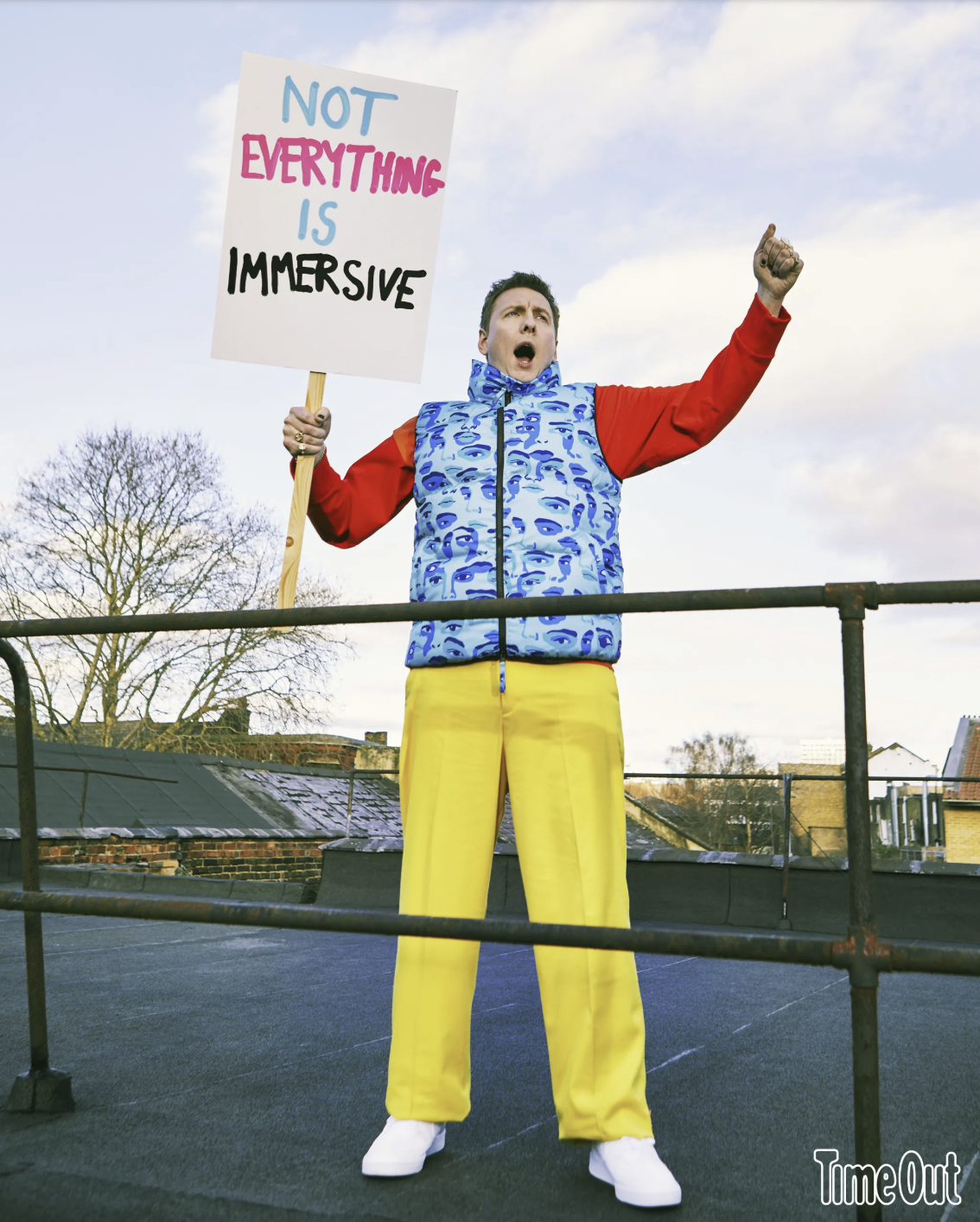
To quote Joe Lycett, “not everything is immersive” But that does not invalidate the term. Language evolves alongside practice. Immersion exists on a spectrum, the word will continue to stretch as the work itself stretches.
Anger at the word immersive often masks discomfort with its popularity. But popularity does not negate legitimacy. It confirms cultural relevance. Don’t call something immersive just to sell tickets, but don’t be trapped by terminology either.
As Cambridge Dictionary quotes “IMMERSIVE – seeming to surround the audience, player, etc. so that they feel completely involved in something”
Language in the arts shifts as practice shifts, and as work needs to be communicated, words spread when they are needed.
For many audiences, immersive theatre became culturally legible through the work of Punchdrunk. Their productions introduced large scale environments, fragmented narratives, and audiences who moved freely through performance worlds rather than sitting passively in front of them. Theatre became the vehicle that carried Immersive into the mainstream.
Punchdrunk did not invent immersive theatre. They would be the first to acknowledge that. In fact, they now more often describe their work as site-responsive rather than immersive. What they did do was translate experimental practice into a form that captured public imagination at scale.
Immersive became something audiences could recognise, seek out, and pay for. Theatre made immersive visible.
Alongside this sat a rich ecosystem of UK companies making immersive, interactive, and participatory work throughout the 2000s, long before immersive became a mainstream label. You Me Bum Bum Train, Shunt, Les Enfants Terribles, Secret Cinema, Coney, DifferenceEngine, CoLab Theatre, Apocalypse Events, dreamthinkspeak, Blast Theory, Uninvited Guests, Third Angel, Improbable, Rotozaza, Invisible Circus, Lab Collective, Dank Parish, and many others were already experimenting with audience agency, world building, participation, and non theatrical space, this is also where a lot of the current practitioner (including myself) who have gone on to make more commercial experiences cut their teeth.
This list is far from exhaustive. It exists as a reminder that immersive practice is not new. It is rooted in decades of experimentation, often happening in warehouses, abandoned buildings, churches, shops, offices, basements, and outdoor sites, almost never on a traditional stage. These pioneers laid the groundwork for everything that followed.

In contrast to those early days, immersive experiences now operates at scale. Ticketing platforms have reported sharp rises in demand, with Eventbrite recording an 83 percent increase in searches for immersive experiences year on year, and DesignMyNight reporting an 88 percent rise in interest. The global immersive entertainment market has been valued at £98 billion – The Independent, pointing to sustained public appetite rather than fleeting novelty.
With that growth comes friction. The word immersive is now used widely, sometimes loosely, and sometimes badly. Misuse can be damaging, not because the term itself lacks meaning, but because poor delivery erodes audience trust and undervalues the craft behind the work.
The much publicised failed Wonka experience is a useful example. It was marketed as immersive because that was the intention. Tickets sold for a reason. Audiences wanted to believe in the promise. The failure was not the ambition, nor the terminology, but the absence of expertise, structure, and understanding needed to deliver immersive in practice.
The risk to the industry is not that immersive is used too broadly. Projection mapped digital art in a gallery space has every right to call itself immersive. So do theatre, live events, attractions, and hybrid digital worlds. The real risk is the wrong people making the work without the skills, experience, or long term practice required to support it.
Immersive is not the problem. Inexpert delivery is, or the work being created without intent as a money grab, but this shouldn’t tarnish the industry or the word immersive.
And The Stage rightly observed that “the term immersive has been maligned and misinterpreted but it is still the word under which some of the most exciting theatre is being made.”
Immersive went mainstream because people wanted it. The responsibility now is to make it well.
Immersive is not a genre. It is a methodology.
At its core, immersive practice brings together artistic integrity, world building, audience journey, story, performance, theatrical design, and craft-led making. Sometimes this is supported by advanced technology, sometimes it is entirely analogue. When these elements align with intention, immersion is not applied, it emerges.
What has changed in recent years is scale, support, and reach. Immersive is no longer operating at the margins. It is now underpinned by formal funding streams and strategic investment, including national initiatives such as Immersive Arts UK, alongside long established public funders like Arts Council Engand. This has enabled artists and companies to develop original IP, experiment, tour, build sustainably, and take creative risks that would previously have been inaccessible.
At the same time, rapid advances in technology have expanded what immersive can be. Spatial audio, real time engines, mixed reality, projection mapping, responsive environments, and networked digital platforms have allowed immersive work to exist beyond physical sites, opening up digital and hybrid spaces that are participatory, persistent, and globally connected. Audiences can now step into worlds that live online, overlap with physical environments, or evolve over time, often at a fraction of the cost of traditional large scale builds.
Alongside funding and technology sits a growing professional ecosystem. Communities such as The Immersive Experience Network and World Experience Organisation have helped formalise knowledge sharing, advocacy, skills development, and international collaboration. This matters as it creates clearer career pathways, supports freelancers and small studios, and continues to generate new roles across design, production, performance, fabrication, engineering, and digital development.
The question is not whether a term is used imperfectly, but whether the work behind it is intentional, crafted, and coherent, when it does it remains a meaningful way to describe work rooted in world building, audience journey, and lived experience rather than novelty alone. We may never all agree on the terminology, but the trajectory is clear: immersive is a practice and what it describes is real, growing, and here to stay.
This is not a phase. It is a movement.
Immersive Experience Network: IEN Summit 2024
Immersive Ideas Ltd is not a name we arrived at casually. We own it because we have spent over a decade living and breathing the work that defines it, in it’s simplest form putting audiences inside experiences, not just in front of them.
Our practice has been built through making immersive work across theatre, live events, festivals, attractions, brands, and experiential environments, long before the term became widely used. Through this we have learned what immersive actually demands when real people are present, moving through space, making choices, trusting the world around them, and responding in real time.
Our skills come from doing the work. From testing audience behaviour, designing and building spaces that have to hold together under pressure, and making creative decisions that balance emotion, logistics, safety, scale, budget, and meaning.
We understand immersive because we have built it, broken it, refined it, and built it again, often in the strangest of spaces, often under tight constraints of budget, time, and circumstance.
Our past experience has given us a strong instinct for emotional logic, clear audience journey, and the subtle mechanics of trust. We know what audiences want, what clients and collaborators need, and how to design experiences that feel generous, coherent, and alive. This kind of thinking only comes from long term, hands on immersive practice.
We use the word immersive with care because it accurately describes the work we specialise in – If a project is not immersive in nature, in some form or another, it is probably not the right fit for us, and that clarity is deliberate and honest.
If you want to work with people who understand where immersive practice comes from and where it can go next, we would genuinely love to talk.
You can explore more writing on immersive practice, world building, and immersive experience design on our website, or get in touch to discuss a project, collaboration, or commission.
Immersive is not about pulling audiences in. It is about building worlds, spaces, attractions, and live experiences that earn belief, establish trust, and reward curiosity.
When we say at Immersive Ideas Ltd “we make reality sweat” we really do mean it!
Web developers, digital innovators and tech professionals are gearing up for the sixth annual Umbraco Spark innovation conference, returning to Bristol this spring at We The Curious on Friday 20 March 2026. Organised by Bristol digital agency Gibe Digital, the event has become a fixture for developers from across the UK and Europe to share insights, ideas and practical knowledge around the open‑source Umbraco CMS and broader .NET ecosystem
Speaking about the conference, Steve Temple, Technical Director and Co‑founder of Gibe Digital, describes Spark as “a calendar highlight” that brings together “so many talented developers from the amazing Umbraco community.” Steve adds that the event leaves attendees “feeling inspired, armed with fresh knowledge to take your Umbraco projects to the next level.”
This year’s programme features a single main track of deep‑dive technical talks, practical demos and forward‑thinking sessions on topics such as load‑balancing for scalable apps, Umbraco Search, next‑generation back‑office features, and experimenting with AI‑driven accessibility tools.
Schedule Highlights:
Thursday, 19 March – The day before the main conference kicks off with a full-day Hackathon & Package Jam for the community, followed by a pre-party at a local game bar with ping pong, bowling, karaoke, food and drinks.
Friday, 20 March – A Harbour Run at 7 AM starts the day, followed by registration with coffee and pastries. The main track runs 9 AM–5:30PM, featuring technical talks, lightning sessions and demos. The Package Awards celebrate standout contributions, and the day wraps up with an after-party. Attendees also benefit from lunch, refreshments, a free cloakroom, and quiet/multi-faith rooms to support wellbeing.
Tickets & Pricing: Standard tickets cost £150 + VAT, available until the end of February or until sold out. Grab your ticket here.
Umbraco Spark continues to cement Bristol’s status as a hub for creative tech events — combining local community energy with the global expertise of the Umbraco ecosystem.
Bristol, UK – January 2026 — Ignition DG Ltd, the Bristol-based strategic events and exhibitions agency, as part of Istoria Group, today announces significant business growth. From expanded global reach to continued leadership, Ignition DG continues to generate impressive results in the sector.
Founded in 2007 with a mission to challenge traditional “build and burn” event practices, Ignition DG has grown into an award-winning creative agency known for blending strategic planning with world-class delivery.
Global Growth
Ignition DG designs and delivers hundreds of exhibitions and event programmes each year – serving clients across pharmaceutical, beauty, biotech, aerospace and technology sectors.
To support recent successes, Ignition DG ended 2025 with the opening of a new European office. With strategic hubs and warehouse facilities now established across the UK, EU and the US, Ignition’s global growth goes from strength to strength. Paired with trusted partners across Asia, the Middle East and South America, the business has consolidated its ability to support global programmes with local expertise.
Client Success
From complex exhibition portfolios and major congresses, Ignition’s work emphasises strategic intent, creative innovation, and seamless project management – underpinning sustained client retention and growth.
Alongside continued client success, Ignition has won awards for booth designs, creative event executions, and bespoke modular solutions that deliver high impact and cost efficiencies for global brands.
With recent client wins, Ignition has attracted new talent to the company, seeing a 19% increase in employees throughout 2025.
Innovation Through Change
In recent years, the company has responded to shifts in the events landscape by scaling its digital and hybrid capabilities. This adaptability has reinforced client partnerships, enabling Ignition DG to deliver hundreds of virtual events and hybrid programmes that seamlessly blend creativity with technology.
Innovation continues to be part of Ignition’s DNA. New strategic capabilities, such as building exhibition attractors in-house, are being launched, alongside medical content writing as a service.
Looking Ahead
“We’re proud of the sustained growth we’ve achieved while staying true to our founding values,” said Sam Rowe, CEO of Ignition DG. “Our team’s focus on creativity and strategic excellence has allowed us to support clients around the world with meaningful, measurable experiences.”
With continued investments in strategic solutions, talent and technology, Ignition DG is poised to grow further into 2026 and beyond. The company remains committed to helping clients across regulated industries to create impactful live experiences that drive business results without compromising environmental or ethical standards.
For media enquiries, please contact:
[email protected]
Jurassic Park is often cited for its technical innovation or iconic moments, but its real influence runs deeper. Long before immersive experiences became the buzz word we know today, the film demonstrated how to build a world audiences could fully step into, understand, and believe in. For creatives, designers, and producers, Jurassic Park functions as a near perfect case study in experience architecture.

One of the film’s greatest strengths is how clearly it establishes its internal logic. Before the dinosaurs appear, the audience is oriented.
We are shown how the park operates, how guests move through it, what is automated, what is controlled, and where the boundaries lie.
This mirrors best practice in immersive experiences. Audiences need orientation before participation. Clear rules do not limit immersion, they enable it. When people understand how a world works, they relax into it. When those rules later fail, the impact is emotional rather than confusing.
Jurassic Park earns its chaos because it first earns its structure.
The arrival sequence, the branding, the orientation film, the guided tour vehicles. This is onboarding in its purest form. The park reassures its guests that they are safe, looked after, and part of a carefully designed experience.
Experience design relies on the same mechanism. Audiences need to know what kind of experience they are entering, how they are expected to behave, and what level of risk or participation is involved. Without this, surprise becomes anxiety rather than engagement.
Jurassic Park understands that trust must be built before it can be broken.
A common misconception in immersive work is that closeness equals immersion. Jurassic Park proves the opposite. The audience is rarely placed in direct danger. Instead, tension is created through perspective. Watching from inside the car, behind glass, under the fence.
The film controls audience position with precision. This is exactly how immersive experiences maintain emotional intensity without overwhelming participants. Immersion is about relationship to events, not physical distance from them.
The science in Jurassic Park is famously flawed, yet the film remains emotionally convincing. That is because its characters behave like people and its consequences feel earned.
Immersive experiences do not need realism. They need emotional logic. Audiences will accept extraordinary premises if the world responds to them honestly and consistently.
At its heart, Jurassic Park is a cautionary tale about creation without accountability. The ability to build something spectacular does not absolve the creator of responsibility for its impact.
This is a vital lesson for immersive practitioners. Immersion amplifies emotion, vulnerability, and trust. With that comes a duty of care. Designing worlds is not just a creative act, it is an ethical one.
Universal
Jurassic Park matters because it is not just a blueprint for brilliant world building, it is also a quietly terrifying dystopia for the future of live experiences and attractions if we get complacent.
Strip away the dinosaurs and you are left with something uncomfortably familiar. A premium attraction driven by scale, automation, branding, efficiency, and spectacle. Guests are processed, reassured, and managed. Human complexity is treated as an inconvenience. Risk is assumed to be solvable by systems. Sound familiar? If not, spend five minutes in a badly designed immersive experience where no one quite knows what is allowed, where the exit is, or who is actually in charge.
Jurassic Park shows us what happens when experience design prioritises control over care, throughput over trust, and innovation over responsibility. It is the logical end point of the thinking that bigger, faster, smarter, more immersive is always better. The joke, of course, is that this is exactly how people get eaten by raptors.
For immersive creators, this is the real takeaway. World building is not neutral. Immersion magnifies everything, emotion, fear, delight, confusion, vulnerability. The more convincing the world, the greater the responsibility of the people who build it. Consent, clarity, pacing, agency, and safe failure are not nice extras. They are the difference between magic and meltdown.
This is where thoughtful immersive design matters. Not just how impressive something looks, but how it behaves under pressure. What happens when things go wrong. How audiences are supported, not managed. How trust is earned, not assumed.
At Bristol based Immersive Ideas Experience Agency, this is exactly where we focus our work. We design experiences that respect audiences, honour story, and understand the emotional mechanics of participation. We build worlds that feel alive because they are coherent, human, and accountable. Not theme parks with better tech, but experiences with purpose, care, and consequence baked in from the start.
Jurassic Park endures because it understood something the industry still occasionally forgets. Just because you can build it, does not mean you should build it that way.
And if the future of live experiences ever starts to feel a bit too much like a glossy orientation film promising everything is completely safe, while the fences quietly hum in the background, that is probably the moment to pause, step back, and rethink the design.
This article was written by Epoch’s Marketing Manager, Ricardo P Martins.
Getting that first job is hard.
Even harder in an industry like ours, filled with self-doubt, giant egos, cut-throat competition, and most recently, the threat of an AI revolution. In this industry, opportunities for new talent to get a foot in the door are few and far between.
At Epoch, we believe that opportunities should be giving to everyone, not just to a few privileged people from the “right” schools and/or “right” backgrounds. So, if we see talent, we want to help.
With that drive in our hearts, we created the Epoch Academy.
The Academy, as we fondly call it internally, is Epoch’s internship programme. It’s our way of giving back to our community, providing opportunities for the next generation, nurturing both the future superstars of the industry and those who haven’t yet had the opportunity (or luxury) to break into the creative workforce yet.
We do that by maintaining strong relationships with a handful of universities across the UK. These are universities that not only produce incredible talent every academic year, but also align with our values of putting people first and building meaningful bonds.
We start creating these bonds by sending a team out to each one of these universities to spend time with the students, getting to know them on a one-to-one basis, hearing their stories, their ambitions and learning about what drives them. The Epoch Academy Workshop, held in Bristol around springtime, is the cherry on top of this beautiful relationship. It’s a day of celebrating all the talent we found along the way and spending quality time with them creating, brainstorming, conceptualising, and most importantly, having loads of fun together.
The Workshop is also an opportunity for them to bond not only with us but also with other young creatives from different universities, backgrounds and walks of life.
It’s important to say that, as we can’t visit all universities across the country, we also take applications for the Epoch Workshop on our website. We make sure that at least 40% of workshop attendees come from these website applications.
The biggest bond of this journey, however, is created during the internship itself. By then, they know us. They’ve met us in their classrooms, connected with us on LinkedIn, and spent a whole day with us in Bristol. So, when they come through big grey door at 54 Queen Square on their first day, it feels like arriving at a friend’s house.
It’s warm. It’s familiar.
Not to toot our own horn, but many of them want to stay.
A few already have.
And those bonds? They are for life.
This article was written by Epoch’s Creative Director, Vix Hansard.
Every single day, the minute we step out of our house, we find ourselves swimming in a sea of visual cues. These cues can guide us, they can teach us, they can resonate with us or in some cases, they can shove us to the margins.
Take a hospital. You’re stressed, you’re scared, and the signs make no sense. Too small, poorly placed, or a muddle of colours. At best, it’s frustrating. At worst, it’s dangerous. Good design can soothe; bad design creates chaos.
Ever noticed raised metal bumps or concrete studs outside storefronts? They’re not decorative, they’re designed to stop homeless people from resting there. They are physical “no entry” sign for the most vulnerable. It’s hostile architecture and it’s basically telling us to f*@k off.
Visuals also reinforce bias. The press often show mugshots for black suspects and family photos for white ones. Before you even read the headline, the picture has framed your judgment. That’s not neutral design; it’s a loaded cue.
But visual design can also include, uplift, and connect.
In classrooms, images and symbols help diverse learners grasp complex ideas. In public transport hubs, clear, multilingual signs empower newcomers to navigate new cities with confidence and joy. A rainbow sticker on a café window is a clear invite to the LGBTQ+ community, saying ‘you’re welcome here’.
And long overdue, fashion is catching on. Inclusive mannequins are popping up in storefronts featuring prosthetic limbs, diverse skin tones, and more varied body shapes. Nike nailed it with their plus-size mannequins standing alongside their slender counterparts in their flagship London store. It’s not a gimmick. It’s visibility. It’s a ‘you matter too.’
Japan has a word for this kind of intentional, behaviour-shaping design:
Shikake (仕掛け), creativity that influences action and emotion without force. Like zigzagging pathways that naturally slow you down, or stairs that play music, SO MUCH more fun than the escalator. Playful, practical, effective.
In summary, we don’t just look at the world, we read it. Constantly. Every shape, symbol, colour, and structure around us is whispering (or shouting) something. The question is: What’s the message? Who gets to connect with it and who’s left out?
Design is power. It can open doors or build barriers. It can be a warm welcome or a cold shoulder. So, let’s design better stories and create visual cues that guide with clarity, include with heart, and resonate. Design speaks. Let’s make sure it says the right thing.
References:
Hostile Architecture by Ben Campkin and Ger Duijzings Designing Disorder: Experiments and Disruptions in the City by Pablo Sendra and Richard Sennett
Shikake: The Japanese Art of Shaping Behavior Through Design by Naohiro Matsumura EJI & Global Strategy Group (2021): Innocent Until Proven Guilty?
Signage and Wayfinding Design by Chris Calori & David Vanden-Eynden
A website that takes digital accessibility features seriously reaches a wider customer base, performs better for SEO and reduces legal risks for the business. Recognising this, world-famous restaurant chain Benihana asked us to deliver a fully up-to-date website that adheres to WCAG 2.1 guidelines.
A website that takes digital accessibility features seriously reaches a wider customer base, performs better for SEO and reduces legal risks for the business. Recognising this, world-famous restaurant chain Benihana asked us to deliver a fully up-to-date website that adheres to WCAG 2.1 guidelines.
Our extensive accessibility work on the Benihana website helped improve its overall accessibility score.
We reduced instances of vague and ineffective link text, replacing them with clear and descriptive alternatives to make navigation more intuitive for users.
Identified and replaced ineffective alt text with accurate descriptions, ensuring that information is accurately conveyed to those using screen readers.
The work we conducted on the new Benihana site significantly improved accessibility, ensuring compliance with WCAG 2.1 AA standards. The changes allowed Benihana to reach a wider proportion of its customer base, providing excellent user experience features for those with accessibility needs.
The accessibility improvements also strengthened SEO. By adding features that enhance usability, such as semantic HTML, clear navigation, and descriptive links, Benihana’s fully accessible website achieved a noticeable boost in overall SEO performance.
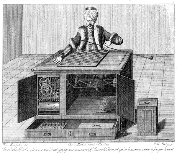
From 18th-century hoaxes like The Mechanical Turk to today’s over-hyped “AI automation,” history shows our fascination with machines that seem smarter than they are. This post explores how illusions of intelligence—from chess computers to chatbots—reveal both the progress and persistent limitations of artificial intelligence, and why skepticism remains essential.
In 1770, the world’s first chess-playing machine was created. Known as “The Mechanical Turk”, it toured the world for almost 90 years before being destroyed in a fire in 1854. A few years later, it was revealed by the inventor’s son that the machine was a hoax. Instead of being operated by some form of mechanical computer, it was in fact a man sitting inside a box playing chess.
With the benefit of hindsight, this should have been obvious to everyone at the time, but the allure of seemingly impossible technology continues to blind us today. Amazon Fresh’s “Just Walk Out” technology, which appeared to use AI to track shoppers automatically, relied heavily on human reviewers in India to process transactions. Similarly, Builder.ai promised automated code generation but employed teams of human developers behind the scenes. Like the chess-playing automation of centuries past, these modern “AI Turks” demonstrate how easily we can be deceived by the promise of technological magic.
As we move into the modern era, chess computers have become a useful benchmark for measuring technological progress. The turning point came in 1996 when IBM’s Deep Blue managed to win 2 out of 6 games against World Champion Garry Kasparov. The following year, an improved Deep Blue won the rematch 3.5 to 2.5, marking the end of competitive human-versus-computer chess. The gap has only widened since then. The processing power that IBM needed an entire room to house in 1997 now fits into everyday devices. Any computer, smartphone or even smart appliance can now outplay the world’s best human players. Even the great Magnus Carlsen, who held the world number one ranking for over a decade, has said his iPhone consistently beats him at chess.
Chess makes an excellent benchmark for technological progress due to several key factors. For this article, we’ll focus on four main advantages:
Chess also benefits from a remarkably efficient notation system. An entire game can be condensed into a single paragraph that captures every move. Take the decisive final game from the 1997 Deep Blue versus Kasparov match:
1.e4 c6 2.d4 d5 3.Nc3 dxe4 4.Nxe4 Nd7 5.Ng5 Ngf6 6.Bd3 e6 7.N1f3 h6 8.Nxe6 Qe7 9.0-0 fxe6 10.Bg6+ Kd8 11.Bf4 b5 12.a4 Bb7 13.Re1 Nd5 14.Bg3 Kc8 15.axb5 cxb5 16.Qd3 Bc6 17.Bf5 exf5 18.Rxe7 Bxe7 19.c4 1–0 (Resignation)
You don’t need to visualise the board position, but loading this notation into any chess program reveals how the game unfolded. Modern chess engines show that when Kasparov resigned, he was trailing by approximately 5.1 pawns’ worth of material and positional advantage. This was a crushing disadvantage that the 1997-era computers had correctly identified.
Deep Blue was a specialised computer designed for a single purpose: winning games of chess. Over the decades that followed, chess algorithms became more efficient whilst computational power increased dramatically. We eventually reached the point where, as mentioned before, an iPhone can defeat the world number one chess player at the very game that earns him millions.
When ChatGPT was released in November 2022, after spending a week recreating rap songs in the style of Shakespeare, the internet quickly discovered something interesting. ChatGPT was terrible at chess. Despite chess being the perfect game for a computer, and despite millions of chess games being part of its training data, ChatGPT failed at a fundamental level. The AI couldn’t follow basic rules, often creating new pieces from thin air or jumping over defences to capture pieces illegally. Its strategic play was equally poor, regularly leaving queens undefended for easy capture.
This reveals a fundamental limitation: despite their impressive language capabilities, Large Language Models lack basic logical reasoning. They cannot consistently follow rule-based systems or systematically evaluate multiple options. Remarkably, despite being trained on vastly more data and computational power than any previous AI system, LLMs struggle with logical problems that were solved decades ago by much simpler algorithms.
Having limitations within a system is perfectly acceptable. I don’t expect Excel to help me edit videos, nor do I use After Effects for expense tracking. The problem with LLMs isn’t that they have limitations, but that the companies promoting them oversell their capabilities whilst the models themselves confidently attempt tasks they cannot actually perform.
I tested this by playing chess against Claude Sonnet 4. The model broke the rules within 2 moves by making an illegal bishop move, then from move 8 onwards kept using a queen to capture my pieces despite the fact that I had already captured that queen. When I tried Claude Opus 4.1, another model from the same company, it performed better initially but still eventually violated the rules later in the game.
Some developers have achieved better results by essentially rebuilding chess logic through prompting. This involves re-stating the complete board position after every move and explicitly listing legal moves for the model to choose from. But this isn’t the LLM playing chess independently; it’s the human prompt engineer providing extensive scaffolding at every step. Without this constant intervention, the underlying model still cannot maintain basic game state, such as remembering which pieces remain on the board.
The most dangerous aspect isn’t that these tools fail; it’s that they fail whilst appearing successful. A calculator that occasionally returns 2+2=5 would be quickly discarded. But wrap that same error in an eloquent explanation about mathematical theory, and people might question their own understanding rather than the tool’s accuracy. The Mechanical Turk fooled audiences because they wanted to believe in the magic. Today’s AI LLMs can fool us because they speak with such conviction that we assume competence.
This confident incorrectness has already caused real problems. Multiple US newspapers published AI-generated “Summer reading lists for 2025” that included entirely fictional books with plausible-sounding titles and authors. The articles read professionally, referenced current literary trends, and seemed thoroughly researched. Only when readers tried to purchase these non-existent books did the fabrication become apparent.
The lesson isn’t to avoid these tools entirely, but to understand their proper role. LLMs excel at reviewing and refining existing content, catching grammatical errors, suggesting alternative phrasings, and identifying inconsistencies in documents. They’re powerful assistants for discrete, well-defined tasks where their output can be easily verified. But when asked to build systems, maintain logical consistency across complex problems, or generate factual information without verification, they become unreliable narrators of their own limitations. The tools work best when we use them to check our work, not when we’re checking theirs.
As part of ADLIB‘s ‘Design for All‘ series, they speak with Martin Underhill, a digital accessibility consultant with a background in user experience design and frontend development. Until recently Martin was Accessibility Lead at Sage, a FTSE 100 company where he where he built a thriving accessibility discipline from scratch.
Here he shares how accessibility became central to his career, how he promotes inclusive design at scale, and practical tools that build empathy and capability across teams.
My name is Martin Underhill and I am a digital accessibility consultant. I help organisations embed accessibility in their teams, products, and processes so it becomes a lasting part of how they work.
I’ve just finished up as Accessibility Lead at Sage, where I spent five years working with about 11,000 colleagues across 23 countries and more than 40 flagship products, as well as internal platforms and digital communications. I led a team of six, spanning auditing, design focused accessibility, code specialists, community engagement, and generalist support.
I started my career as a freelance designer and frontend developer, and I quickly learned to simplify the user interface so I could deliver on time and give clients value; in doing this, I improved the overall user experience. That habit of starting with a minimal viable design before adding complexity led me naturally toward accessibility.
Later, as an interaction designer in UK government, I helped teams meet WCAG 2.1 AA. I worked from accessibility audit reports, coached developers to write more semantic markup, and demonstrated screen reader use. That is where my design and frontend skills came together and set my path in accessibility.
Inclusion sits at the centre of everything I do; accessibility is part of inclusion, but my goal is broader. I want everyone to feel they can engage with accessibility, even when they’re unsure or resistant. The door stays open because inclusive products are in the best interest of every user.
At Sage, my role was as an internal consultancy across many product teams and disciplines, including design, development, content, QA, product ownership, and project management; that approach informs how I work with clients now.
Because our core team was small we grew a network of Accessibility Champions and a wider community. We ran:
A recurring challenge is misconception and fear. People often worry about saying the wrong thing or think accessibility is brand new and impossibly complex. My approach has been to focus on a welcoming culture where questions are safe and mistakes are part of the learning process. If someone uses unhelpful language, for example “people suffer from disabilities,” I follow up privately and tactfully and introduce the social model of disability, explaining that people experience barriers created by poor design, not by their impairment. But I also think it is important not to write someone off just because they start from a problematic position.
If we want an inclusive culture in the broadest sense, that means including people we disagree with, even those who might initially be dismissive or ableist. Often, those people are worth talking to the most. You do not change minds by shunning people, you change them through conversation, respect, and showing them real world examples of barriers and solutions. Some of our strongest allies began as sceptics, and seeing that transformation is one of the most rewarding parts of my job.
During my time at Sage, we introduced Empathy Labs to give people a safe and structured way to understand different experiences. Labs included visual impairment goggles, motor impairment gloves, and software based colour vision simulations such as red green colour blindness. These sessions could have been controversial if they trivialise disability, so we were sure to frame them carefully; the purpose was to understand barriers and improve design.
For this year’s GAAD our Champions network ran a day of Empathy Labs across seven or eight offices, including Newcastle, Dublin, London, Manchester, Barcelona, and another office just outside Barcelona. We invested in simulation kit and licenses for all offices. Getting them shipped into Europe, even to Dublin, was surprisingly hard, but worth the effort. Engagement jumps after these sessions and we see membership rise in our channels and groups. Champions can now mobilise labs for next year’s GAAD and for awareness moments such as International Day of Persons with Disabilities and Purple Tuesday.
That experience showed me how powerful empathy exercises can be when they’re framed correctly, and it’s something I now draw on when helping clients build their own awareness activities.
I learn best by doing. I use CodePen to write small HTML examples, then run a screen reader to check whether what I hear matches what I see. Books, articles, talks, and conference sessions are valuable, but hands on learning sticks. An at home empathy lab, even a simple one, helps you build real intuition for barriers and better design choices.
Inclusion is about openness. The more you engage people, through empathy exercises, hands-on testing, or conversation, the more they’ll want to be part of the solution. That’s when accessibility stops being “someone else’s job” and becomes part of the culture; something I’ve seen in government, at Sage, and now in my consultancy work.
ADLIB’s Accessible Design Resources
Following the insightful recommendations from our Design For All participants, we’ve curated an extensive collection of tools, guides, articles, books, blogs, and videos. This resource is specifically designed to support accessibility and inclusion specialists at every stage of their journey.
View Accessible Design Resources
This blog previously appeared on the ADLIB Blog.
You need to load content from reCAPTCHA to submit the form. Please note that doing so will share data with third-party providers.
More Information