Until recently, the menopause was something that was not understood and not talked about in equal measure. But after several celebs spoke about their experiences, it became something of a hot topic, with many ‘experts’ appearing to offer help, like tips for a ‘menopause diet’.
We needed to cut through this noise when we created the Hartwell brand. This was different: its founder Natasha Hartwell was a nutritional therapist who based her work on science and evidence-based results, and made real-world, practical suggestions. This was a real expert who could actually help with the symptoms of menopause, and help people feel like themselves.
Hartwell’s approach was a fantastic differentiator and a great place to start, so we began the process of building the brand around this strong core idea.
As with any branding, whether we’re creating a brand or refreshing one, we need to understand what makes it unique, what makes it tick and what makes other people care.
We started a deep dive into Hartwell’s way of working, including how it does it, what it values and its ambitions. The answers to these big questions would help define the new brand’s values and personality, which would lead us towards how the brand should look and feel.
Hand in hand with that, we also carried out an audit of the busy world Hartwell would be entering, specifically focusing on the menopause diet market. What were existing competitors doing? And was any of it working? We discovered an ocean of word salad, bland imagery and ‘mumsiness’, with very few examples of brands who really knew how to communicate what they were doing.
We held a focus group for people going through menopause, to find out about their general experience and if they had tried menopause diets. It was clear that they felt unseen and unsupported, and were suffering emotionally as well as physically.
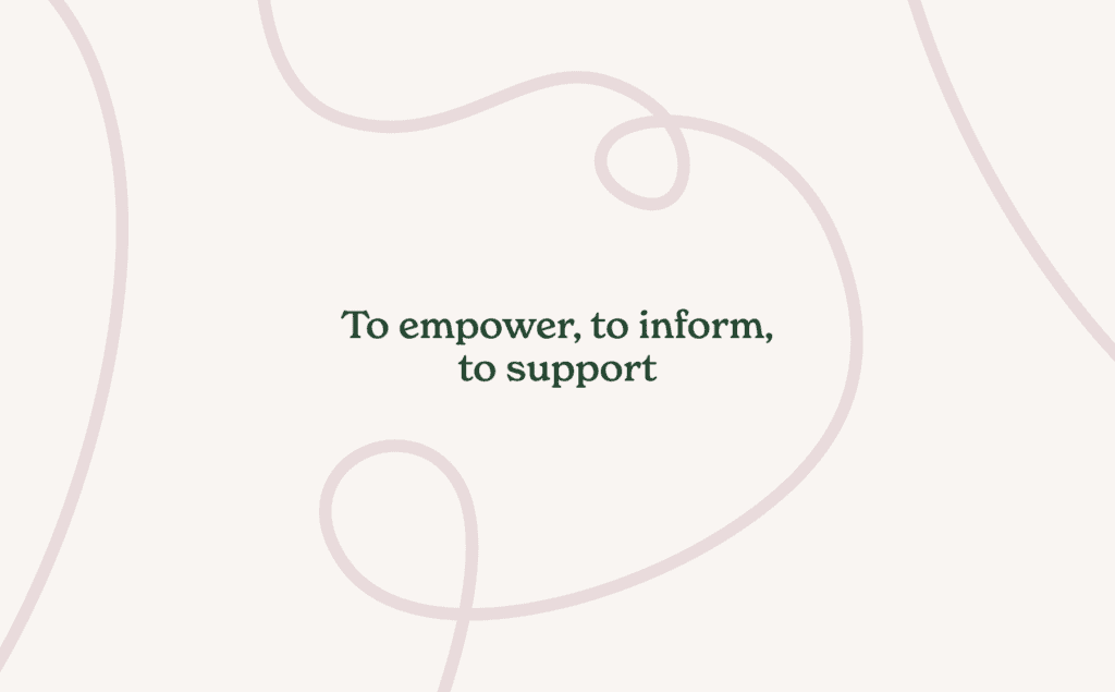
Our research showed us that to reach as many people as possible, Hartwell had to be very clear with its messaging, putting its unique science-based approach front and centre. But to connect emotionally, this clarity had to feel personal. As a result, we made the decision that the voice of Hartwell would be Natasha, so it would be all written in first person, and talking directly to the target audience – just as it would be in a one-to-one consultation.
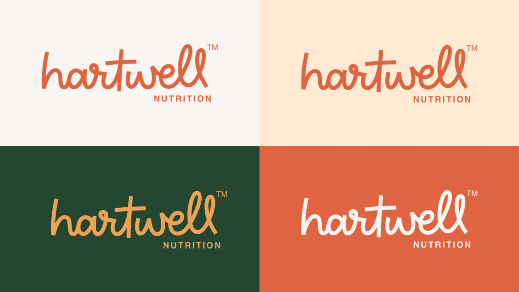
This connected perfectly with the decision to use Natasha’s surname as the name of the brand (her name, her voice) and also helped to complete the circle with the logo, which feels like a signature.
This hand-drawn logotype not only gives the brand a personal, human appeal, it also shows that Natasha is not afraid to sign her name to her work. The brand’s confident because its work is based on evidence – Natasha knows that she can genuinely help her clients.
We created a stacked version of the logo too, primarily to work with social media and smaller spaces, but also with one eye on the future, where ‘Eat well’, ‘Live well’ and other variations could be used.
The logo had been developed as part of a stylescape. These are visual explorations of a brand driven by a core thought, and include everything from brand palettes and imagery through to typefaces. They’re a great way to ensure everything is designed as a family, not in isolation, and to see the entire brand working together.
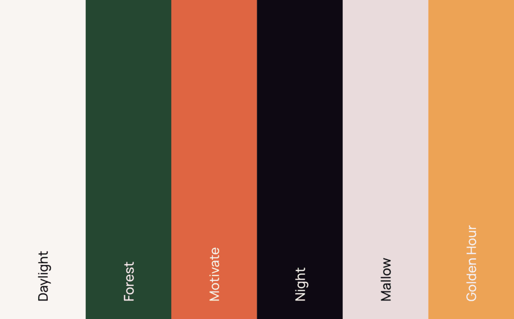
This particular stylescape was based on the idea of empowering clients, factual information, non-judgemental advice and friendly support. Those building blocks led us to a colour palette that was vibrant and earthy, warm and dignified. We purposefully kept away from a palette that was overtly feminine.
Brand imagery centred on collages which connected the way of life our audience wanted to get back to, with nature. The collage construction gave us the scope to tell infinite stories, while the connection to nature was a common theme throughout the work, coming both from Natasha’s understanding of nutrition, and people’s connection to cycles.
Finally, and developed from the hand-drawn logo, we introduced the squiggle. This graphical motif doesn’t have a defined form, and instead is unique each time it’s used, just like Hartwell’s clients and the advice Natasha gives them. The squiggle device can be used to frame text, create direction or simply bring some visual interest to a design, and helps to bring the whole visual identity together.
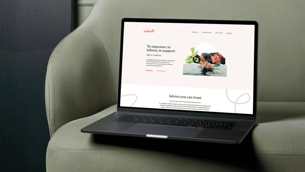
As part of the brand launch, we designed and wrote the Hartwell website. We initially mapped out a number of user journeys so we could design the perfect UX for the busy audience. Our goal was to show enough to prove Hartwell’s credentials, and then invite the audience to take the next step by getting in touch. Copy was therefore kept to a minimum, with the approach being to balance the warm, personal tone with the science that backed it up. This was helped by the brand fonts, the soft and warm New Spirit, paired with the strong and steady Elza Text.
The look of the site mirrored this balance, with a clean look punctuated with lifestyle/nature combination images that brought energy to every page. With minimal copy, the space in the design really helped to deliver a fresh experience, in contrast with nearly every one of Hartwell’s competitors.
The finished brand feels like a modern lifestyle/health brand (not a faddy menopause diet plan), which has the confidence to show what it can do, without having to tell its audience everything it can do.
Find out more about Hartwell Nutrition here
We’ve won a few awards to date but this is the biggest one so far, our first gold! “The Third Angle,”, a podcast we make for industrial software company PTC won the Gold for Best Business Podcast at the British Podcast Awards in September. In all honesty I was shocked, not that I think it’s not worthy, I’m hugely proud of it and the team who make it, but, the competition was heavyweight! It beat podcasts from the likes of the FT, The Economist, and the BBC.
The judges said some kind things: “This is how to do a corporate podcast, I love the fact that they get more from the guests than just a simple interview. The tours and interactive parts bring this to a different level. It’s a blend of geeky and clever – but also really accessible.”
“The Third Angle” provides a refreshing dive into the design and engineering world. It’s not just a corporate message board for PTC. Instead, it offers listeners an intimate tour behind the curtain of innovation. By avoiding the cliché Zoom chats and taking the listener into real-life settings – whether that’s a Danish lab, an Essex workshop, or a Nairobi production line.
I really do think our Bristol roots inspire us to think differently, to be authentic, and we always try where we can to harness the rich tapestry of creative talent that we have here.
Every detail of “The Third Angle,” from its visual identity to the futuristic and playful soundtrack (created by a Bristol-based composer), is curated to make the podcast memorable and stand out, something that listeners would eagerly share with friends and colleagues, which is vital when the business podcast space is so competitive.
The win I think reaffirms our belief that corporate podcasts, when produced with flair, can compete with anything out there. A big part of the success is also down to our client PTC who have really got behind the creative vision.
For anyone contemplating stepping into the branded or corporate podcast world we’re always happy to chat about how to make sure you get cut through. In this vibrant Bristol community, standing out is what we do best!
We’re delighted to announce Gravitywell’s rebrand.
Delivered by the superb team at Seon Creative, our new identity emphasises our status as Bristol’s Venture Studio.
A Venture Studio deploys its expertise, resources and infrastructure to generate and validate startup ideas, then build and launch them into the market.
At Gravitywell, we do this by offering a full suite of hard and soft services to validate, fund, design, build and launch PoC, prototypes and MVP software products.
“This is a long overdue alignment of the brand with Gravitywell’s mission. I’m thrilled to be part of this exciting vision and proud to support a bold position in the tech startup industry.”
— Simon Bos, Founder, Gravitywell
If you’re a tech founder — or an entrepreneur with an innovative idea for a startup — Gravitywell can help build and launch your business.
Contact us today.
Over the last year, mustard jobs have seen a surge in activity within the events industry across the UK. With Brexit, Covid and the Cost of Living Crisis significantly affecting the rate of movement within the industry in recent times. We’re breaking down the current trends, salary expectations, candidate availability and industry growth of the events sector.
At the beginning of the year we saw various external factors make candidates more hesitant about moving roles. Even though the cost of living remains high, the UK hasn’t plunged into a recession yet so candidates are maneuvering in the market again.
The events industry is booming across the UK, and Brand Experience within London remains a particularly busy sector for the mustard team for permanent and contract roles.
Covid-19 has become a memory of the past and as a result the Tradeshow Exhibition industry is back and better than ever. Virtual Broadcast has maintained popularity within the corporate space as streaming functionality is more accessible than ever. This has provided continued success for global brands looking to improve sustainability, reducing flights and event waste.
Whilst London still remains the hub of the event sector, other areas such as Manchester, Leeds and Bristol are seeing sharp growth, fueled by increased flexibility to work from home post pandemic. As a result, we’re seeing top talent move away from London.
Firstly, Sustainability. Eco washing has become a prevalent issue across the industry, with brands implying sustainability rather than working on making real positive change. As more candidates in the industry are looking to work within an actively sustainable organisation, being certified as B-Corp or part of an industry specific sustainability group such as Isla, will ignite candidate attraction.
Next up, Flexibility. As a lot of employees within the sector devote their weekends and evenings to meet the demand of the job, working the ‘allotted’ 9-5 are becoming increasingly difficult to adhere to whilst maintaining a work-life balance. As a result, there is increased pressure on employers to offer flexible hours to align with this.
The digital age has taken events to the next level. Consequently, employers are looking for event professionals with a mix of digital skills, the more digital integration the better. AR and VR offer interactivity that will engage audiences across the entire industry and showcasing any digital skills will give your CV the edge. This could include anything from working on virtual events, website registrations, video content, motion graphics, graphic design, animation and 360 photography.
Salaries have gone up drastically when comparing the mustard XP salary guide from 2021 to 2023. As an example, a Mid-weight 2D Designer working in London in 2021 would be earning around £28,000 – £36,000 but in 2023 they’re more likely £40,000 – £50,000.
This could be because a lot of candidates left industry during the Covid-19 lockdown period for job security elsewhere so there is smaller pool of candidates, as a result employers are battling for the top candidates, offering higher salaries to entice them into their role. As the industry has bounced back in full force the demand for skilled candidates has increased.
“The Experiential, Events and Exhibitions industries have fluctuated dramatically within my five years as a recruiter in this space. We’ve seen various highs and lows across the industry over the last few years, but now is such an exciting time to be expanding your business or to move into a new role.”
– Jamie Rogers, XP Divisional Lead at mustard jobs.
At Episode Two, we’re nuts about great packaging design and the solid consumer engagement it can bring. So, when Koko, a leading dairy-alternative brand, asked us to help reinvent the on-shelf presence for their coconut-based milk, we couldn’t wait to get cracking.
After wrapping our heads around the nutty fact that coconuts are in fact a fruit, we wanted to understand a bit more about the brand story. And we love what they’re all about.
Launched in 2010, Koko was the first UK company to make a coconut-based alternative to dairy milk. Their plantations are grown with love and care and rooted in strong ethics. Their plantations have shorter, hybrid trees so they can be harvested by people on the ground using hand tools and knives. What’s more, the same people pack the coconuts within hours of picking, to guarantee freshness, ripeness and quality.
Koko’s heritage, commitment and passion has led to its success with consumers today, but thirteen years is a long time in the world of FMCG and, with a new milk alternative hitting the shelves almost daily, it’s easy for consumers to feel a little drowned with choice.
So, Koko knew they needed a packaging refresh to really shake things up, without completely losing the look of their already established brand. Koko have a loyal customer base, affectionately known as the ‘Koko Nuts’, so whilst there was an appetite for newness, regular buyers still needed to recognise the product on shelf.
First off, we looked to tone back the tropical feel so that we could remove confusion amongst new consumers – these are not coconut flavoured milks, they just harness all the goodness of the coconut as an ingredient. The packaging needed to present the product as a delicious dairy alternative; not a tropical milk, not a cooking product.
The colours and graphic elements we chose deliberately reflect the product usage. The new pack looks like a fresh milk carton and the bold design change has a younger, modern feel to better align with the needs of Koko’s core consumer base.
New naming of M!lk and Yogrt! takes on a playful and cheeky tone to reflect the friendly and fun brand personality. With the full range of products being relaunched, the new packaging also ensures clear brand consistency across the ranges – creating a much stronger, recognisable brand presence on shelf.
” With an ambitious brief, that needed to be turned around within a tight timeframe, we knew we needed a creative agency who could dive straight in – and that’s exactly what Episode Two did. They immediately understood what we were trying to do and have really captured the essence of what we want Koko to be. We absolutely love the new look and know our Koko Nuts will too!”
Victoria Eadon, Marketing Manager
> Download the full ebook here for free.
INTRODUCTION
Tackling noise and cynicism in a post-truth world
No 21st century business would disagree with the assertion that the technological advances of the last couple of decades have fundamentally changed the marketing industry.
From build-it-yourself-website platforms to single-print self-publishing services to ChatGPT-generated content, the barriers to entering the competition for people’s attention has never been lower. Winning that competition, however, has never been more challenging.
But the challenge is not simply that it’s difficult to be heard above the noise. The ease with which literally anyone can publish content has made people cynical. As a result, they’re no longer asking, “What can you tell me?” Instead, they’re demanding, “Who are you to tell me?”
In this context, not only is it not enough to create content. It’s not even enough to create articulate content, or content that hooks people’s attention on social media, or tick’s the right boxes for Google’s ever-changing algorithms.
Instead, businesses need to dig deep into the knowledge, skills and experience within their people and create content that is brimming with something AI-driven content mills can’t reproduce: expertise.
Expertise is, firstly, a positioning strategy
There are many ways to position a brand in a marketplace. You can compete on price or personality, values, location or, if you’re lucky, the uniqueness of your product or service offering. Or you can choose an expertise-based positioning strategy.
Expertise builds trust. It encourages loyalty. It allows you to charge a premium because it shows you’re wiser and sharper than the next brand – and you can prove it. If members of your team have mastered certain disciplines and subjects, why would you try to compete on price?
This strategy is also a strong choice because it’s difficult to emulate. You can’t fake expertise, or not for long anyway. Only a few brands have what it takes to even qualify – and fewer know how to translate the expertise within their business into marketing strategy.
But, if it is to have an impact, expertise-based positioning can’t simply be a strategic choice. It needs to be executed well. In other words, you can’t just say you’re an expert, you have to prove it.
Why choose an expertise-based positioning strategy?
> Download the full ebook here for free.
Two of the Mr B & Friends Senior Leadership Team have been promoted and appointed to the agency’s Board level as the independent brand consultancy forges ahead with expansion plans.
Effective immediately, Kate Gorringe will become Executive Creative Director, and Strategy Director Adam Partridge will step up to become Executive Strategy Director. They will take up places on the agency Board alongside CEO Simon Barbato, Chairman Peter Gandolfi and Managing Partner Ellie Wilson.
Kate Gorringe has been with Mr B & Friends for almost a decade. In her capacity as Creative Director she has led large-scale projects for Principality Building Society, Persimmon and Canada Life among others. Leading the team of 13 creatives based in the Bristol office, Kate inspires the team to deliver truly extraordinary work to clients across a range of sectors.
Adam Partridge has led the agency Strategy and Planning department for the last seven years counting Bristol Bears, Bristol City Football Club and Hoare Lea among his successes. His ability to identify and articulate a distinctive brand positioning is highly valued by both existing and prospective clients. His new role has a broader strategic mandate to include the agency brand and marketing operation, product and service innovation and development
and overseeing the strategic output of the Bristol and soon to be opened London office.
The promotions will enable Mr B & Friends CEO, Simon Barbato, more time to concentrate on the company’s expansion plans including the imminent opening of London. Once Mr B & Friends London is up and running in autumn, he’ll be exploring options for a US base, having already scoped out opportunities in the market over the last couple of years.
Barbato says, “The appointment of Kate and Adam to Board level is testament to the skill and commitment they have shown over the years that I’ve worked with them. They’re both hugely talented and the best qualified people to drive the vision for Mr B & Friends forward. It also provides some much-needed headroom for other ambitious staff within the ranks. With
such an array of talent on our Board now, I’m excited to be able to forge ahead with expanding our presence in new markets as we look to challenge the ordinary for brands on a global scale.”
In a world of increasingly sophisticated wrongdoing, investigative platforms need to do more than just keep pace. They need to keep investigators ahead.
Built on ever-evolving technology, Clue Software makes connections and shapes cases to help shift momentum in the favour of investigators. Forever moving safeguarding operations forward.
Clue Software was created to enable continuous progress in one place. From data analysis and reporting to referrals and outcome management, it provides a single application to manage knowledge.
Initially trusted by Frog Capital to conduct due diligence, as part of the Series A investment round our role then transferred into that of an interim CMO post-investment. During this time we conducted a thorough repositioning of the brand to support the growth ambitions of the business and new investors, whilst helping to build the team and recruit a permanent CMO.
Support included:
Brand Strategy
Stakeholder Engagement
Brand Identity
Brand Guidelines
Collateral Development
Marketing Strategy
For more information, visit Talisman Sparro.
On August 1st, Park Street based agency Dirty Design unveiled their rebrand. Timed to coincide with the 20th anniversary of the company’s founding by Charlotte Hockey-Berry in 2003, the new look is a huge development from the previous creampuff logo and signature Pantone 806 pink.
After a tumultuous few years which saw the unexpected loss of their founder, the Dirty Design team felt it was time to take stock and find a way to mark the progression of the company and acknowledge this new chapter, while still paying tribute to their roots.
The fresh identity expands on the existing colour palette with the addition of primary and secondary shades, which are paired with a bespoke font and set of unique and fun illustrations. The new Dirty Design logo is said to “reflect who we are as a company today; it’s personal, flexible and friendly”.
“After many years of putting our own visual identity on hold, we finally decided to practise what we preach and give ourselves a long overdue refresh. We pride ourselves on being a friendly and approachable agency, and our aim was to show that in our new look. It’s been great fun working on this with the other designers and collaborating with the whole team, to develop a style that suits who we are now and the company that Charlotte started 20 years ago.”
– Steve Harris, Head of Design
The rebrand marks an exciting time for the agency, who this year are expanding their work within the charity sector, including producing all design assets for this years YoungMinds #HelloYellow campaign, supporting national children’s charity Barnardo’s in design for various campaigns, and creating a fresh look and feel for the Motability Foundation’s direct mailer pack.
“I’m so proud of the whole team. Our new Dirty look is simply fabulous, and although light years away from the original it still portrays what we’re all about; a creative and fun bunch – and of course it’s still very pink! I’m so excited to see what the future holds and for us to continue to do what we do best, produce stunning designs and provide outstanding account management – to work with and support our incredible clients.”
– Lucia Boccacci, Managing Director
You can see the full rebrand in action at Dirty Design’s website; dirtydesign.co.uk. You can also watch their 2023 showreel below:
The worlds of digital, product and service design are familiar with having end-users and customers involved in defining, testing and developing inclusive and accessible experiences. In brand identity design such involvement may be much less common but I don’t believe that that should remain the accepted norm. Always open to learning and developing my processes, I’m on a journey of discovery – exploring how I can ensure that The Co-Foundry takes a truly inclusive approach towards creating brand identities fit for the 21st Century.
Solving a branding brief can be done in any number of ways – there is never one single solution. But despite there being multiple angles and possible approaches, it’s not unusual to find that insufficient differing perspectives get explored during the strategic and creative stages of a project – something which can result in assumptions being perpetuated and generic solutions being delivered. And although no one sets out to deliberately exclude underrepresented voices, that thing where you assume your knowledge is all knowledge, is an easy trap to fall into.
Socially-conscious, human-centred businesses, institutions and organisations already understand the importance of listening to more than just the loudest and most dominant voices. They actively cast their net wider and ensure that individuals and minority communities get heard too. As brand strategists and designers, we should make creating space for, and listening to these diverse and underrepresented voices, an integral part of our practice too.
In this post I want to track the stages of a ‘typical’ brand project, identifying where we can embed inclusive practices and, in this way, exploring how brand designers, strategists and their clients can take practical steps towards a more inclusive approach.
Considering how brands are experienced by a more diverse range of customers and potential customers in the real world will lead to insights that then help create more meaningful and more widely resonant brand identities. These can, in their turn, contribute to extending brand reach and improving a brand’s accessibility and appeal across, for example, demographic divides, divergent thinkers, abilities and religions.
A 2022 study by the Design Council found the UK design industry in good shape but with a buoyant growth trajectory not being matched by a growth in diversity. More recently, speaking at Clerkenwell Design Week, Design Council CEO Minnie Moll spelled this out, saying, “only 23% of designers in the UK identify as female” while “88% of design managers identify as white”. It’s something I’ve written about on The Journal over the years here and here.
Inevitably, we’re all sometimes guilty of only viewing the world we live in from our own limited prism. So how can we ensure that the light we refract takes in the full gamut of possibilities and experiences, and not just a limited palette? How can we shine a light on underrepresented communities, reflecting life as it really is and ultimately driving change?
Apart from being an ethical, respectful, empathetic and positive way to design, there are several strategic reasons why inclusivity matters. In UX and CX design there is already a broad consensus around inclusive design extending market share and accelerating innovation, so how can inclusive brand identity design benefit the brand, and the audience it serves?
Key benefits of adopting inclusive practices include:
In other words, from a commercial perspective, you increase your brand value and drive higher brand engagement.
An inclusive approach starts not just with knowledge of your audiences but with knowledge of yourself.
The path to greater inclusivity starts with asking yourself: “Who might I be excluding with my design decision?” (Jeff Zundel, LinkedIn’s Inclusive Design Advocate). We need to recognise and acknowledge our own unconscious bias and begin with an open mindset, whether that’s through unconscious bias training or simply respecting and being open to the opinions of others.
So, start with the question: “Who are we not reaching or serving?”
Educating yourself on how current events and public discourse impacts the people you intend to reach is important too, but nothing beats actually consulting and working alongside your stakeholders.
Follow this link for the full article, where I look at this from a ‘typical’ brand design process and see where we can bring voices that may have previously been left out, in.
You need to load content from reCAPTCHA to submit the form. Please note that doing so will share data with third-party providers.
More Information