JonesMillbank, Bristol-based video production company, were commissioned by Cheltenham-based global coffee brand SOHO Coffee Co. to produce a range of brand-level photography.
“Whilst not our primary service, we’ve always supported clients with photographic commissions given the similarity in the disciplines. In fact most of our film crew started their lives as photographers” said Russell Jones, Co-Founder and Director.
“SOHO Coffee Co. are a new client but their values resonated with our own; SOHO actually stands for Simple, Original, Honest, Organic”.
The photography is part of a brand and menu overhaul, utilising bold colours and real people, with large-scale OOH and digital advertising in mind.
The JonesMillbank team worked alongside food stylist Joanna Resiak (www.joannaresiak.com) and makeup artist Naomi Lake (www.naomi-lake.com).
“It’s always a pleasure working with talented specialists. Both were fantastic and Jo made syringing egg yolks onto sausage sandwiches look easy” said Joffie Burt, Head of Production.
Visit jonesmillbank.com/work/soho-coffee/studio-photography for a selection of photos and behind the scenes stills, else keep your eyes peeled at your local SOHO Coffee Co branch and online.
***
JonesMillbank are a passionate full-service video production company
They work exclusively in-house with a talented team of multi-disciplined creatives, all the while telling authentic stories long before it was cool for a range of clients such as University of Bristol, Battersea, The Royal Mint, IDLES and Randstad.
jonesmillbank.com
01173706372
[email protected]
What is a creative brief?
A creative brief is a short document that sums up a project’s mission, goals, challenges, demographics, messaging, and other key details. Typically produced by the person heading up the project, a creative brief outlines the problems to solve and offers the tools they might need, without prescribing a solution.
Why do you need a creative brief?
To start – you need a plan! A solid creative brief ensures everyone is on the same page before the project has begun and acts as a guiding north star throughout. Simultaneously allowing a project to stay on track, whilst underpinning the creative concept and strategic thinking.
A creative brief helps align everyone on the task at hand. Even the best creative minds in the world can’t solve a problem they don’t understand. More than just an arbitrary document, it is a tool that allows for clear and thorough communication from the very beginning of the design process. It prevents potential last-minute project changes, misunderstandings, and conflicting objectives along the way.
Marjorie Newnham, Project Manager at Fiasco Design, adds: “With larger projects that involve multiple stakeholders and various rounds of creative, it’s especially important to agree on the deliverables up front, so there’s no potential for confusion later down the line.” Establishing parameters and crucially – building trust, at the beginning will help ensure a smoother project journey.
Who is a creative brief for?
It’s quite likely that the people who will use the brief are an external creative agency who may not be familiar with language that is specific to your industry. So it should be accessible to a designer or web developer, for example, and avoid lots of acronyms or jargon. However, worth adding that this doesn’t mean a creative brief needs to be dry! It’s meant to incite enthusiasm and possibilities.
Hayley Yates, Account Director at Fiasco Design, adds: “It’s valuable for us to know if a client’s been through a similar creative process before, or if this is their first time. It allows us to tailor our approach based on their level of understanding of the process, as the acronyms and jargon exist in our industry too!”
What should a creative brief include?
Whilst not an exhaustive list, including these key bits of information will help a creative agency to understand and work towards your project.
Although it might seem like a lot of information to convey in a relatively limited amount of space, a good creative brief stays focused and to the point. Pages and pages of additional information should be unnecessary. The more you are able to distill your thinking into clear and concise points, the clearer it will be to the creative agency you’re partnering with. The brief process in itself, might in fact help to refine exactly what you’re hoping to achieve.
Working at the intersection of brand and digital, we take our partners with us at every step of the creative journey. Our open and inclusive ethos helps us to create joined up work that sparks change. Looking to start a creative project? We’d love to hear from you: hello@fiasco.design.
The names Kardashian, Musk, Rogan and Winfrey are now just as well known as the likes of Apple, Microsoft, Coca Cola and Nike.
Whether you love them or hate them, their fame, notoriety and adoration are unquestionable. The Kardashians boast hundreds of millions of social media followers, Joe Rogan is the world’s most listened to podcaster and Oprah Winfrey is the very definition of the word mogul.
Individuals now hold just as much value, as leading brands… and this is all achieved through the power of personal branding.
On this, there is much debate as to who conceived the idea of personal branding. Many claim it to be Tom Peters in a 1997 article The Brand Called You. However, history shows us that the ideals around personal branding existed long before the two words were coined together.
It was once written about Henry VIII that what he sought was not gold or gems but virtue, glory, immortality and Alexander the Great conquered nations and brought along with him his own scribe to publicise his ‘great deeds.’
It is often thought that ideals around personal branding are a modern phenomenon, turbo-charged by the ideals of social media. This is not true. You need only look to the history books to see how the ideals of personal branding have been interwoven with historical leaders.
Personal branding is the practice of building an identity for oneself, based on a number of elements such as knowledge, background, experience and values. Once established, this identity is then strategically projected to the outside world.
This is very much like brand-building for a business, it’s something that takes time, dedication, know-how and lots of time and patience.
Personal branding in action can range from overt to covert. We see it in day-to-day life more than we think. Magazine covers, newspaper articles and social media streams are filled with personal branding activities, and these are some of the most overt examples of it in action.
But the more subtle elements of personal branding can fly under the radar, being noticed only in a more subliminal manner.
Simply put, strong brands help you attract more customers, it helps with longevity and helps to tell your story, and build authenticity and trust. This is a strategic process with many benefits for both the individual and any brand or business they may be affiliated with.
Consider the personal brand of Steve Jobs. At the peak of his powers and the resurgence of Apple as a brand powerhouse. Brand Jobs and brand Apple were intertwined and interchangeable. Apple’s success could not have happened without Jobs.
Building a personal brand is a strategic process with an array of benefits for you and your business. A strong personal brand increases your authority and trust, shapes the way you’re perceived, boosts your competitive advantage and can provide great credibility and trust.
Creating a personal brand takes time, effort, and dedication. Having a distinct and well-thought-out personal branding strategy is key.
1. FIGURE OUT WHO YOU ARE
Every strong personal brand is routed in a unifying identity. This is built around the core drivers, motivators, interests, and beliefs of the individual. This is the keystone of building an authentic brand
Example: David Attenborough is perhaps the shining example of a personal brand in action. A man who has used his passion and his knowledge to tremendous educational effect, endearing himself to a global audience in the process.
Once you have the who, think about that what… namely ‘what’ do you want to be known for.
Example: Margaret Thatcher wanted to be seen as a leader, so the image of the Iron Lady was created. A change in physical appearance and numerous photo opportunities reinforced this. The famous Tank driving image was one of the most powerful in setting the tone for The Iron Lady.
Trying to appeal to the masses straight from the get-go does nothing more than dilute your brand.
Instead, try focussing on defining a specific niche that’s well-aligned with your ethos and what you want to achieve. You can build your audience over time, but don’t make the mistake of trying to go too large too soon.
Example: Joe Rogan didn’t become the world’s biggest podcaster overnight. He started in the world of mixed martial arts and stand-up comedy, building a fanbase over years before branching out to podcasting.
People want to connect with people, and sharing your personal story and your professional success is one of the best ways of endearing yourself with a consumer base. If you don’t want to mix your personal and professional life, then talk about your business journey instead.
Example: Gary Vaynerchuck famously ‘holds up five’ in his photographs. This is a link to his personal story. As a child, he longed for a New York Jets jersey, but his parents couldn’t afford one. So his mother knitted him a jersey, with his name and the number five on the back.
Corporate responsibility and empathy are important traits in personal branding.
Now, as consumers shift focus away from praising multi-millionaires and billionaires for their achievements. Gen Z and millennial consumers are particularly concerned with brands and individuals who are mission-focused and have ESG on their agenda. This is why it’s important to cultivate an ethical and trustworthy image that sets you and your business apart.
Example: Bill Gates is perhaps one of the most high-profile examples of celebrities giving back. To date, The Bill and Melinda Gates Foundation has given more than $50 billion dollars to causes throughout the world.
An important aspect of building a strong brand is owning your domain and building a strong personal website. Creating a site under your own domain name gives people an opportunity to get to know you, associate more with your brand and in time and if applicable take up services you may offer.
Example: simonsinek.com is a great example of using an online presence to boost personal and company brand. Sinek’s site is not only an extension of his own brand, but an effective vessel for his numerous coaching, classes, and written materials.
Creating and promoting content online is a great way to build and maintain your brand, as well as engage in various touchpoints which link to your brand and audience.
You may choose to write articles or guest posts, contribute to online publications or start your own blog. But it must be noted that content needs to be maintained, as stale old content will reflect negatively on your brand.
Example: Martha Stewart’s personal brand has had its ups and downs, but the fact that it remains strong and trusted is a testament to her own brand. Marthastewart.com is a great example of using content that’s reflective of an individual brand. The site is diverse and varied but all content featured is what we’ve come to expect from the perennial homemaker.
Speaking engagements are fantastic opportunities to amplify your personal brand, and in some cases, your personal brand can be hinged around public speaking opportunities.
It’s important to tailor the talk to your brand, speaking at an irrelevant event that brings nothing to your brand value is of no worth. Research the opportunities that are right for you and right for you and your brand.
Example: Tim Robbins is perhaps the ultimate example of public speaking in action. His brand has been leveraged entirely around public speaking centrepieces. Robbins himself is an example of changing brand identity with the times, discarding the flash and brash of the 90s in favour of a more subdued and contemporary brand style.
If you want to build a personal brand to complement your business, PR is a powerful tool. PR and personal branding go hand in hand, PR experts and agencies can utilise an array of tools and skills to promote a public image. And they can also prove vital in crisis management scenarios. PR can also be a strategic tool in advising and developing the strategic elements of brand strategy.
Example: Like them or loath them, there’s no denying that the Kardashians have played a masterstroke in aligning public relations and personal brand. At every step, they have utilised and capitalised on media moments to advance their brand value… and their bottom line
A lot of business owners disregard personal branding as nothing more than a vanity project, designed to game the metrics favoured by social media channels. But this is an underestimation of the power of a personal brand.
Strong brands can help businesses grow, build and retain audiences and in-time increase the bottom line.
Martha Stewart’s personal brand allowed her to navigate difficult waters and even a prison sentence and come out the other end in a strong and healthy position. Gary Vee’s rags to riches story has been utilised to build his brand and increase his own wealth and Bill Gates has taken every advantage of his charitable givings to generate positive brand publicity.
GYDA is thrilled to announce its repositioning as a Mastermind-centred business. The relaunch which happened in June 2022, sees GYDA increase its focus from being a business consultancy who helped agency leaders through traditional consultancy methods, to one that focuses on peer-to-peer Mastermind groups for agencies leaders all over the world.
The relaunch was the culmination of a six month project initiated by the managing partners Robert Craven and Janusz Stabik.
Robert said:
‘Our experience of running Mastermind programs spans back over seven years and includes the renowned Google Elevator program. It made sense to pivot the business to focus on the tools that work for agency leaders. We continue to support our clients with additional 1-2-1 coaching and growth centered consulting.’
The project included an in-depth strategy phase where GYDA collaborated with their growth experts and agency clients. Followed by a rebrand project with TinyBrand.
Janusz said:
‘We were so excited to work with Jemma at Tiny Brand again. Helping us to solidify and refine our brand strategy, they went on to create a new visual identity and collateral for GYDA. We are over the moon with the results. Our beautiful new brand fits perfectly with our audience and confirms GYDA’s position as market leader for mastermind programs.’
Visit GYDA.co to learn more about GYDA Mastermind
Visit Tiny Brand
The Enterprise Sessions is a new content series led by Prof. Michele Barbour Associate Pro Vice-Chancellor: Enterprise and Innovation at the University of Bristol.
The series has been created to inspire entrepreneurs and help them to realise impact from their ideas. Michele interviews founders, researchers and academics from different disciplines and career stages who’ve been part of the University’s Enterprise ecosystem. Each episode is a treasure trove of information covering a range of topics from funding, licensing and IP, consultancy, contract research and business incubation.
Guests include Konstantina Psoma, Professor Wuge Briscoe, Professor Roberta Guerrina and Dr Tom Carter.
Bristol now tops the list of UK universities for the return on investment achieved by spinouts and is ranked in the top 3 for equity investment.
Prof. Michele Barbour said: “The University of Bristol has an impressive track record of enterprise and innovation and we’re keen to share that knowledge within our community as well as with a wider audience. The Enterprise Sessions is a new content series that brings to life the personal stories of spinout Founders and how our enterprise ecosystem has them.
Firehaus took our idea and created a branded content series, introducing the broadcast-style interview approach, as well as the name and look and feel. The approach has allowed me to develop rich conversations with our interviewees and showcase their experience of our ecosystem which will be of huge benefit for anyone involved in research, innovation and enterprise.”
Nick Barthram, Strategy Partner at Firehaus said: “Firehaus has worked with a range of organisations in the Research, Innovation and Enterprise space, including UKRI, Made Smarter Innovation and The University of Bristol. Consequently, we’ve developed a clear understanding and methodology to ignite opportunities at the intersection of academia and industry”.
Strategy, Concept and Art Direction: Firehaus
Film Production: JonesMillbank
With a name like Koko you’d expect these guys to be a bit nuts about coconuts, but the love they have for this plant goes way beyond their name.
A family-owned company that takes great care of their coconuts, growing them the way nature intended and packing them within hours of being picked – always by human hands – to guarantee, freshness, ripeness, and the highest quality.
With a range of delicious milk alternatives already in the market, Koko wanted to offer something more to their growing audience… a vitamin enriched coconut milk which contains enhanced nutritional benefits for both physical and emotional well-being.
Having worked together on previous Koko products, Episode Two were asked to bring this exciting new product to life.
“We wanted the packaging design to really champion the unique ‘natural goodness’ proposition” says Creative Director Mark Stubbington “and help elevate the Koko brand credentials.”
“While it was also important to stay true to the core range look and feel” adds Creative Strategist Rikki Payne.
And the result? Bursting with 11 vitamins and minerals, Koko Life! helps support the immune system, brighten the mind and look after skin – don’t you feel happy just looking at it?
“This was a tricky brief. We needed our new product to fit with the existing Koko range, but demonstrate the additional nutritional benefits and energy delivered by a product fortified with vitamins. The outcome speaks for itself, with a striking visual identity that perfectly balances the Koko brand with an elevated lifestyle proposition.” Heather Lewis. Senior Marketing Manager
Facebook rebrand? Say what?
Facebook, one of the most used products in history has announced its rebrand to Meta and there is a huge splash on social media with online users sharing the news and having conflicting opinions. Perhaps there is a slight confusion of what is actually happening.
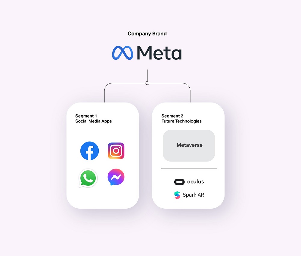
Facebook, the social media platform isn’t getting a rebrand as such, however, the company that owns Facebook, WhatsApp and Instagram, is.
Meaning Meta will be the Parent Brand for the social media apps, including Facebook, and any new products and services that may be completely irrelevant to social media.
The misconception
Facebook is indeed an iconic media brand however they claim that they want to be and do more than that. Drifting away from the misconception of Facebook being the social media platform only.
Having one of the social media apps being called the same name as the parent company creates confusion and lessens flexibility, meaning not being able to move forward and grow. It doesn’t encompass everything they do today and especially their future plans.
I think that there was just a lot of confusion and awkwardness about having the company brand be also the brand of one of the social media apps,” he said. “I think it’s helpful for people to have a relationship with a company that is different from the relationship with any specific one of the products, that can kind of supersede all of that. Mark Zuckerger
https://www.theverge.com/22749919/mark-zuckerberg-facebook-meta-company-rebrand
Meta solves the issue
Moving forward Meta wants the business to focus on two different segments. One for the social apps and one for future platforms. A new company brand to encompass everything they do and build.
Mark Zuckerberg states that the mission remains the same: bringing people together, still the company that designs technology around people. ‘Connection is evolving and so are we’.
Meta, derived from the Greek word beyond, symbolising that there is more to build.
A new brand system is applied
Creating a brand system that is able to hold under the different segments. The social media products such as WhatsApp, Instagram and Facebook, as well as any new products and future platforms.
Each product has a unique purpose and appeals to different audiences, based on culture, age, region, lifestyle, profession, et al. Therefore it is important that they are differentiated between them.
The image below illustrates some of the brands Meta currently holds and how they will probably be divided.
Brand architecture
Brand architecture is the way a company structures and presents its products to the target audience. It’s the relationship between brands within an organization and how they interact with one another.
Companies grow and target various audiences through different acquisitions and product lines, brand architecture is articulating a key structural system, helping each type of product to connect with the right audience and form perception.
It creates clarity by having a structure that achieves a robust system achieving flexibility and a system that can align and support any future plans; new lines of products, services.
There are a few strategies and methods applied to create brand architecture, each one serves a different purpose. See below.
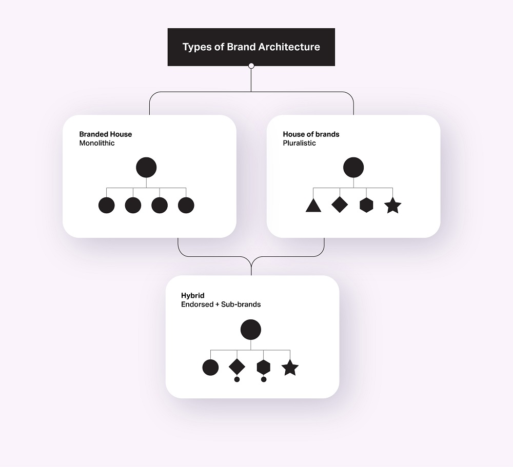
Branded house (monolithic):
A single master brand, using one visual system. Sub-brands are differentiated by descriptors, not logos. Usually, they are easier to manage and consumers choose based on loyalty. However, it is harder to target a specific audience and their needs.
House of brands (pluralistic):
The house of brands is basically the opposite of the branded house. It detaches the master brand from any of its products. The parent company is irrelevant and ‘invisible’ to the individual products that it distributes, enabling them to even compete with each other. If one of the brands is under a crisis, the others would not be affected. With this method is easier to target desired audiences, yet it can be the most costly one.
Hybrid (endorsed):
This category allows products to be associated or disassociated (to any level) with the parent company. Usually to benefit from the visibility of the company’s parent. It can also be used in the reversed way; when a product should not be linked with another one or the company parent at all. It is the most flexible approach yet hard to comprehend and manage.
Leading independent brand and creative agency Mr B & Friends is celebrating its 16th birthday with a significant senior appointment as it embarks on an ambitious five-year growth plan.
Ellie Wilson will join the business as Managing Partner, bringing her expertise in managing high performance agency teams and building long term client relationships to Mr B & Friends.
Wilson is moving from Taxi Studios, where she worked for eight years, most recently holding the role of Operations Director. At Mr B & Friends she will join the senior leadership team and will be working with Client Services, Operations and Finance to ensure the business is in optimum shape as it eyes expansion.
Wilson’s appointment is crucial as the agency seeks to expand its presence at home and abroad to accelerate the growth of the business. Over the last 18 months, Mr B & Friends has seen a rapid increase in activity across existing client business, while securing a number of new clients including OVO, Britvic, Marsh and BMT. Increasingly working with more international clients, such as InterContinental Hotels Group and Sofidel, has ignited the agency’s ambitions to further its reach in a number of key cities.
With a host of clients already based in London, a new office there is a natural progression. This will be followed by a base in West Coast US close to the HQ of its sister company Noble, while a further presence in SE Asia is planned for 2025 to complete the trio.
Back in the South West, Mr B & Friends is due to move into a new HQ at Whitefriars in Bristol in July, offering more space for its growing Bristol team. The agency team across all departments will be offered the chance of secondments and relocation to the new locations as they are established.
The plans coincide with the agency celebrating 16 years in business. Still focused on delivering brand expertise, Mr B & Friends has attracted an enviable client roster of consumer and B2B brands seeking brand strategy, identity, communications, internal communications and creative services across some high growth vertical markets. The growth plans will see head count within the business more than double to 70 employees by 2026.
Founder and CEO Simon Barbato says, “This has to be the most exciting phase in Mr B & Friends history. We have engineered our business to deliver superb brand consultancy with creativity for ambitious clients while delivering a sustainable business model to encourage future growth. I am delighted that Ellie is joining us and will help spearhead the expansion of the business. She brings a huge amount of talent and experience in all levels of agency management, which will enable me to focus on our growth plans. The future is something we’re all excited about.”
Managing Partner Ellie Wilson added, “I’m thrilled to be joining Mr B & Friends at such a pivotal point. My conversations so far have confirmed that we’ve got an outstanding team and firm foundations in place to take on the expansion. I’m looking forward to playing my part and ensuring we all enjoy the journey.”
Rita will talk about how she has found brand thinking not just fundamental to successful businesses of all shapes, sizes and stages, but also how you can apply it to yourself to ensure that you are as valued and influential as you can be. She will:
Tickets are priced at £50+VAT for BCI members and £75+VAT for non-members which includes a buffet lunch so there’ll be plenty of opportunity to catch up with old friends and make some new connections too.
If you’d like to join the BCI network, read all about becoming a BCI member here.
As a high-profile business leader, acclaimed brand guru and sustainability champion, Rita is able to inspire organisations of all kinds to find new ways to succeed in an uncertain world.
She has been called ‘Brand guru’ by the Financial Times and ‘The doyenne of branding’ by Campaign magazine. Retail Week commented that she is ‘A fabulous ambassador for business’. Alongside her board chairing and non-executive roles, Rita is a writer, keynote speaker, conference chair & practitioner on all aspects of brands, branding and business leadership.
Her career has included being a Vice Chair and Strategy Director at Saatchi & Saatchi, as London CEO and Chair at the global brand consultancy Interbrand and as co-founder of BrandCap. She is now a portfolio chair and non-executive director on the board of businesses including John Lewis Partnership, Nationwide Building Society and Ascential plc. Previous boards have included ASOS, Dixons Retail plc, Emap, Bupa and Populus Group. Her non-profit boards have included WWF (Worldwide Fund for Nature), the UK Sustainable Development Commission and Green Alliance. She was recently appointed Chair at Forum for the Future, the leading international sustainability organisation. In the 2014 New Year’s Honours List, Rita was awarded a CBE for services to the creative industries.
Rita is a regular columnist and media commentator, as well as author of ‘The Future of Brands’ and two editions of The Economist book ‘Brands and Branding’. Her new book on leadership ‘Love your imposter’ was launched by Kogan Page in September 2020.
Bristol-based brand consultancy, Mr B & Friends, has unveiled a vibrant new look for cyber security and Cloud IT specialist Kocho, bringing the two established businesses together under one name.
Kocho is the company formed from managed services provider TIG, and identity and cyber security experts, ThirdSpace. Backed by the private equity house, BGF, they’ve come together to harness the benefits of their separate strengths, making them a leading provider specialist for Microsoft Security and Cloud Technology. The distinct combination of expertise will enable Kocho to help grow ambitious companies in a truly sustainable and secure manner.
The brand has been designed with transformation front of mind, and the name ‘Kocho’ comes from the Japanese word for butterfly. The logo features a crest-like butterfly symbol with a star symbolising the transformation and protection the new business provides its clients. The brand positioning is anchored by an organising thought of ‘Become greater’, demonstrating how Kocho enables every client, colleague, and partner to flourish.
The sector that Kocho operates is crowded, so it was vital to develop a brand that was distinctive and had clarity at its core. The entire branding system, including iconography, type, colour, photography and moving image, all ladder back to the strategy. The design system features a series of illustrated patterns and ever-changing shapes that suggest the fluid motion of wings. The tone of voice shows the humility and confidence in Kocho’s ability to deliver greatness and commercial impact at both enterprise and mid-market level businesses in the UK and beyond.
Steve Richardson, Executive Creative Director at Mr B & Friends says, “From our workshops with the client team ‘Becoming greater’ was our statement of intent. The identity and tone of the brand had to represent this, but also had to stand apart from its competitive set. What client doesn’t want to be greater today than yesterday? Huge thanks to the brave client team, who embraced this bold approach from the off.”
As part of the brand relaunch, Mr B & Friends worked on a light art launch film with Sola Lightbombing. This used Pixel stick light typography combined with real-time generation of light art both in a studio and in cityscapes. The light trails tell the story of transformation and innovation, creating a fresh way to build the Kocho narrative.
Gareth Rees Jones, Director of Marketing at Kocho says, “Mr B & Friends really captured the vision that we were trying to achieve. The new brand celebrates our people, our expertise and the outcomes that we achieve for our clients. We’re delighted to be launching our new combined business under the Kocho brand.”
You need to load content from reCAPTCHA to submit the form. Please note that doing so will share data with third-party providers.
More Information