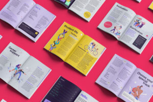
Working with Ben The Illustrator, Fiasco created an interactive glossary of terms to make the world of theatre more accessible to people from different backgrounds.
Developed as part of The Hub, The Old Vic Theatre offers free digital learning resources designed to welcome anyone of any age, experience or ability, into the world of theatre. Playing a key role is an “interactive glossary” of theatre-related terms, created by Fiasco Design.
The educational microsite aims to debunk the jargon often associated with theatre. Setting the experience on a stage, visitors are guided through an animated performance that explores the different roles, responsibilities and inner-workings of the theatre. Exploring the site, visitors learn about the many different people who help to run the theatre on a day-to-day basis. Visitors can watch and explore at their own pace, scrubbing back and forth to discover, revisit and learn.
“We want viewers to feel like they’ve stepped into our world and discovered something new and unexpected on their own terms.” Magid Elbushra, Digital Content Producer, The Old Vic Theatre.
“It was a pleasure to collaborate with Ben The Illustrator and The Old Vic on this microsite. Right from the start we were aligned on a more experiential approach, turning the passive action of watching into something active, engaging and fun.” Mike Frost, Digital Lead, Fiasco Design.
The colours are inspired by The Old Vic’s interior: opulent shades of reds and gold contrast a suite of deep and electric blues. The aim was to capture the atmospheric qualities of stage lighting by splitting the colour into ‘light’ and ‘dark’ themes, which mimic theatrical lighting effects.
“I’m very proud of what we collaborated on, it was a pleasure to work with the Fiasco team and will always state that setting the whole experience on-stage with the lit/unlit approach was a stroke of Fiasco genius!” Ben O’Brien – Ben the Illustrator.
You can view the project case study on Fiasco’s site here.
Building communities of global thinkers and explorers around the world, Bayswater combines two of life’s greatest adventures: education and travel. Bayswater is an international educational provider on a mission to educate and inspire the next generation through a life-changing educational experience.
Following their acquisition of Eurocentres – a renowned language school, and opening new campuses in locations around the world, Bayswater approached Fiasco Design with the brief to capture their progressive outlook on education; to challenge the status quo; and design a visual brand that is fit for the expansion of the business.
“We were tasked with developing an identity that is dynamic, progressive and optimistic, a fresh take for an educational brand. Harnessing the spirit of adventure, the brand idea celebrates travel and Bayswater’s global community.” – Ben Steers, Co-founder and Creative Director, Fiasco Design.
A suite of bold, colourful patterns are the backbone of the visual identity, reflecting the vibrant and diverse community taking a bold leap into new experiences. Whilst the brand palette and typographic system works to capture the aspirational and energetic tone of the brand.
The logo with its coloured pathways represents students of different backgrounds following their own unique pathway; uniting in the Bayswater community to be a part of something greater.
Typeface Fann Grotesque helps to ground the playful visual identity, giving the brand name a characterful, yet trustworthy feel. A reassuring nod to parents.
Meanwhile, photography is intended to feel active and optimistic. Celebrating individual personalities, the imagery is inclusive of a diverse global community of students.
The end result is a spirited brand that inspires the next generation to embark on the educational adventure of a life-time.
“We established Bayswater in 2017, but after rapid expansion and the integration of a variety of legacy industry brands, we wanted a reset and to double down on the Bayswater name with an exciting new brand canvas. It’s been great working with Fiasco on our full rebrand. We have appreciated the process, it’s been very collaborative and it’s very exciting to see the new look come to life across so many different platforms and formats.” – Stephan Roussounis, Founder and Managing Director, Bayswater.
You can read the full case study here.
What is a creative brief?
A creative brief is a short document that sums up a project’s mission, goals, challenges, demographics, messaging, and other key details. Typically produced by the person heading up the project, a creative brief outlines the problems to solve and offers the tools they might need, without prescribing a solution.
Why do you need a creative brief?
To start – you need a plan! A solid creative brief ensures everyone is on the same page before the project has begun and acts as a guiding north star throughout. Simultaneously allowing a project to stay on track, whilst underpinning the creative concept and strategic thinking.
A creative brief helps align everyone on the task at hand. Even the best creative minds in the world can’t solve a problem they don’t understand. More than just an arbitrary document, it is a tool that allows for clear and thorough communication from the very beginning of the design process. It prevents potential last-minute project changes, misunderstandings, and conflicting objectives along the way.
Marjorie Newnham, Project Manager at Fiasco Design, adds: “With larger projects that involve multiple stakeholders and various rounds of creative, it’s especially important to agree on the deliverables up front, so there’s no potential for confusion later down the line.” Establishing parameters and crucially – building trust, at the beginning will help ensure a smoother project journey.
Who is a creative brief for?
It’s quite likely that the people who will use the brief are an external creative agency who may not be familiar with language that is specific to your industry. So it should be accessible to a designer or web developer, for example, and avoid lots of acronyms or jargon. However, worth adding that this doesn’t mean a creative brief needs to be dry! It’s meant to incite enthusiasm and possibilities.
Hayley Yates, Account Director at Fiasco Design, adds: “It’s valuable for us to know if a client’s been through a similar creative process before, or if this is their first time. It allows us to tailor our approach based on their level of understanding of the process, as the acronyms and jargon exist in our industry too!”
What should a creative brief include?
Whilst not an exhaustive list, including these key bits of information will help a creative agency to understand and work towards your project.
Although it might seem like a lot of information to convey in a relatively limited amount of space, a good creative brief stays focused and to the point. Pages and pages of additional information should be unnecessary. The more you are able to distill your thinking into clear and concise points, the clearer it will be to the creative agency you’re partnering with. The brief process in itself, might in fact help to refine exactly what you’re hoping to achieve.
Working at the intersection of brand and digital, we take our partners with us at every step of the creative journey. Our open and inclusive ethos helps us to create joined up work that sparks change. Looking to start a creative project? We’d love to hear from you: hello@fiasco.design.
Fiasco welcomes new Associate Creative Director, Chris Tozer to the team. With ambitions to grow the agency this year, Chris brings a wealth of experience from working at some of London and Bristol’s top agencies.
“We’re really excited to welcome Chris into the Fiasco team. His wealth of experience in the industry, strong focus on ideas and leadership qualities were what convinced us that Chris would be a great fit for the agency.” – Ben Steers, Co-founder and Creative Director.
Chris adds: “Fiasco hasn’t hired at this level before, which is exciting because it means my role can be shaped quite organically. I’m looking forward to surrounding myself with the best talent out there and being part of an inspiring network of creative minds who collaborate to do great things. It’s that simple really. ” – Chris Tozer, Associate Creative Director.
Fiasco is a brand and digital agency that builds modern brands with heart and spirit. The 18-strong team of creative thinkers and doers work out of their Bristol studio, where they partner with businesses of all sizes, around the world. You can read more about Chris and his journey to Fiasco over on their site, here.
Fiasco Design have partnered with Bristol-based natural wine purveyors Native Vine, to produce a charismatic brand and website that re-imagines the experience of wine selection.
Native Vine champions exciting natural and biodynamic wines, stocking a range of unique, organic and vegan wines from small-scale producers. Specialising in wines from lesser-known regions and independent winemakers, they are passionate about strengthening the connection from vineyard to glass. With ambitious plans, Native Vine approached Fiasco with the challenge to make them more accessible to a wider audience.
The new brand identity builds upon the human stories of the wines, strengthening the connection between winemaker and drinker. It aims to cut through the elitist jargon that traditionally surrounds wine and put the fun back into wine buying.
The wonderful array of colour hues that characterise natural wines is celebrated via a dynamic palette that is broad, vibrant and reflective of a diversity of colours and flavours. The hero font ‘Blazing Sun’ captures the imperfections of organic wines and the hand-crafted feel that carries through the branding. Fiasco customised the font to ensure it fits Native Vine’s international roster by building a full suite of accents. The new logo alongside chunky typography and Matisse-inspired paper-cut graphic shapes, feels characterful, unpretentious and oozing with character.
Through photography, colours of the wine are captured either mid-pour or via reflections of the glass. These images pepper the new site and echo the Native Vine shop interior in terms of light and texture. Including hands in the photography reinforces the real-world experience of enjoying wine and brings the site to life. Online images have a playful hotspot feature, encouraging you to click to reveal more information, akin to Instagram’s shopping functionality; bringing wine buying to a younger, more digitally-minded audience.
An interactive wine finder tool re-imagines the in-store experience for a digital space. The online journey allows the user to discover their ultimate wine match based on colour preference, occasion and food pairing, to create a flavour profile that matches them to 3 bottles with a varying price range.
With most of the wines being from small-scale makers, the titles of the wines have very little weight. So instead, emphasis is placed on customer reviews. These were framed to be like how you might describe a wine to a friend, breaking down any preconceived notions of stuffiness associated with a sommelier.
You can view the project case study here: https://fiasco.design/project/native-vine
The year-long exhibition of Mexican-American artist Octavio Medellin features a variety of works dotted across multiple sites in and around the city that inspired them.
To celebrate his life’s work Fiasco created a tactile, interactive map of Dallas, which allows visitors to explore and discover the key locations, landmarks and public artworks associated with Medellin’s career.
“We wanted to create a map of Dallas with a curious sensibility that avoids cliches of rodeos and cowboys, in favour of a playful, celebratory take on the artist’s life and legacy.” – Mike Frost, Digital Designer, Fiasco Design.
Illustrator Nicolas Burrows helped to bring the vision of Medellin’s Dallas to life by developing an abstract and figurative style of imperfect collage illustration. Playing with exaggerated mark-making techniques, the illustrations reflect the craftsmanship and philosophies that underpin Medellin’s work. The colour palette champions his use of raw materials – using pops of brighter hues to create a dream-like, more positive vision of Dallas. The overall feel echoes Medellin’s spirited, childlike love for craft.
A prominent figure in the Texan art scene, Medellin was passionate about sharing his wisdom and championing the next generation of artists. Adopting Medellin’s ethos, the website is designed to land with a broad demographic: an inclusive space for people from all walks of life to learn and be inspired.
The site is joyous for all to explore; a tactile digital experience that connects with the sculptural qualities of Medellin’s work through Burrows’ playful interpretive illustrations.
The navigation around the site helps to break up six decades of work in a digestible way for all to enjoy. Whilst the playful user interactions and bold colour palette connect this artist of huge cultural significance with a new, younger audience; keeping his work relevant to this day.
“It was a real joy to work with Dallas Museum of Art on the site for this unique exhibition of Medellin’s work. They were a fantastic partner, seeing our vision for the microsite and really getting behind it. We’re excited to see how the map is received.” – Ben Steers, Creative Director, Fiasco Design.
“Fiasco were amazing to collaborate with, and were truly innovative in their approach to our interactive map creation. They came up with amazing creative solutions, as well as providing real time brainstorming and troubleshooting along the way. We’re thrilled with the result— and the interactive museum engagement with both our members and the public!” – Lizz DeLera, Creative Director, Dallas Museum of Art.
You can view the full case study here.
“Emotional wellbeing for the next generation requires us to be there not just at bedtime but also across the day and in environments like classrooms. Our goal is that proactive development of EQ becomes as important as IQ. In order to reflect this, we have evolved from Moshi: Sleep and Mindfulness to Moshi.” – Ed Barton, COO, Moshi.
Moshi are on a mission to improve the health and happiness of the next generation by teaching them the fundamentals of mindfulness from an early age. The UK is facing an unprecedented mental health crisis, with children most affected of all. Today, 1 in 6 children suffer with poor mental health; from anxiety and eating disorders, to attention deficit/hyperactivity disorders and more. Through guided meditations, mesmerizing stories, and soothing sounds, Moshi aims to make mindfulness magical to young minds.
As Moshi expanded their content from sleep-only to round the clock mindfulness, they approached Fiasco Design to encapsulate the change via a new digital home. “We initially appointed Fiasco to rebuild our website. The project quickly became something much more and led to us sharpening our brand across platforms with the website at the centre.” says Ed Barton, COO, Moshi.
The updated brand colour palette now includes brighter hues, with accessibility in mind. The original main brand font, Calibri, has been replaced by Chromatica by Polytype foundry, a versatile sans serif type with a warm and personable tone.
Fiasco also helped to set the tone when it came to photography, introducing a vibrant set of studio shots that replaced stock imagery. Charming hand-drawn annotations add a sense of personal expression, as unique as every child.
The new website drives subscriptions whilst simultaneously capturing the magic of mindfulness. Moshi’s personality has been dialled up through playful UI design and motion. The result is a site that echoes the spirited nature of the app and ultimately champions the child.
“As a parent to a young child, I’ve had first-hand experience of how transformative the Moshi app can be to family life. It was a pleasure, therefore, to get the chance to work with the team at Moshi to help realise their vision for the brand.” – Ben Steers, Creative Director, Fiasco Design.
You can read the full case study here. Fiasco’s partnership with Moshi is the manifestation of their brand pledge to use creativity to inspire change. Working seamlessly across brand and digital, Fiasco creates extraordinary brands with heart and spirit.
iO Academy is on a mission to help to address the gender imbalance in the tech industry, and give people the training they need for a career they’ll love.
Based in the South West, iO Academy is tackling this head on with a rebrand that speaks to their core values of inclusivity and accessibility. Working with Bristol-based creative agency, Fiasco Design, they’ve created a brand that reflects their ambitions of creating a more diverse and inclusive industry, bringing about meaningful change.
It’s no great secret that there is a representation gap for women in tech. More inclusive career pathways in the technology industry have been the focus of various initiatives, such as Tech Talent Charter, Code First Girls, and Tech She Can, along with the Department for Digital, Culture, Media & Sport’s Digital Skills Innovation Fund and the Academy’s own Diversitech Fund.
Over a quarter of women students say that they are put off a career in technology as it’s too dominated by men. (PWC)
The UK economy would benefit from an extra £2.6 billion each year if the number of women working in tech is increased.
83% of millennial British women stated that they actively seek out employers with a strong record on diversity, equality and inclusion. (PWC)
Women account for 50% of the UK working age population but only 16% of IT professionals are women. (BCS)
iO Academy is an award-winning coding bootcamp based in the South West. In 2015 it was set up by healthtech company Mayden – not initially as a business, but as a way to solve a problem. Like so many tech companies around the UK, they needed more developers to sustain their own growth. So a team of Mayden developers designed a programme that would train people with no coding experience to be industry-ready developers in just 16 weeks. Their direct tech experience led them to build a course with a new approach; one that gave students the up to date and practical skills that were needed most. A course that anyone, regardless of their gender, ethnicity or background, could come out of as the sort of developer that tech companies want to hire.
After five years in business, it was time to look at themselves and uncover the ingredients which would make them an innovative, purpose-driven brand.
The Academy reached out to Fiasco Design at the start of 2020 with a view to repositioning the company, reflecting their own growth from an idea to solve a talent shortage, to a company with an international reputation. The aim was for a fresh, future-proof identity that would appeal to a diverse range of prospective students and break down perceptions about the tech industry.
With graduates working in tech companies from Bath to Berlin, a 50:50 ratio of men and women trainers, and a strong work ethic towards diversifying the industry and creating an environment that facilitates opportunities for all, Fiasco Design and Mayden Academy embarked on a full strategic review of the current branding; assessing their DNA and defining their core values and company proposition.
Through a number of workshops conducted by Fiasco and Mayden, a new brand name was formed; iO Academy. On the one hand it’s a clear nod to coding language – IO is shorthand for input/output in computer programming. On the other it’s also the name of one of Jupiter’s moons, which seemed a good metaphor for the brand’s innovative, future-focussed outlook.
Margaret Davidson, Business Development and Marketing Manager at iO says, “Fiasco saw right to the heart of who we are as a brand and came up with a visual identity to represent us which we would never have thought of ourselves. In particular, what we wanted was to become more attractive and accessible to a wider range of people, with a core focus on diversity and inclusivity. Working as part of a new niche sector within a wider industry that often seems intimidating, this was a challenge. Fiasco came up with an approach where we now feel confident that an underpinning of inspiring inclusivity will be clear in everything we do, and help us to be part of bringing meaningful change.”
With the name and proposition came a new visual expression for the brand. The visual language is designed to reflect exploration, harnessing imagination and working towards a better future. The graphic shapes give a sense of wayfinding, collecting badges and new skills following a creative pathway. Verbally the tone is positive, ambitious and empowering, and speaks to the curious and willing.
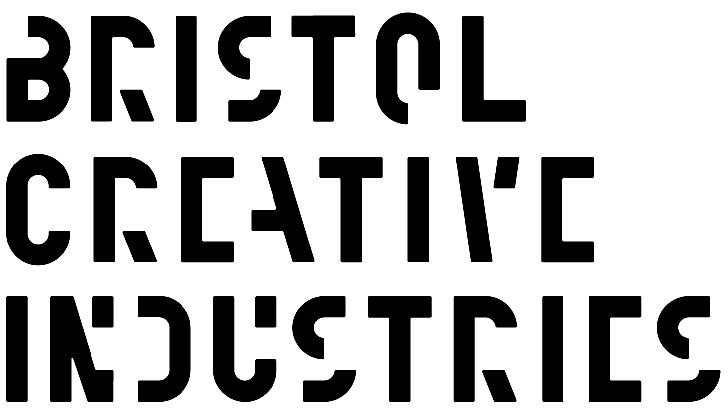
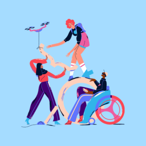
Working with Belgium-based illustrator Soren Selleslagh, the team created a suite of illustrations to depict aspects of the student journey across the course and into their new careers. Soren’s human-centred approach evokes joy and empowerment through positive representation of all types of people. With a devoted outlook to making meaningful illustrations, this partnership gave the brand identity the visual storytelling elements that demonstrate openness and inclusivity.
Ben Steers, Creative Director at Fiasco Design says about the project: “It’s been fantastic to work with the team at iO and help them towards realising their vision of leveling the playing field within the tech industry by creating a fairer, more diverse community of developers”

Our stunning, centrally located private 12 desk studio/office in the heart of Bristol city, just off Christmas Steps has now become available.
This is an opportunity to work in a beautiful studio/office that includes bespoke furniture, meeting room, shower facilities, bean-to-cup coffee machine and views across the whole of Bristol to name just a few perks.
Included:
• Floorplate – 1,000+ sq ft
• Fully furnished including all desks, pedestals, and ergonomic chairs
• Completely private and secure entrance
• Meeting room
• Shower and W/C
• Kitchen and multiple break-out areas
• Bespoke furniture
• Tala lighting
• All bills and superfast broadband included
• Professionally cleaned (weekly)
• Flexible 12 month contract (No long leases here!)
£3,600 p/m including all services and rates
Please email [email protected] for more information.
You need to load content from reCAPTCHA to submit the form. Please note that doing so will share data with third-party providers.
More Information